


From «Prostokvashino» to «Prosto Nashe»
Brand of traditional dairy products
Scope of work:
Packaging concept
Label designs
Illustration
Label designs
Illustration
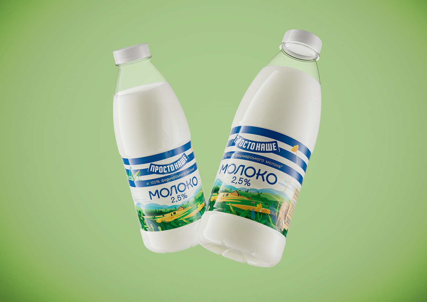
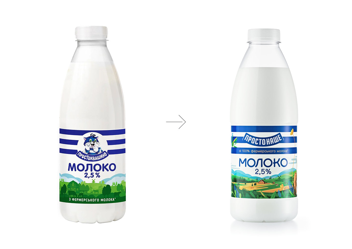
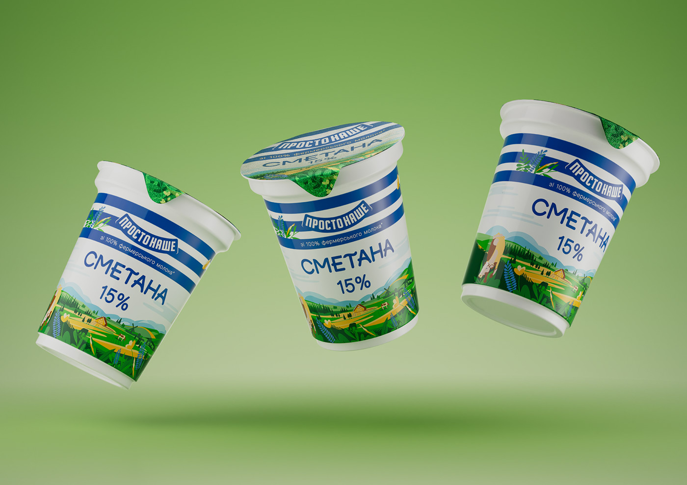
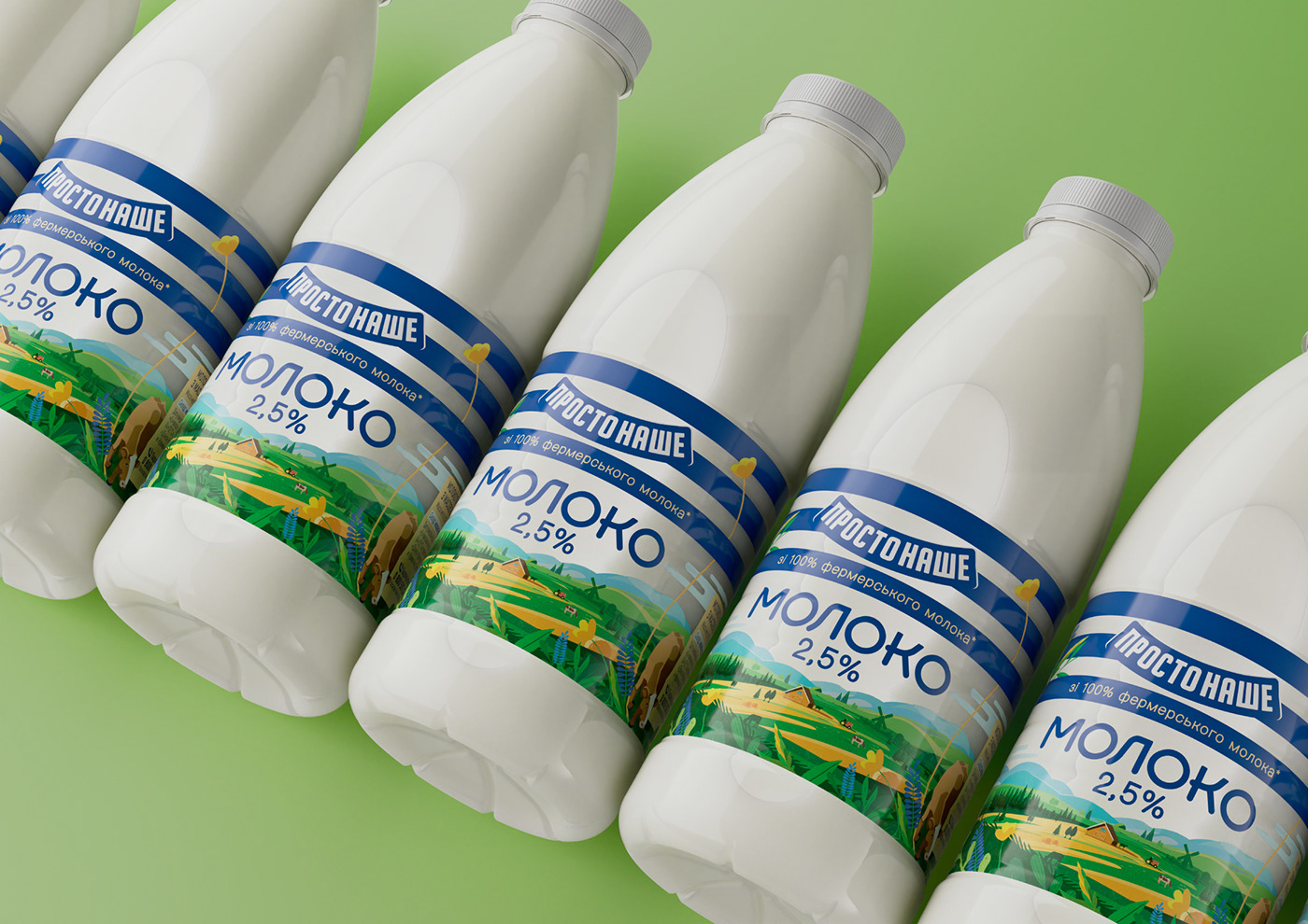
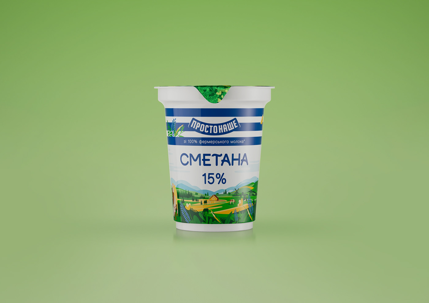
The brand of traditional dairy products "Prosto Nashe" replaced the "Prostokvashino" brand, which had become outdated for Ukrainian society. We conducted a rebranding and changed the packaging design, maintaining maximum recognizability but shifting the focus from the cat character to new key design elements.
After conducting a design analysis of the previous packaging and studying its perception by consumers, we concluded that the three blue stripes on a white background are the key element of brand recognition. While the iconic character Matroskin is secondary, it is he who serves as a design element rich in detail, thus providing an important contrast to the three simple blue stripes of branding. Therefore, to remove the character, we needed to fill the design with another detailed element, which became the background narrative illustration.
In addition to changes in key design elements, the trademark blue color was also slightly adjusted towards a warmer shade. The brand line is presented in such categories as milk, kefir, fermented baked milk, sour cream, and yogurt cheese. All products are produced at one of the factories in the city of Kremenchuk, Poltava region, Ukraine. From milk supplied to the factory from nearby farms.
https://reynoldsandreyner.com/prosto-nashe


