Pure Persona
Our approach began with the essence of Pure Persona's ethos – purity. We sought to create a visual language that not only reflects the purity of their products but also resonates with their commitment to self-care as a moment of respite and relaxation.
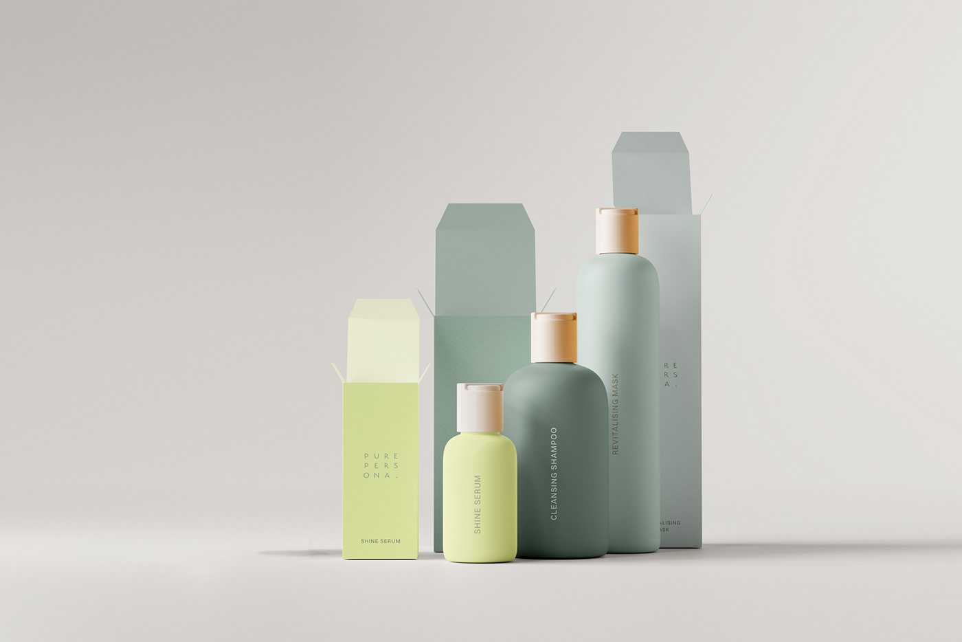
Central to the design process was the selection of a calm and grounding color palette that evokes a sense of tranquility and mindfulness, inviting consumers to pause and indulge in self-care rituals. Amidst this serene backdrop an accent of spring green injects a subtle yet powerful energy into the identity, symbolizing vitality and renewal. It serves as a reminder that amidst life's demands, there is always room for rejuvenation.
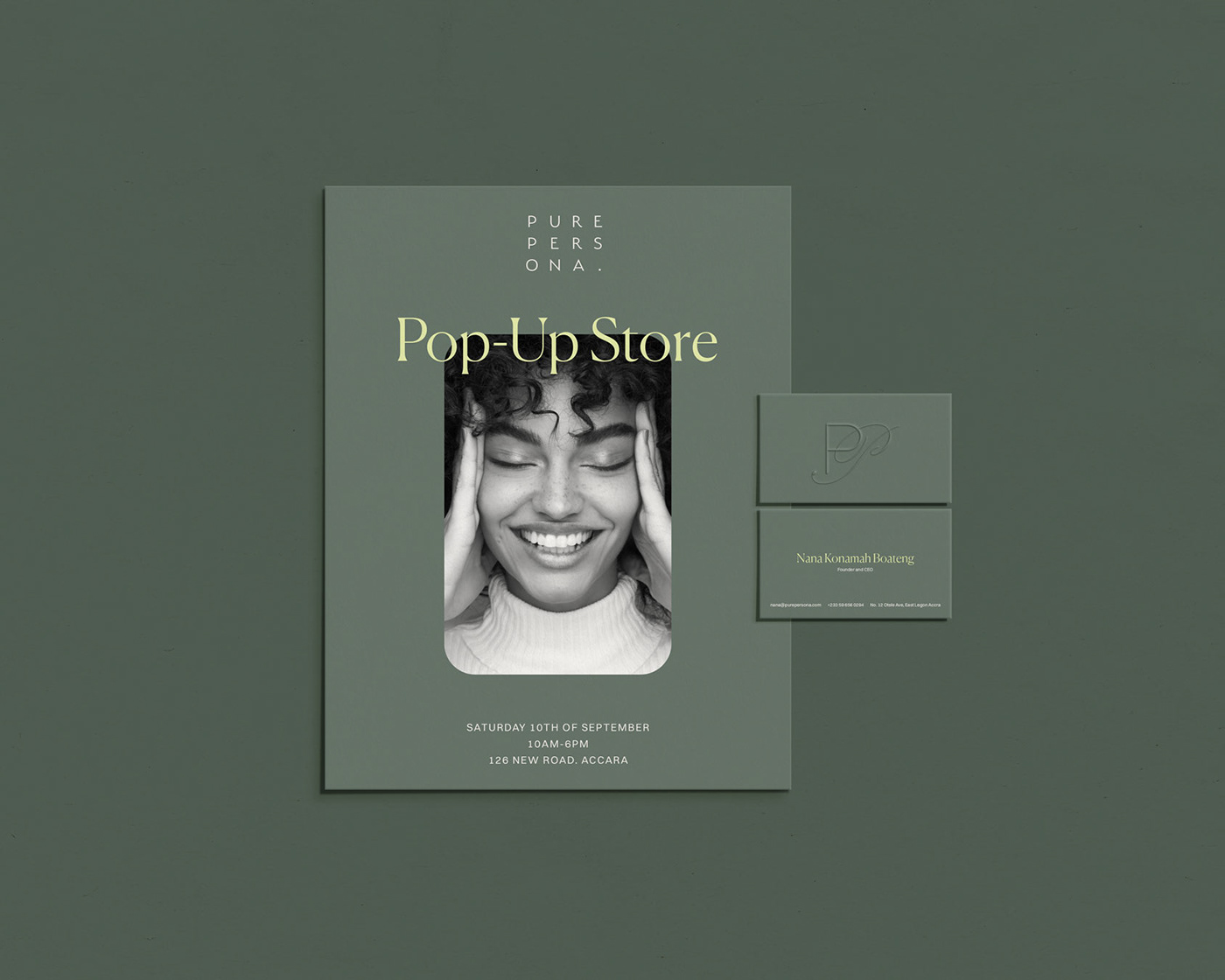
At the heart of the identity lies the PP monogram – a distinctive symbol of Pure Persona's commitment to purity with a touch of elegance. The choice of clean, sans-serif fonts enhances the overall simplicity and through subtle variations in weight and spacing, we achieved a harmonious balance between sophistication and approachability.