


Doc Brown Farm & Distillers
A farm growing heirloom grain, milling, fermenting and distilling it, then ageing the liquid in locally made charred barrels to make an authentic, old-style bourbon – it sounds like a dream come true. But Amy Brown, Paige Dockweiler and Daniel Williams of Doc Brown Farm & Distillers are making that dream a reality.
We knew immediately that Doc Brown had a strong proposition. The farm grows a rare strain of maize called Jimmy Red Corn, which was used to make bourbon in the South before Prohibition but nearly died out when agriculture became industrialised. On their family farm in Georgia, Amy, Paige and Daniel are raising the corn naturally and sustainably, turning it into farm fresh whiskeys.
What they needed from Ginger Monkey Design was a brand identity and packaging design system to encapsulate the wonderful story and values behind their business, which would also have the flexibility to cost-effectively introduce new product concepts as they were envisaged.

The story
Our journey with Doc Brown Farm & Distillers began in 2020. First, we simply asked a lot of questions and did a lot of research to gain an in-depth understanding of the business. Roots set deep in the Georgia soil, a farming heritage behind them, an indefatigable work ethic, strong beliefs, a vision for the future, an abundance of humour – with Doc Brown we had the beginnings of an interesting, intelligent, multi-layered narrative.
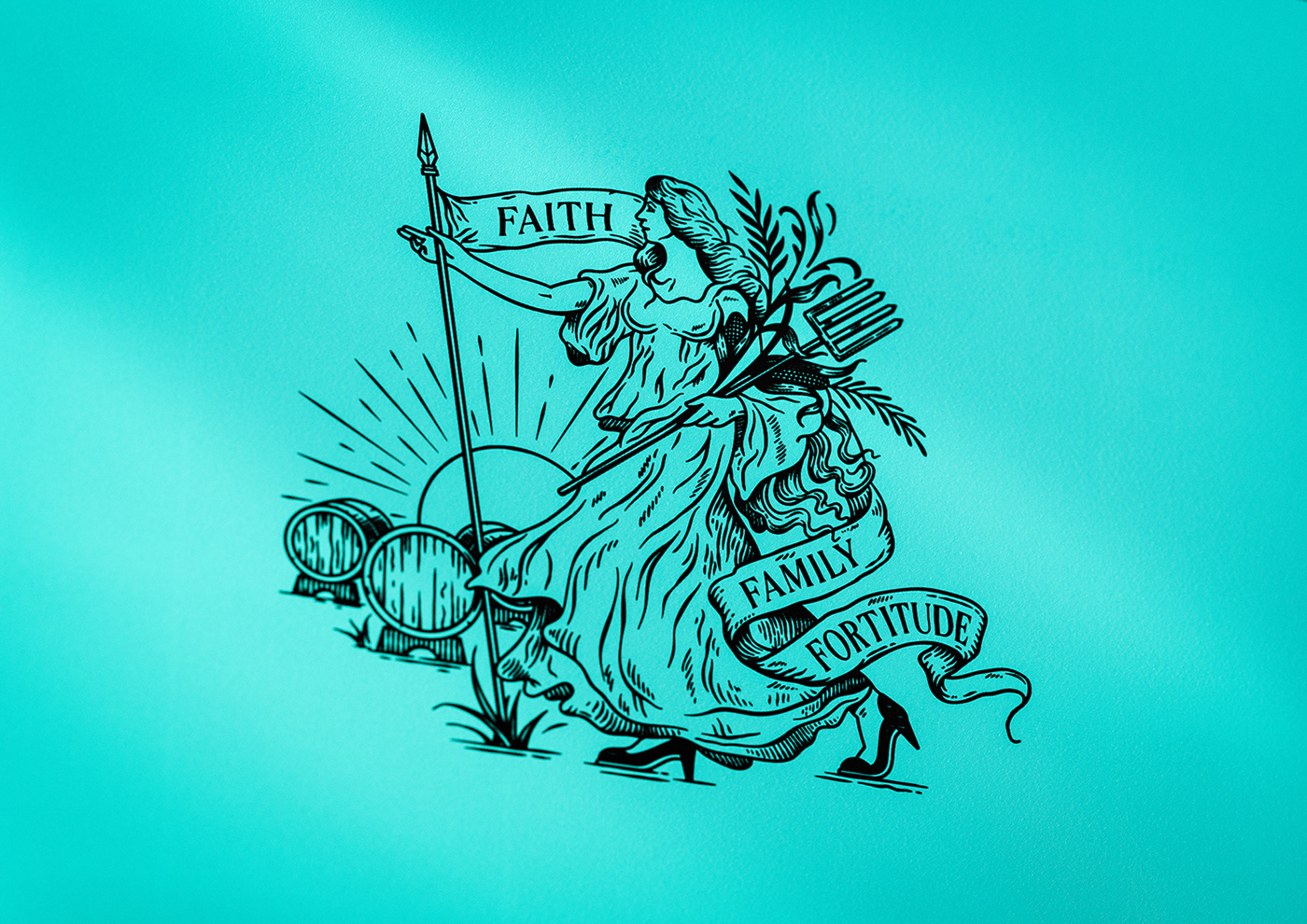
During the concept phase, we worked on different ways of articulating everything that was important to our clients, confirming the type of language, tone of voice, how the ideas would connect and where the emphasis would lie. With values based on the notions of family, fortitude and faith, and using the word ‘heirloom’ as a core theme, we formulated a new brand, but one that drew heavily on the heritage behind the business.
Our journey with Doc Brown Farm & Distillers began in 2020. First, we simply asked a lot of questions and did a lot of research to gain an in-depth understanding of the business. Roots set deep in the Georgia soil, a farming heritage behind them, an indefatigable work ethic, strong beliefs, a vision for the future, an abundance of humour – with Doc Brown we had the beginnings of an interesting, intelligent, multi-layered narrative.
During the concept phase, we worked on different ways of articulating everything that was important to our clients, confirming the type of language, tone of voice, how the ideas would connect and where the emphasis would lie. With values based on the notions of family, fortitude and faith, and using the word ‘heirloom’ as a core theme, we formulated a new brand, but one that drew heavily on the heritage behind the business.
Unique expressions
Doc Brown Farm & Distillers take a natural and traditional approach to the entire process, which is reflected in the hand-rendered lettering and typography developed for the brand. The logotype takes cues from Victorian and early 20th century signwriting and advertising, with each layer of the message expressed in a different style. Contrasting forms not only create visual interest but they reinforce the heritage behind the business.
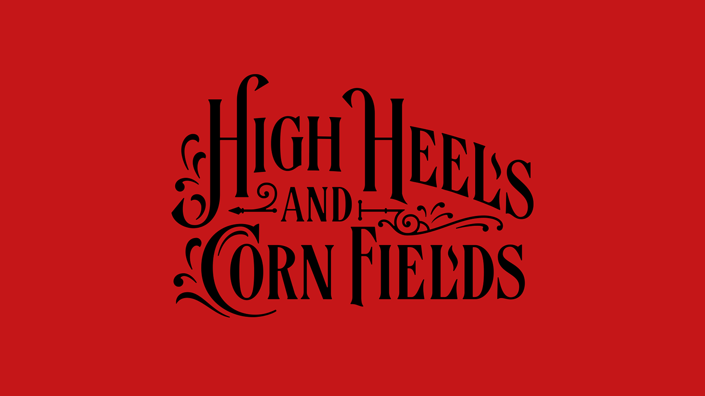
We helped Doc Brown develop various taglines and phrases to capture different aspects of the mission – Georgia Thru and Thru, High Heels and Cornfields, Heirloom Spirits Made the Old Way. To further take ownership of this messaging, a custom typeface was created specifically for key expressions.
Doc Brown Farm & Distillers take a natural and traditional approach to the entire process, which is reflected in the hand-rendered lettering and typography developed for the brand. The logotype takes cues from Victorian and early 20th century signwriting and advertising, with each layer of the message expressed in a different style. Contrasting forms not only create visual interest but they reinforce the heritage behind the business.
We helped Doc Brown develop various taglines and phrases to capture different aspects of the mission – Georgia Thru and Thru, High Heels and Cornfields, Heirloom Spirits Made the Old Way. To further take ownership of this messaging, a custom typeface was created specifically for key expressions.


Worth waiting for
We had a good idea of what the first products would be, but while the bourbons were still maturing in their casks the plot took some twists and turns. Two labels were developed for release in 2023 – Effie Jewel and Uncle Bogue. Both derive their back story from characters in the Doc Brown family tree, and label artwork was created to convey all the unique aspects of the overall Doc Brown approach, along with the characteristics of each individual whiskey.
In the interim, we also helped develop three flavoured Bourbon Cream liqueurs, enabling Doc Brown to generate revenue while the core product lines were ageing. The liqueurs quickly sold out, reassuring everyone that the brand was on the right track.
An ongoing partnership
Just like distilling, brand development is a journey and beyond creating the identity and designing the packaging, we continue to work in a collaborative partnership with Doc Brown.
Future products are in development, we designed the Doc Brown website and contribute to it on an ongoing basis, and we are helping the company with new projects to effectively communicate what really sets them apart. There is a lot more to the Doc Brown story than has thus far been revealed, so watch this space.


