01 — NEW MANUFACTORY
New Manufactory is a space located in the building of an old Soviet sewing factory in Moscow.
Here, exhibitions of contemporary art are held, speakers give lectures every week, performances, fashion shows, and other cultural youth events of the city take place.
Metaphor: a stitch, a sewing seam.
The abbreviation "NM" is used as a fragment of a sewing stitch. The "NM" can be elaborated on by turning simple lines into intricate embroidery patterns. The typography and logo also appear as if they are stitched with short stitches on fabric.
Designed for Uprock Studio.


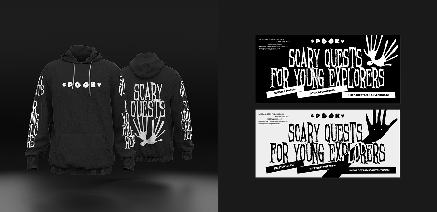
02 — SPOOKY
Spooky is a company that organizes scary quests for children.
The metaphor is "theater of shadows." The characters are black elongated silhouettes of unknown, eye-like creatures, with hints of hand-like appendages.
The two "O" letters in the logo resemble eyes that can gaze intently, blink, and squint angrily.
Designed for Uprock Studio.
The metaphor is "theater of shadows." The characters are black elongated silhouettes of unknown, eye-like creatures, with hints of hand-like appendages.
The two "O" letters in the logo resemble eyes that can gaze intently, blink, and squint angrily.
Designed for Uprock Studio.


03 — MULI
MULI (mu - music, li - listen) is an application where you can find all your favorite songs,
create playlists, and discover music according to your taste.
The logo resembles a musical equalizer frozen in the shape of the letter "M."
It also incorporates zigzag lines to symbolize sound waves.
Designed for Uprock Studio.
create playlists, and discover music according to your taste.
The logo resembles a musical equalizer frozen in the shape of the letter "M."
It also incorporates zigzag lines to symbolize sound waves.
Designed for Uprock Studio.


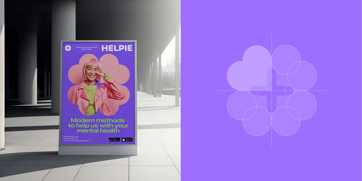
04 — HELPIE
HELPIE is an online platform for finding psychologists.
The logo combines a medical symbol (cross) with a symbol of luck — a four-leaf clover.
In the field of psychology, the aim was to move away from the clinical aspect, so the ends of the cross are rounded, and the symbol itself resembles a flower.
Designed for Uprock Studio.
The logo combines a medical symbol (cross) with a symbol of luck — a four-leaf clover.
In the field of psychology, the aim was to move away from the clinical aspect, so the ends of the cross are rounded, and the symbol itself resembles a flower.
Designed for Uprock Studio.

05 — SSC
The company SSC is engaged in the production of bricks and building blocks.
The letters in the logo resemble bricks stacked on top of each other.
Additionally, an element has been added to the identity that symbolizes construction and development.
Starting as a simple dot, it transforms into a three-dimensional element that fills the space.
Designed for Uprock Studio.
The letters in the logo resemble bricks stacked on top of each other.
Additionally, an element has been added to the identity that symbolizes construction and development.
Starting as a simple dot, it transforms into a three-dimensional element that fills the space.
Designed for Uprock Studio.


06 — URBAN LITERATURE
Urban Literature is a major book publishing company.
In their logo, the letter "U" transforms into a book, and images, including book covers, are stacked on top of each other, symbolizing a large print run.
Designed for Uprock Studio.
In their logo, the letter "U" transforms into a book, and images, including book covers, are stacked on top of each other, symbolizing a large print run.
Designed for Uprock Studio.


Thank you for whatching!


