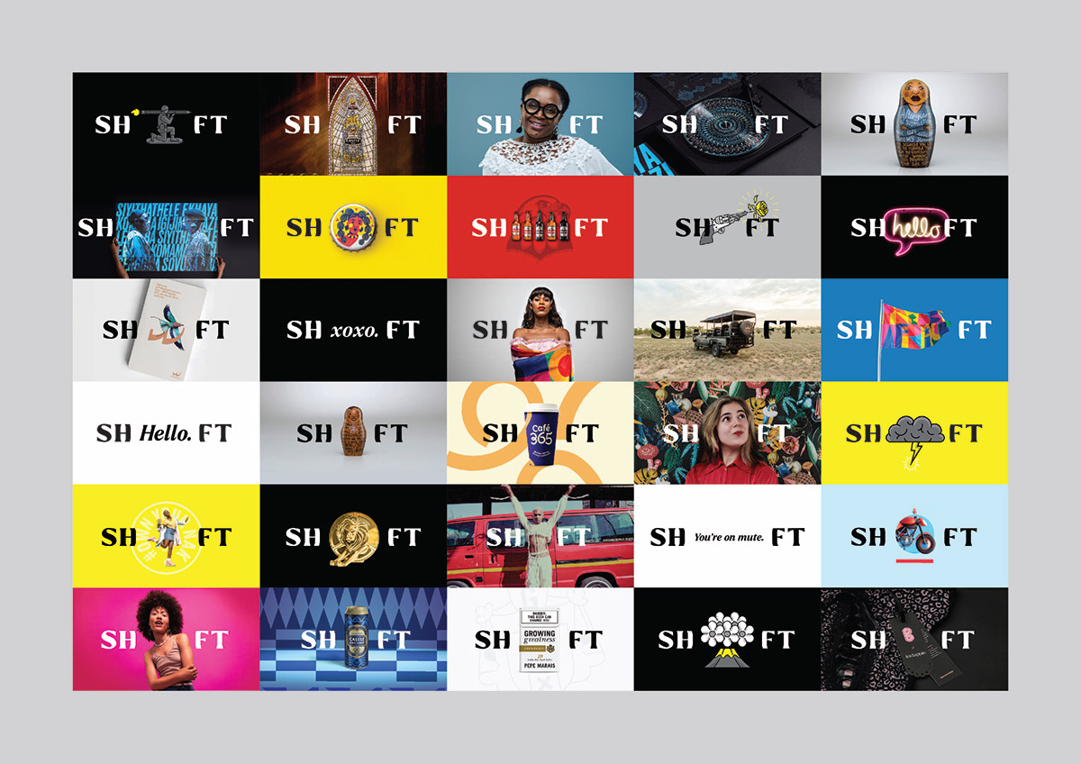
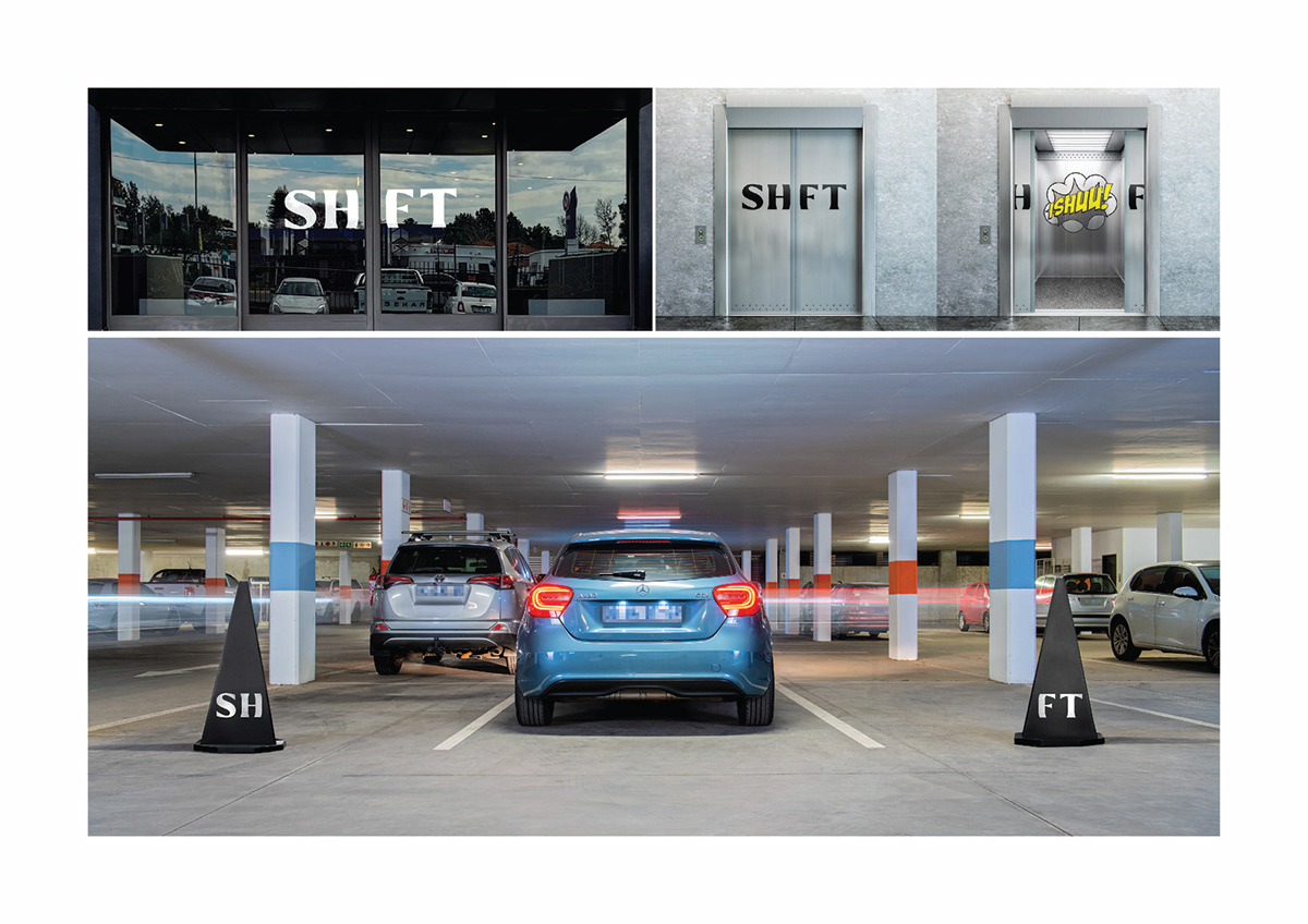
As SHIFT repositioned as a stand-alone agency, they needed to express their purpose and develop their own unique identity. Creating an IMPACT through design is at the heart of what they do. Which is why, by turning the I at the centre of the name into a dynamic, shifting space, we placed the IMPACT right at the heart of the logo.
The identity functions as a playful shifting bracket that “frames” various elements within their name, tactically placing these at the centre for emphasis. And what is placed inside it starches as far as the imagination can go.