These circle shapes shown in the logo design represent the business’s philosophical core, as well the products they work with, grains in their most basic form. The circles showcase their journey to impact; the ongoing perpetual motion of progress, growth and sustainable solutions – ones that keep on growing, onwards making an impact as they go.
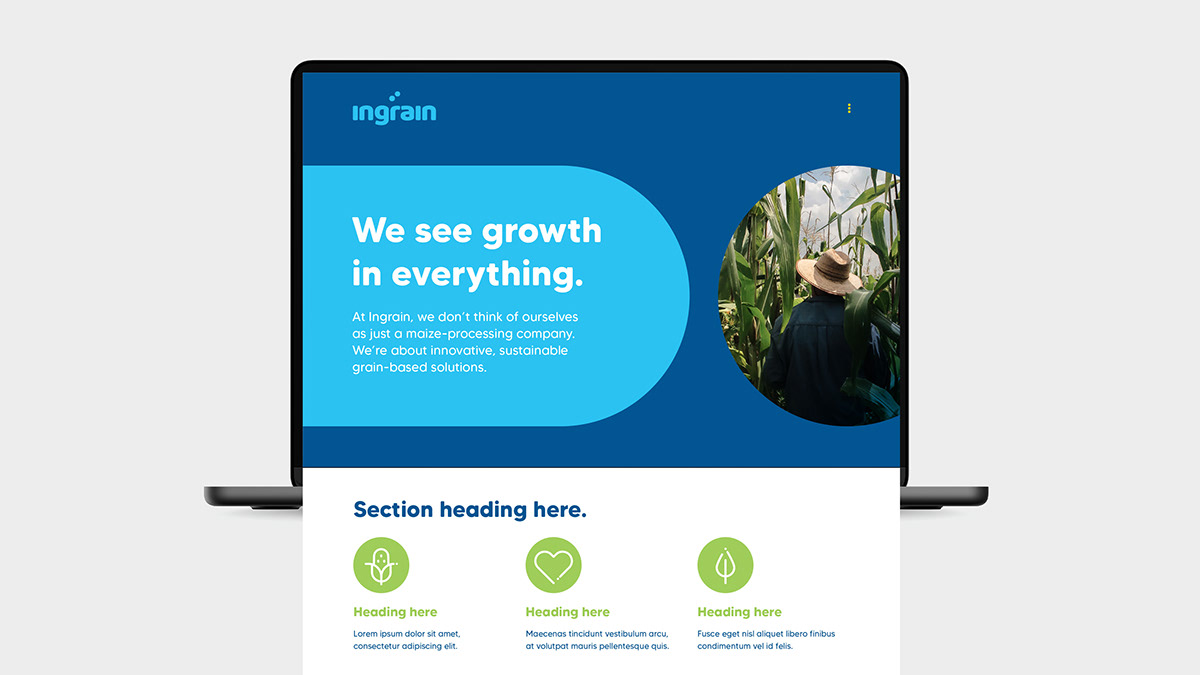
The visual identity was inspired by these impact points. The circular shapes can grow and stretch vertically or horizontally, holding images, ideas or products in an ownable space. They can be bolder or more subtle when necessary, acting as a versatile device aligning with our tonality and strategic outlook to make a sustainable impact wherever they go and whatever they do.