


Archinform
Archinform is a full-cycle architectural bureau founded in 2008 in the Ural region. The bureau specializes in individual architectural design, striving to implement a comprehensive approach in project development. This includes creating sketches and architectural concepts, as well as completing the entire documentation cycle and performing the functions of a chief designer.
Our task was to rethink the visual identity of the architectural bureau, giving it a modern and expressive appearance. Reflecting on architecture and urban planning, we compared the aesthetics of contemporary architecture with font design. This formed the basis of the visual concept.
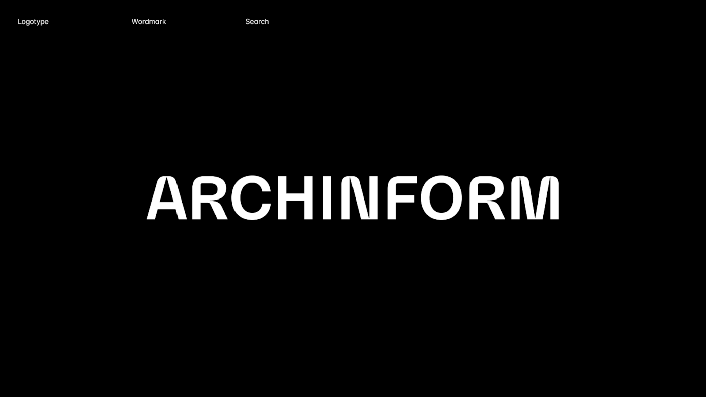
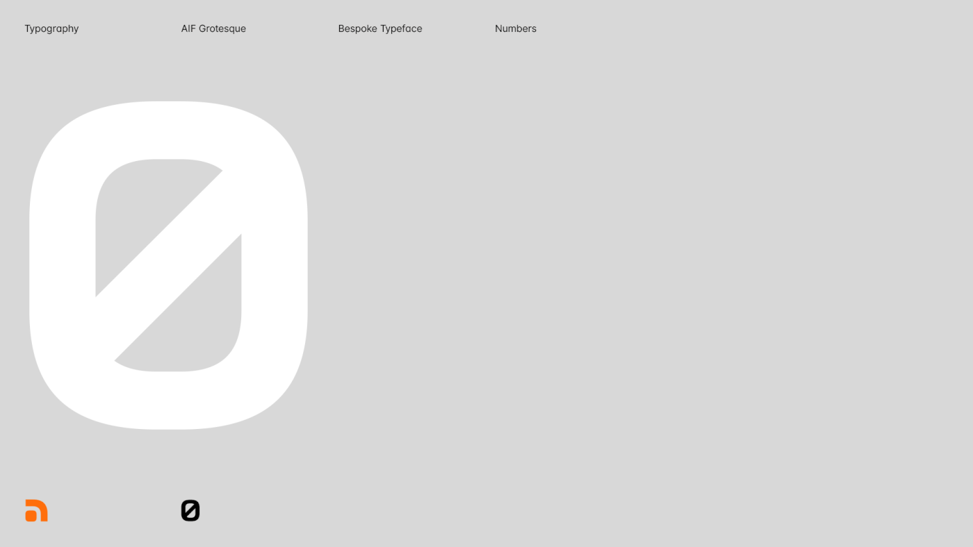
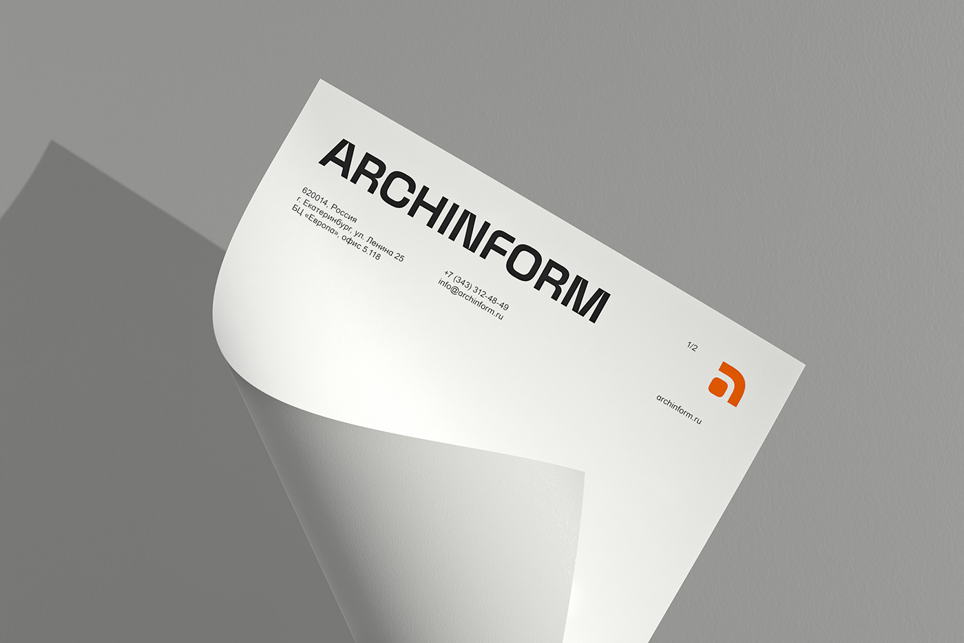
The developed logo is based on simple geometric shapes and complex radii, embodying technical sophistication in architecture. The minimalist aesthetics serve a functional purpose, emphasizing the bureau's projects. The symbol represents a graphic monogram in the form of the letter "a," appearing natural and simple yet carefully considered. An important aspect of creating a unified and recognizable brand image was the development of a custom display font based on the logo. The font includes uppercase Latin and Cyrillic letters, as well as numbers and punctuation marks. It can be used in print and digital materials, such as printed materials, presentations, websites, and other media. The color palette of the visual identity is inspired by natural motifs (water, sky, and sun) and is based on shades of blue with the addition of a soft and warm orange color.
____


____
Thanks for watching.
More works on
© 2023, BrightHead Studio.


