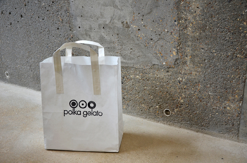
Polka Gelato
Artisan Ice Cream shop in Fitzrovia London
Artisan Ice Cream shop in Fitzrovia London
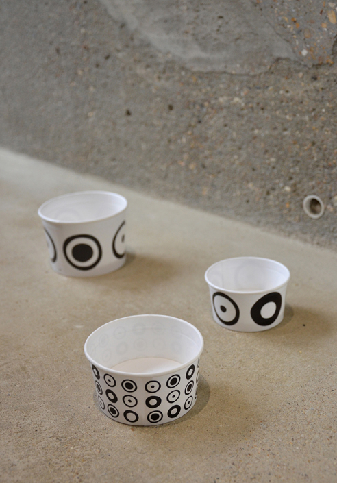
VONSUNG recently completed the total identity design for Polka Gelato,from naming, identity, branding, signage, website to spatial design. Based in aconservation area, Fitzroy Square, Polka Gelato opens its doors to showcasetheir artisanal way of creating ice cream. Despite all the talk of a double-diprecession in the UK, the client's wish was to offer something enlightening,from old to young, a sense of affordable luxury amid these difficult times.
The ambition of the new ice cream brand was to open a gelato storesourced only from the finest ingredients of precious, exotic fruits, herbs,spices and flavors. The vision was to bring the age-old history of Italiangelato to London, while a recent trip to New York sparked a new revolutionarythought – the gelato popsicle. To realize this vision, London's designstudio, VONSUNG, was invited to work on the dream.
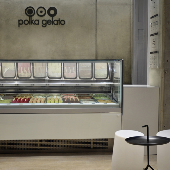
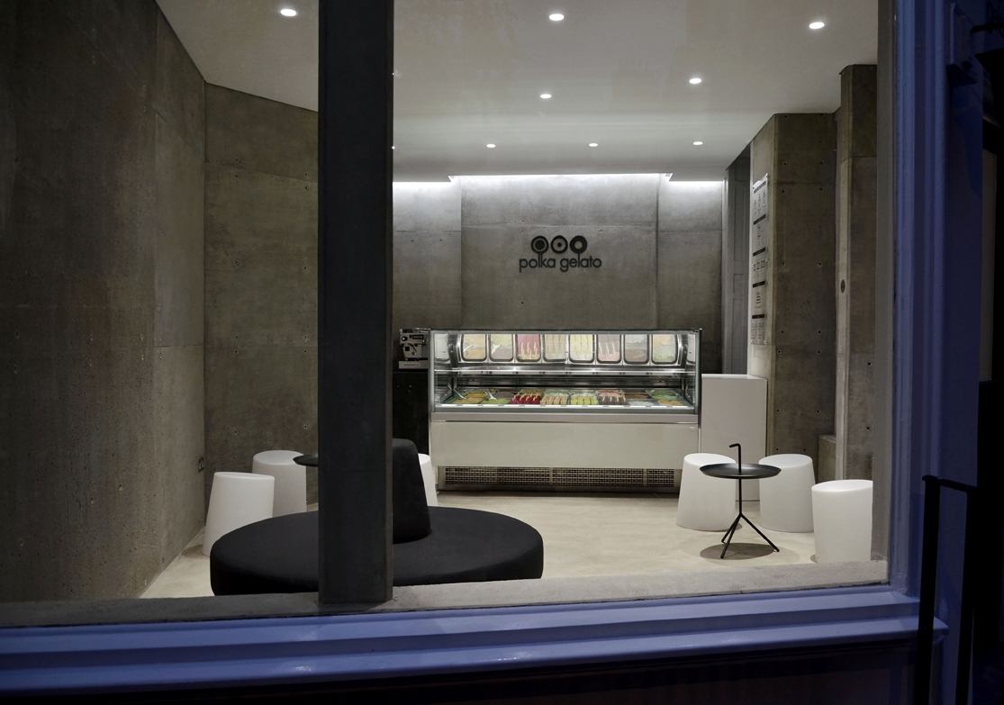
The character of the listed building situated near the Fitzroy Square,is clearly that of a London period building. The dilemma was how to avoid theice cream parlor formula of pop-culture, primary colours interior decoration,without making a disconnected piece of modern design that clashes with thebuilding’s original identity. An early decision was to place the Polka’scolourful, beautifully crafted gelatos as the central focal point and make thesurrounding interior resemble the sculpted nature of the hand-made gelato.
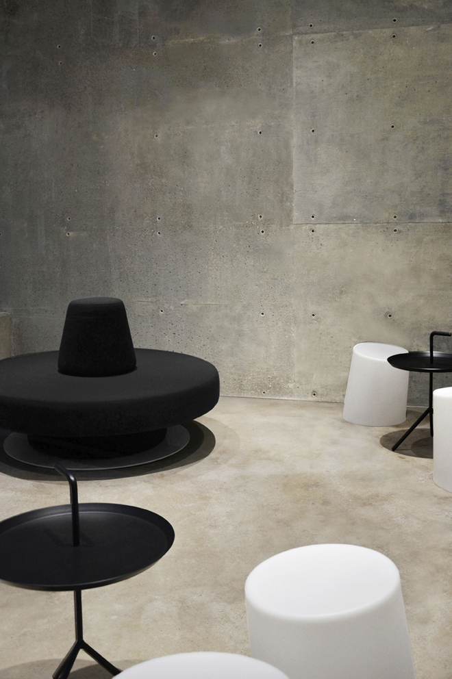
The concept of the store plays with the complementary characteristicsand the related dichotomy between male and female; child and adult; night andday. This is reflected in the design through the formal language and tactilequality of the finish materials used. The surrounding interior is unified witha single colour used on all surfaces.Housed inside aconcrete/limestone mix surrounding, the furniture piece on the floor isdesigned as a strong, masculine and dynamic form whilst the lighting enunciatesfemininity to create more fluid contour lines. The store is designed in a moreplayful manner creating different zones that maintain the perspective viewbetween them.
Joseph Sung (Creative Director VONSUNG) has strived in his precedentprojects to experiment variant ways to explore materials. Among the natural,old, and time-proven material, Sung has derived at lime concrete for thisproject. Being situated in a historical setting, Sung felt that juxtaposing oldand new material would give expected meaning for both, as exemplified usingexternal architectural material within the interior space of the gelato store.Stemming from the client brief, Sung identified with the key word, 'artisan', andmade every effort to not to allow the solid masses of concrete material to feeluncomfortable for the visitors, but feel a sense of skill, artistry of thespace. The boundaries of the interior wall and ceiling were made to bepermeable as possible by way of shadow gaps and openings. Also, to reduce themonolithic manner of concrete, Sung mixed limestone into the batch and applieda smooth finish to the raw concrete. The result was an interior space, whichkindles the feeling of being an insider in an environment; simply put, itrecognises what may feel like being within a creamy gelato batch. By adoptingthis method of design, Sung drew the attention to the timeliness of the spaceand architecture. All faculties of perception and senses, particularly tactility,facilitate the customer experience.
Known for increasingly severe minimalism, this project is Sung's latestinterpretation of totality of branding design, however restrained and serenebut rich in texture and delicate modulated light. With the aim of creatinga space that will age better with time, our design creates a circular passageallowing the customer to experience the space in multiple ways andinterpretations. Furniture staged in key points throughout the store createsthe spatial concept.
The ambition of the new ice cream brand was to open a gelato storesourced only from the finest ingredients of precious, exotic fruits, herbs,spices and flavors. The vision was to bring the age-old history of Italiangelato to London, while a recent trip to New York sparked a new revolutionarythought – the gelato popsicle. To realize this vision, London's designstudio, VONSUNG, was invited to work on the dream.
The character of the listed building situated near the Fitzroy Square,is clearly that of a London period building. The dilemma was how to avoid theice cream parlor formula of pop-culture, primary colours interior decoration,without making a disconnected piece of modern design that clashes with thebuilding’s original identity. An early decision was to place the Polka’scolourful, beautifully crafted gelatos as the central focal point and make thesurrounding interior resemble the sculpted nature of the hand-made gelato.
The concept of the store plays with the complementary characteristicsand the related dichotomy between male and female; child and adult; night andday. This is reflected in the design through the formal language and tactilequality of the finish materials used. The surrounding interior is unified witha single colour used on all surfaces.Housed inside aconcrete/limestone mix surrounding, the furniture piece on the floor isdesigned as a strong, masculine and dynamic form whilst the lighting enunciatesfemininity to create more fluid contour lines. The store is designed in a moreplayful manner creating different zones that maintain the perspective viewbetween them.
Joseph Sung (Creative Director VONSUNG) has strived in his precedentprojects to experiment variant ways to explore materials. Among the natural,old, and time-proven material, Sung has derived at lime concrete for thisproject. Being situated in a historical setting, Sung felt that juxtaposing oldand new material would give expected meaning for both, as exemplified usingexternal architectural material within the interior space of the gelato store.Stemming from the client brief, Sung identified with the key word, 'artisan', andmade every effort to not to allow the solid masses of concrete material to feeluncomfortable for the visitors, but feel a sense of skill, artistry of thespace. The boundaries of the interior wall and ceiling were made to bepermeable as possible by way of shadow gaps and openings. Also, to reduce themonolithic manner of concrete, Sung mixed limestone into the batch and applieda smooth finish to the raw concrete. The result was an interior space, whichkindles the feeling of being an insider in an environment; simply put, itrecognises what may feel like being within a creamy gelato batch. By adoptingthis method of design, Sung drew the attention to the timeliness of the spaceand architecture. All faculties of perception and senses, particularly tactility,facilitate the customer experience.
Known for increasingly severe minimalism, this project is Sung's latestinterpretation of totality of branding design, however restrained and serenebut rich in texture and delicate modulated light. With the aim of creatinga space that will age better with time, our design creates a circular passageallowing the customer to experience the space in multiple ways andinterpretations. Furniture staged in key points throughout the store createsthe spatial concept.