“Like a cup of tea,
It’s all in how you make it.”
It’s all in how you make it.”
The ingredients and process, those are what matters.
A good brand was born out of a story, insights, ideas and strategy.
A good brand was born out of a story, insights, ideas and strategy.
Eternitea is a premium tea product by Toffin. It’s difficult to stand out in a crowded market, yet Eternitea set us that very challenge. Eternitea had crafted some excellent and finest quality tea blends, but no brand identity to adorn them in. In addition Toffin, the mother company had been well established and
familiar name in this industry.
Thus, we create a logo and a way to communicate the products to visual.
Logo Development
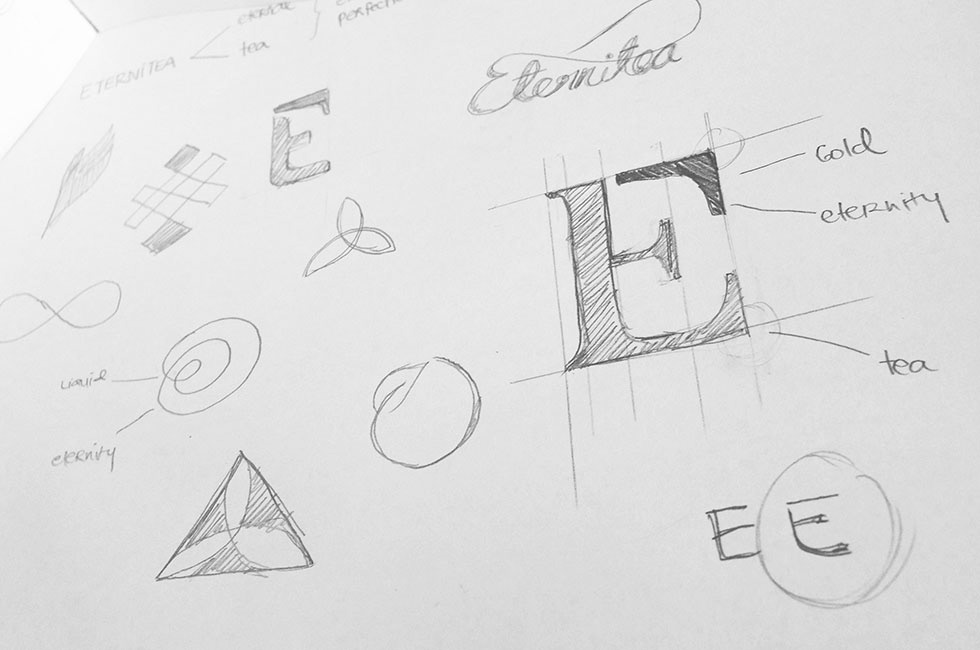


Logo Concept
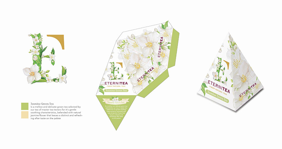
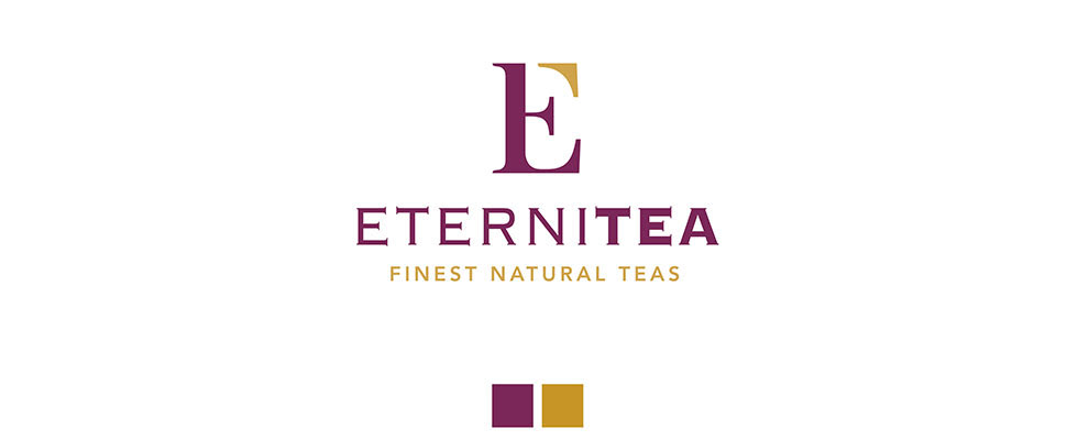
Eternitea = Eternal + Tea. Tea is always symbolized as a liquid of gold, that gives tranquility, warmth and freshness. Gold is a symbol of eternity and perfection, as it represents the quality and
exclusiveness of the product itself – an endless perfection.
The logo is symbolized the word Eternal and Tea by the form combined between letter ‘E’ and ‘t’.

A very adaptable logo
Every kind of tea has a different characteristic, defined by the way tea is made and consumed,
by the way people interact with tea, and by the aesthetics surrounding tea drinking.
by the way people interact with tea, and by the aesthetics surrounding tea drinking.
Therefore the letter ‘t’ in the logo which represent tea, is made to adapting to characteristic of each tea,
while a form which resembling the letter E is always the same and perennial.
while a form which resembling the letter E is always the same and perennial.

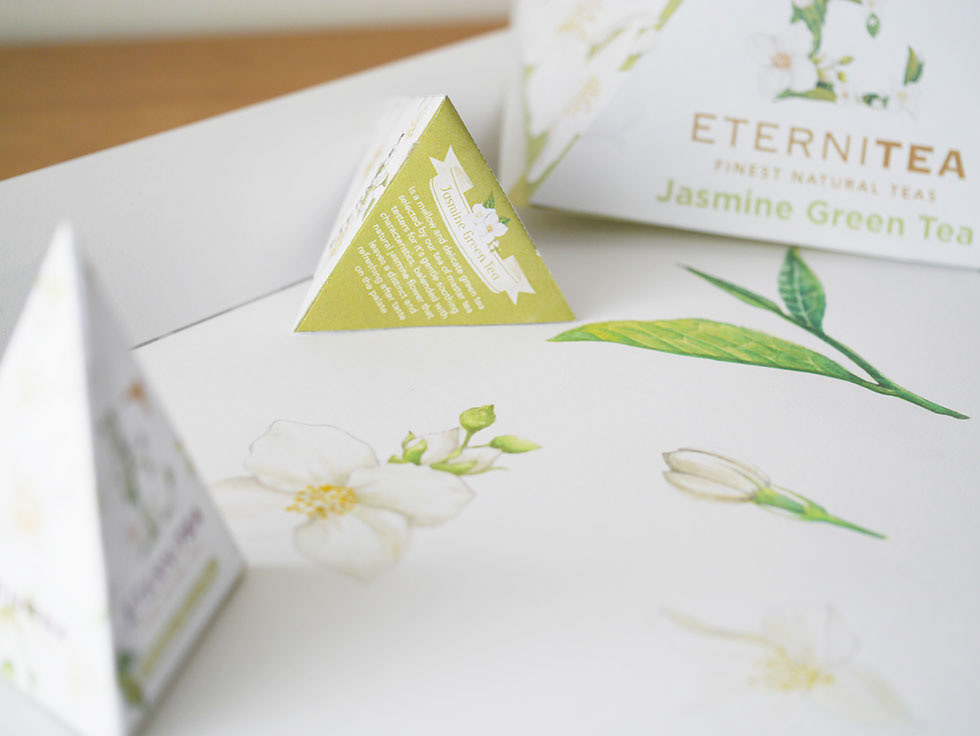
Packaging
The new brand identity, together with a clear positioning statement as a finest natural and exclusive tea product, has consolidated and strengthened Eternitea’s image, clearly distinguishing them from other brands