


Client
A network of beauty salons in Saudi Arabia called the Nail Lounge. The network provides premium services in the beauty industry. As part of updating the interiors of establishments, they decided to update the brand, which will correspond to the status of the service.
"High-level experience by getting the best service, high-quality materials & and atmosphere of the beauty salon. The Nail Lounge gives customers the experience of a place where they can be pampered"
— What the client writes about himself.
Task
Create a new brand name, logo, and identity for the brand. One of the main tasks is to complement the interior style for updated salons and the ability to scale the style to all the necessary media easily.


We were inspired by two main directions:
1 — fashion brands that form their identity thanks to text logos.
2 — aestethic design with light graphic elements.
Solution
We designed an elegant logo featuring a scalable letter o that can easily transform into a graceful oval, or an elongated element with rounded edges, reminiscent of the shapes present in the interior.


Brand Graphics and Scaling
Thanks to this visual approach, we were able to work out a series of patterns and elements that are easily scalable and create an unlimited number of possible variations in the implementation of the brand's visual style.
Realization
Soft shapes, rounded edges, and elongated forms are exactly what characterizes the brand's silhouettes in the interior, logo, and identity, and the shape of the carriers themselves, where possible, continues this philosophy.


Result
The result of this project was an updated brand with a new name and visual identity that works in tandem with the interior. In this way, we combined the client's impressions at all stages of interaction with the visual image of the brand.
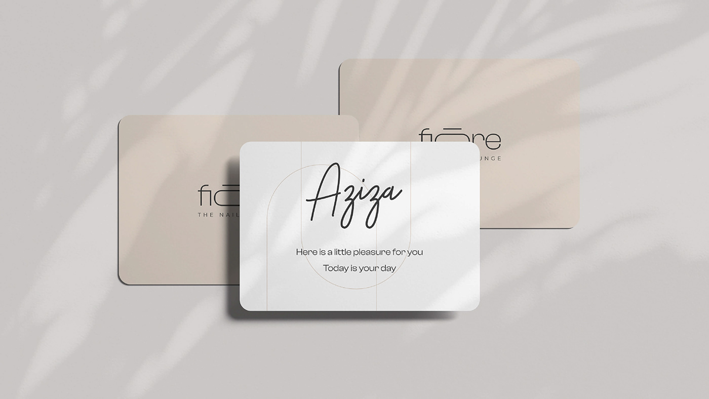
Fiōre — a new brand name.
Soft shapes, lightness, tenderness, and a special ritual of self-care - these are the emotions we convey through the updated brand name.
"Fiōre — it’s our customers, that need
to get the best service & experience
from The Nail Lounge"
to get the best service & experience
from The Nail Lounge"


