

Qicon Design
客戶 發票怪獸
設計 ujHsu
App Icon Design
重新設計發票怪獸的App Icon,我的思考點是什麼呢?
我想像是一個攝影師,要重新為Q摸拍大頭照,我的鏡頭應該離他多近或遠呢?用多少的焦焦距呢?什麼表情?我希望使用者能看到更簡單的形狀,強而有力造形深刻到使用者的腦中的符號(特徵是logo的重點)。我以這樣的思路重新取樣與設計。
What is my thinking point when redesigning the App Icon of the invoice monster? I think I'm a photographer. I want to take big head photos for Q Touch again. How close should my lens be to him? What's his expression?
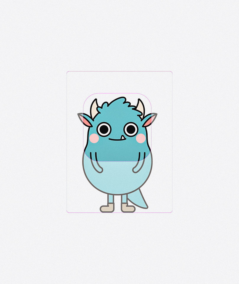
一個強而有力的符號,深深刻入使用者的腦中。我以這樣的思路重新設計這個 App Icon。
A powerful symbol deeply enters the user's mind. I redesigned this App Icon with this idea.

不同的季節與慶典,我想app icon能出現不同的點綴物,能充滿歡慶感,也不會太過花俏。
Different seasons and celebrations, I think App icon can have different embellishments, full of joy.


App 起始畫面設計
需要主要角色都能出現,想要除了可愛外,能添增設計感。
在這樣需求下,我想像用格子來呈現不同角色的特色與個性,然後他們能拼成一幅色彩豐富的作品。
The main need to appear in the picture. want the picture to be cute and add a sense of design. In this demand, I imagine using square grids to present the characteristics and personalities of different characters, and then they can put together a colorful work


Apple Watch 符號設計
這個設計需求,是要在watch上呈現出Q摸的頭像。所以需要符號化,在造形上與色彩上,我做了許多簡化的測試,然後不同的尺寸呈現,試著找出最好的圖形。
This design requirement is to present the avatar of Qmon on the watch. So it needs to be symbolized. In terms of shape and color, I have done a lot of simplified tests, and then presented in different sizes to try to find the best graphics.


以上是我做肖像類的平面設計思考點,分享之。
Thank you Qmonster.


