Embracing Motherhood: Unveiling the Radiant Identity of "Hera"
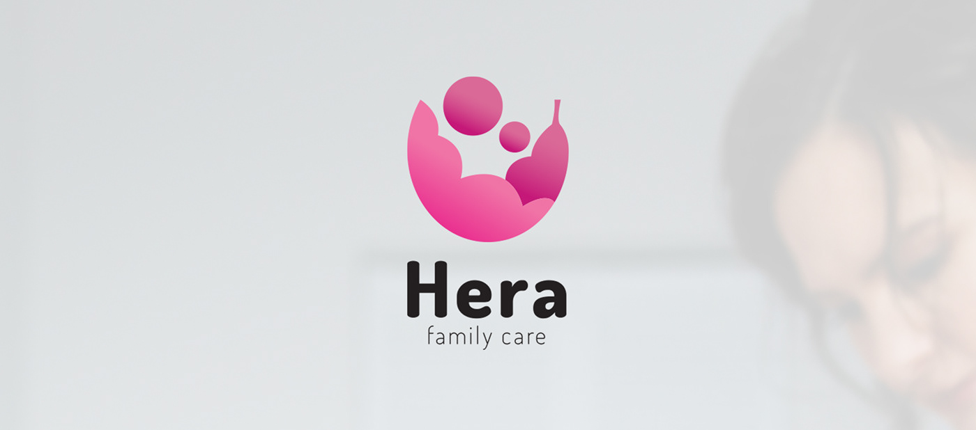
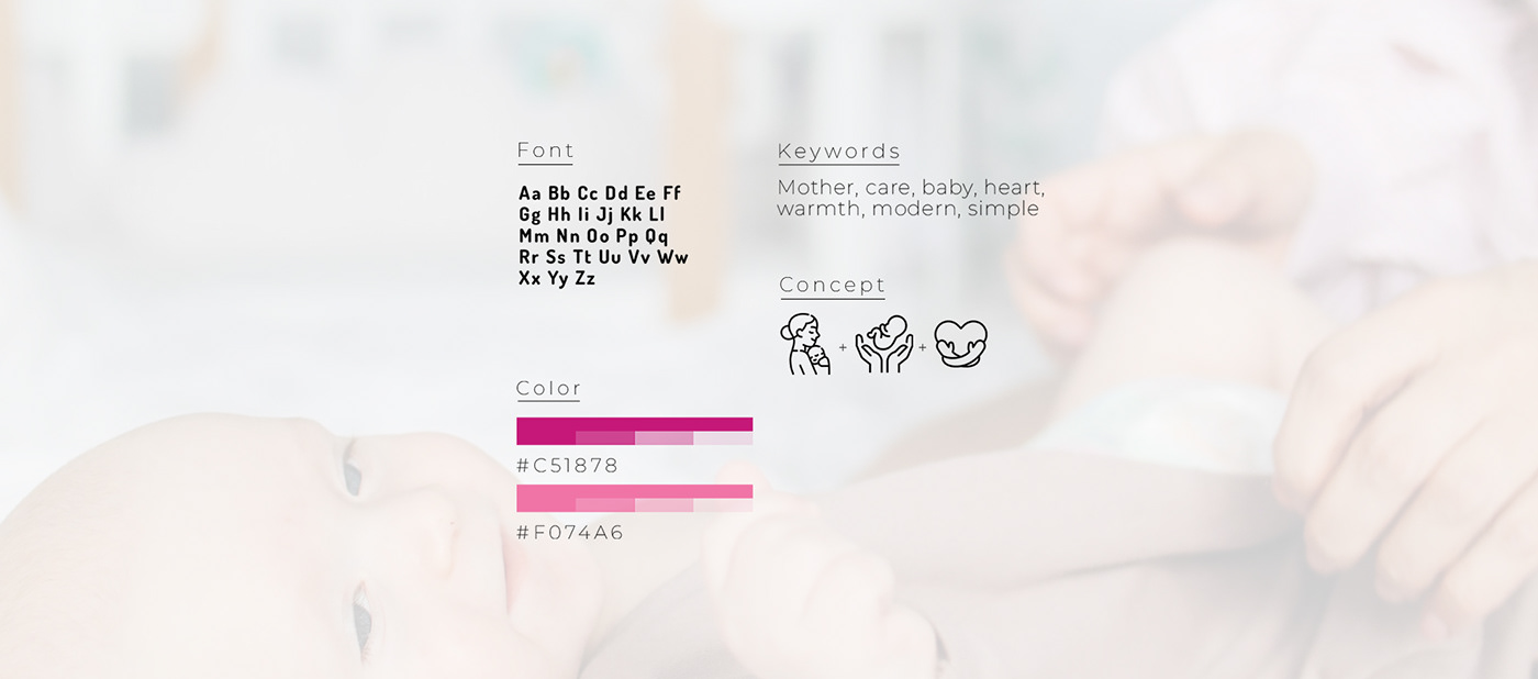
Thrilled to share the heartwarming journey of crafting the brand identity for "Hera" – a haven for expecting mothers, inspired by the nurturing essence of the Greek goddess herself. The gentle curves, soothing pink hues, and subtle gradients of the Hera logo echo the warmth and care that define this private midwife company. Every choice made was rooted in understanding the unique needs of "Hera" and the delicate nature of their services. From the softness in the logo to the nurturing gradients, the brand breathes life into the ethos of support and care, the intimate connection "Hera" fosters with mothers-to-be. From a visual standpoint, be it social media or print materials, it’s designed to evoke the same emotions of comfort and trust that clients can expect from their services.
A heartfelt thank you to "Hera" for allowing me to be a part of this beautiful journey. It's been an honor to translate the spirit of maternal care into a visual identity that reflects the grace and strength of every woman embracing motherhood. Here's to "Hera" becoming a beacon of support for expectant mothers, a brand that wraps them in warmth and guides them through the extraordinary voyage of bringing new life into the world.