


PROTOKOL
Logo and Visual Identity Design
Arad, Romania 2023
Protokol is the newest business venture of talented coffee connoisseur Filip Adrian and his team. After successfully opening Kaffeine as the first specialty coffee in Arad, Romania, after 2 years they now want to venture further and open a second shop on the same street that focuses on pastries and coffee.
Studio Maller was tasked with coming up with a name and visual identity that would stay close to the roots and foundation built by Kaffeine, but with a new and refreshed feel that allows it to have its own personality.
Studio Maller © 2023


Concept Breakdown
Logo Architecture & Design Language
The name originates from 2 greek words: Protos, the first, referencing the fact that they were the first to bring a specialty coffee shop the small town of Arad. Kolo, the social glue to create an amazing new community centred around quality food and coffee while creating a space designed for human interaction
Combined these two words form Protokol, an old form of spelling protocol, but which allows the brand to stand out due to its unique yet memorable name. The visual concept and logo were then developed by David Julean who used the well balanced font DX-Rigraf Semi Bold and modified the "K" letter to add an element that would contradict the stylistic direction created by the other shapes in the word mark.
The loop symbolises multiple elements present on a daily bassi at Protokol. From the rolled dough, to the a written line on one of their labels, to the neon lights in their interior design.
The secondary logo was created with the purpose of being used as a seal of approval for the quality and freshness with every item in Protokols' inventory. Inspired by Japanese food certification labels, we create the secondary logo lock-up to include producer symbol as well as a circle that can be used as a check box by staff. Our animator Raul Lile brought the secondary logo even further with this fluid yet mechanic animation. It can now be used in short form content featured on Protokols social media platforms.

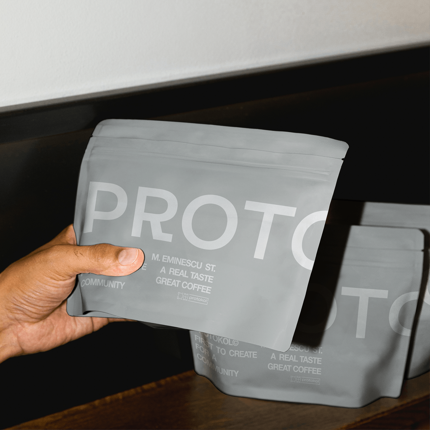
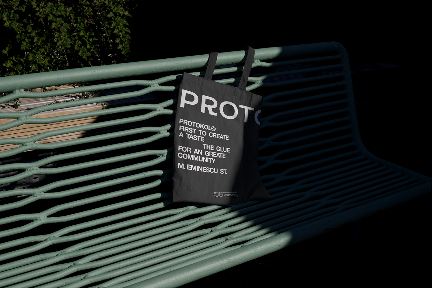
In order to creat a cohesive design language, we wanted to create brand assets by only using text blocks that include Protokols motto, call to actions or service details. These blocks are formed using the typeface Helvetica Neue with two to three words per row.

To allow for more variety in our packaging design concept, we decided to introduce a logo break on the letter "O", so that half of the logo would be on the frontside and half on the backside. This not only allows us to play with the characters in animations and assets but also make a customer turn the packaging around while following the letters of Protokol.
Interior Design
Mood-boards and Art Direction
As part of the this brand identity project Ioana Groza helped guide the visual direction and inspiration for the interior design. Following the minimal graphic aesthetic created for this brand, we wanted to build on the blend between rough materials, such as concrete slabs, with fine materials such as white tiles, shiny stainless steel surfaces and plexiglass details.
Evoked by the harsher and almost bureaucratic sounding name of Protokol, the overall feeling we wanted to give the interior space was one similar to a lab or specialised cooking space. Minimal and clean, yet hipper focused on details that work well together to give character and cohesion to this unique space.


Behind the Scenes
Work in Progress
The construction is set to be finished by the middle of 2024, but we can already see how our guidance has nicely shaped key elements in Protokols interior design. These two images form the real location in Arad to show to constant progress and to get us all excited.

Brand Elements
Print Design and Visual Identity
Protokol was our first brand where we set the goal of only using fonts and text blocks as visual assets. Below you can see examples of how we used these designs in print, packaging and social media. Usually we prefer a aesthetic balance formed by only using two to three fonts per branding, but for Protokol we decided to break this rule and use fonts that would work best with the medium it was used for.


Protokol marks the second time we work together with the very talented people at Kaffeine Arad and we would like to thank everyone involved, it was a blast!
Credits:
Logo & Brand Identity: David Julean
Motion Graphics & Art Direction: Raul Lile
Interior Design Consultancy: Ioana Groza


