Jacobs
Restaurant Rebrand
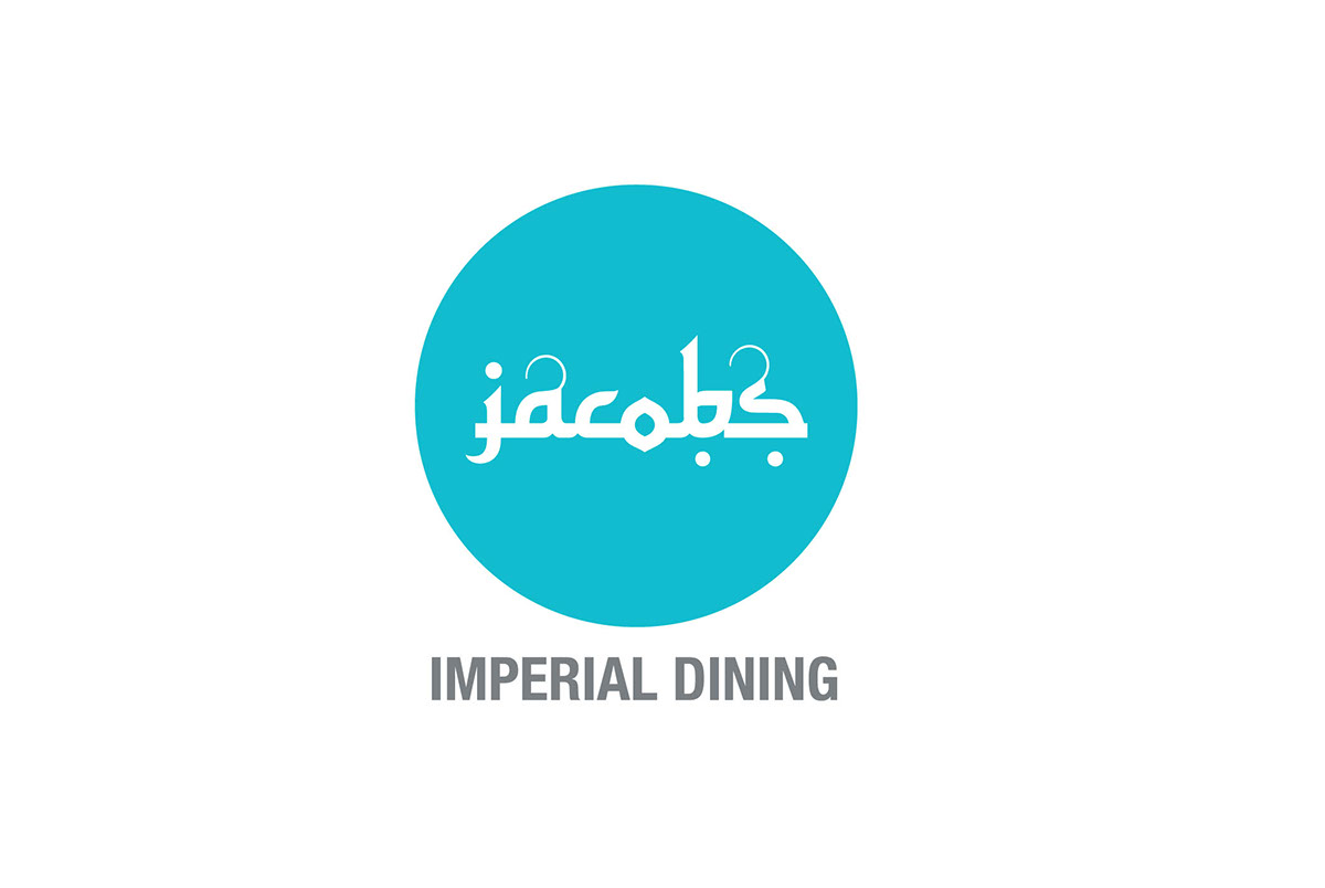
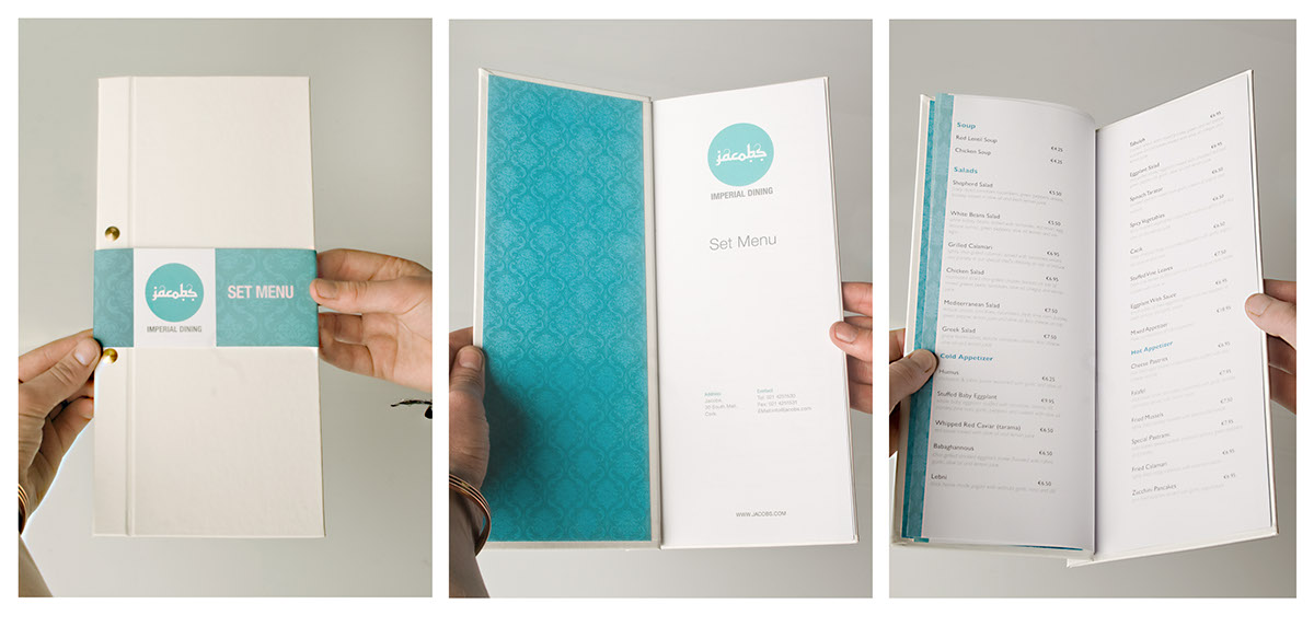
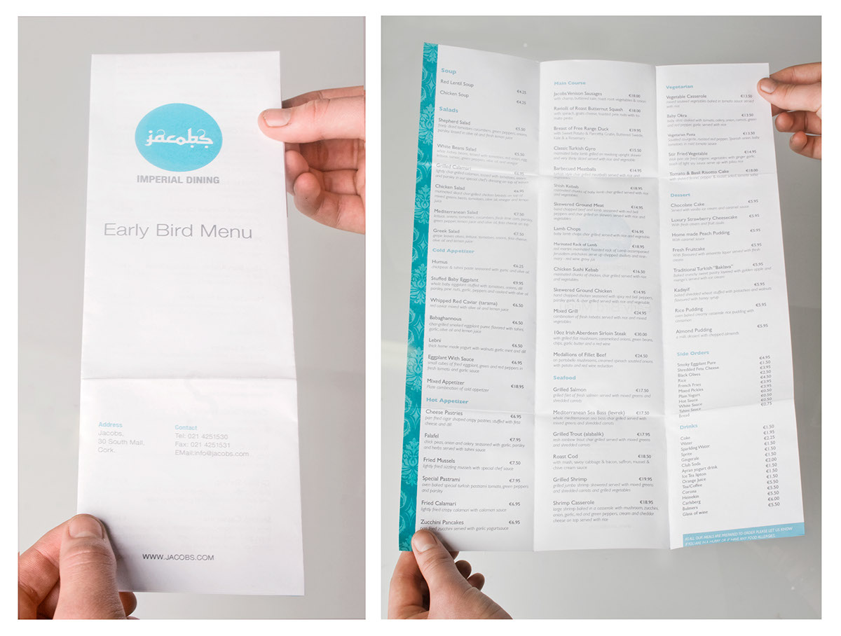
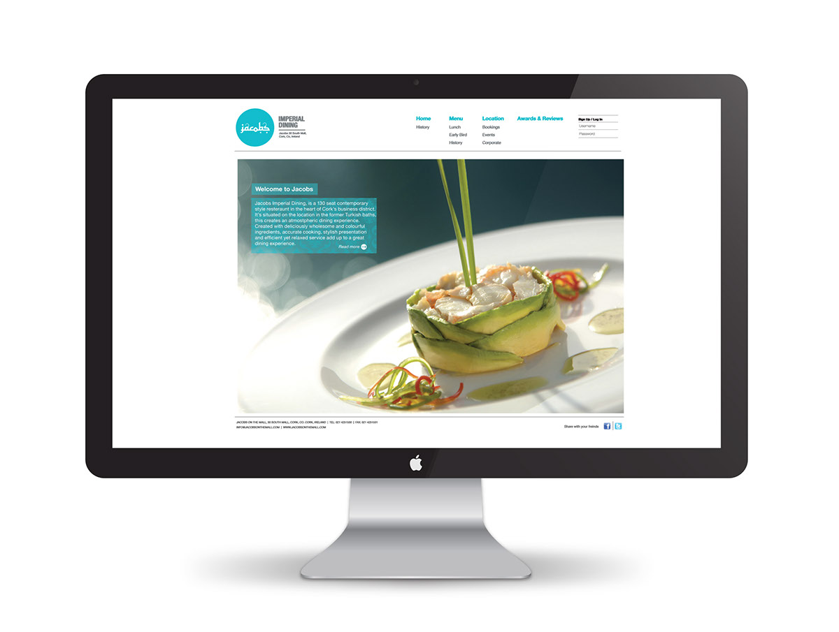
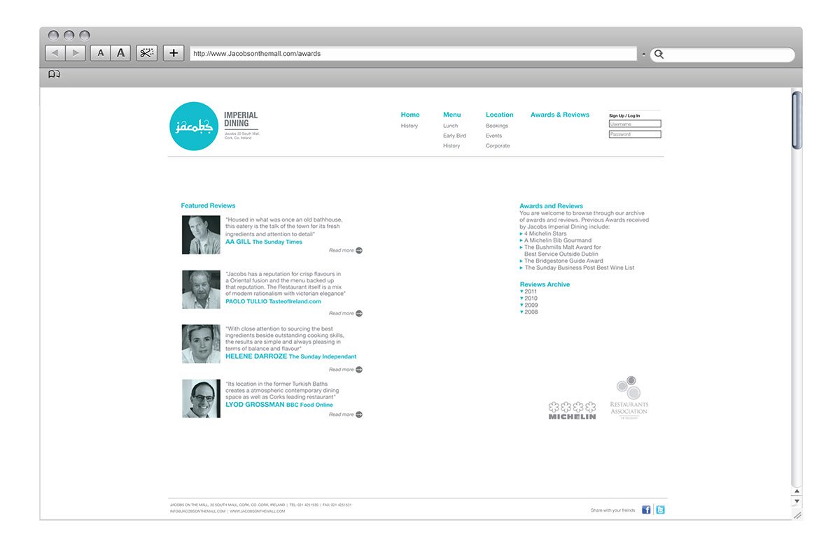
The main attribute of jacobs restaurant is its unique location. The buildings unique history of being a Turkish bath house is highlighted in its new identity. When considering the logo design I wanted to highlight the Arabic look and feel of the new restaurant design. The colour green was chosen for the logo because it is the colour of Islam and the circle is the center point of where Islamic patterns begin symbolising the role of Mecca.
The aim of this rebrand was to highlight the restaurants historical past giving the logo a Arabic look whilst keeping it both modern and contemporary.