What is needed
The design of a typeface can be approached from many angles with different tools and ingredients. Type is so versatile that every little ingredient influences its appearance. Whether you write words with a brush that translates a spontaneous feeling or whether one creates elegant strokes with a broad nib pen or whether you construct solid characters from geometric shapes, influences the way people perceive a text. It is therefore crucial to acknowledge these ingredients and their implications. This is the task of a type designer.

In-between
Designing Cabrio began with an experiment to combine geometric letterforms with the warmth of calligraphic elements. All of the characters follow predefined parameters and are constructed on a grid, while subtle humanistic elements are injected into them. A typeface should not look like a “Frankenstein”, stitched together from different pairs of arms, legs and ears (typographically speaking). Even when different ingredients are added, the result should remain homogenous and natural.

Finding the Balance
Some of the characters have specific stroke endings, particularly visible in a and e. These brush elements lend a certain warmth to the constructed framework. Finding just the appropriate amount of a humanist feel before the face turns casual did pose a certain challenge. The overall tonality was to remain serious and professional — something that is perhaps not achieved when all the terminals have brush-like endings. The solution turned out to be an interesting mix of pointed brush endings for a, e or t as well as vertical stroke endings as can be seen in C, G or s. In addition to these features, the architecture of several letters has a strong impact on the overall appearance: a diagonal cross-bar in e or a slightly crossed w. Design decisions like these as well as many others lend Cabrio a warm voice.

Putting it to work
A lot of attention and care has been placed on the legibility of Cabrio: a typeface that can be successfully used in the development of corporate identities should work for all lengths of text across all sizes. The rhythm of character widths is a crucial factor to be carefully observed in trials of several cycles on screen as well as in print. Of course bolder weights should make a strong impression in headlines and logos. Legibility at smaller sizes is increased by opening up rounded shapes vertically, as has been done in C and G. This also lends them a certain dynamic.
More generally speaking, a purely constructed anatomy does not make a great typeface for reading, because geometric letters tend to be based on basic shapes that result in an overall wide appearance. In relation to each of the different weights, we paid careful attention to the overall character width: while lighter weights are slightly narrower than a full (mathematical) circle and therefore slightly more space-saving, bolder weights are slightly wider — the O is indeed very close to a mathematical circle. Bolder weights tend to be used in larger sizes more often, which is where the geometric appearance really shows. All of these decisions result in a multi talent with legibility preferences in the lighter weights as well as a strong character in bold display applications.

Lively Italics
Given the origin of italic letterforms and based on the concept of Cabrio, it made a lot of sense to push its italics one step further into a humanist direction. The main feature of these italics are pointed brush terminals on some prominent characters such as m, n or h. In keeping with conventional italic shapes, we have equipped Cabrio italics with a one-storey a and a two-storey g. These tweaks result in a lively italic that lends a unique voice to emphasised words in any text.

Black, ExtraBlack, Poster
The first sketches of Cabrio contained weights ranging from Light to Black. When testing this scope in trial layouts, it was clear that this family would easily endure a super-strong-heavy-weight. Special challenges arise with such extreme weights, because they require specific considerations that are not systematic. Typically, any design decision made within a type family has an impact on the entire visual system: several weights may be created in one phase to see if an approach works across the family. However, some decisions may not work out in extreme weights, i.e. considering bold stems in a limited space. For this reason we designed the “Poster” weight: a family member that is unique enough to stand on its own. One of the main differences in the Poster weight is the dot of the lowercase i: its unusual shape does not get in the way with tight line spacing.
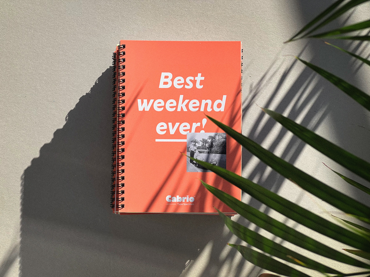
Putting a typeface to use brings it to life
Only when type is in use it really starts to live. Cabrio™ is meant for a wide audience and ought to work in all kinds of user interfaces (print and digital). Its contemporary look is present in its visual expression, in its scope and its overall performance.