


Brand:
Nexustruct
Nexustruct
Task:
Comprehensive brand identity development for Nexustruct, an innovative construction company, with the aim of reshaping its image and impact. This project focused on visually encapsulating Nexustruct's commitment to innovation and excellence.
Comprehensive brand identity development for Nexustruct, an innovative construction company, with the aim of reshaping its image and impact. This project focused on visually encapsulating Nexustruct's commitment to innovation and excellence.
Analysis:
Our journey began with a thorough analysis of the construction industry, where I delved into studying competitors, market trends, and Nexustruct's evolving target audience. The research revealed a landscape filled with conventional and uninspiring brand identities in the construction sector. Simultaneously, Nexustruct's audience was undergoing a transformation, seeking a more modern and dynamic construction experience.
Our journey began with a thorough analysis of the construction industry, where I delved into studying competitors, market trends, and Nexustruct's evolving target audience. The research revealed a landscape filled with conventional and uninspiring brand identities in the construction sector. Simultaneously, Nexustruct's audience was undergoing a transformation, seeking a more modern and dynamic construction experience.
Бренд:
Nexustruct
Задача:
Создание комплексного фирменного стиля для инновационной строительной компании Nexustruct с целью изменения ее имиджа и влияния. Проект был нацелен на визуальное воплощение стремления Nexustruct к инновациям и совершенству.
Nexustruct
Задача:
Создание комплексного фирменного стиля для инновационной строительной компании Nexustruct с целью изменения ее имиджа и влияния. Проект был нацелен на визуальное воплощение стремления Nexustruct к инновациям и совершенству.
Анализ:
Наш путь начался с тщательного анализа строительной отрасли, в ходе которого я изучил конкурентов, тенденции рынка и меняющуюся целевую аудиторию Nexustruct. Исследование показало, что в строительном секторе существует множество традиционных и неинтересных брендов. Одновременно с этим аудитория Nexustruct претерпевала изменения, стремясь к более современному и динамичному опыту строительства.


Decision:
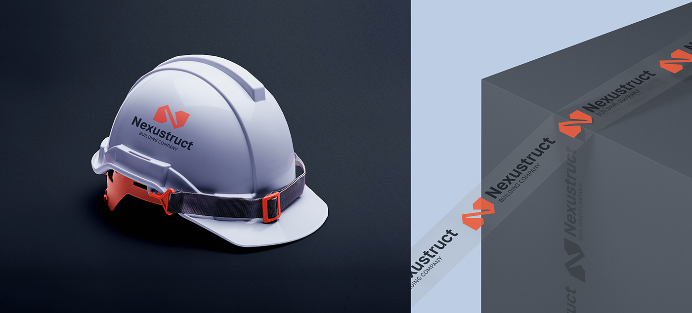
The use of orange (symbolizing innovation, dynamism and enthusiasm) was important to the company, despite the many brands using it. Nevertheless, its combination with sky gray (a symbol of aspiring skyscrapers) helped to set it apart from its competitors. The dark gray hues lend a sense of reliability.
The inclusion of isometric coordinate lines played a key role in the design. These lines not only convey the precision and structure inherent in construction, but also give the brand a dynamic and three-dimensional feel, reflecting Nexustruct's modernity and forward-thinking nature.
A minimalist sign in the form of construction modules/blocks/buildings connected in the initial letter N.
The modern grotesque Golos emphasizes the overall style. A detailed version of this font is used in the text part of the logo
The modern grotesque Golos emphasizes the overall style. A detailed version of this font is used in the text part of the logo
Решение:
Для компании важно было использование оранжевого цвета (символизируя инновации, динамизм и энтузиазм), несмотря на обилие брендов, использующих его. Тем не менее его сочетание с небесно-серым (символ стремящихся ввысь небоскребов) позволило отстроить его от конкурентов. Темно серые оттенки придают ощущение надежности.
Включение изометрических координатных линий сыграло ключевую роль в дизайне. Эти линии не только передают точность и структуру, присущую строительству, но и придают бренду динамичность и трехмерность, отражая современность и дальновидность Nexustruct.
Минималистичный знак в виде строительных модулей/блоков/зданий, соединенных в начальной букве N.
Современный гротеск Golos подчеркивает общую стилистику. Детально доработанный вариант этого шрифта использован в текстовой части логотипа
Современный гротеск Golos подчеркивает общую стилистику. Детально доработанный вариант этого шрифта использован в текстовой части логотипа


The Result:
The culmination of our efforts was a complete transformation of Nexustruct's visual identity.
The culmination of our efforts was a complete transformation of Nexustruct's visual identity.
The brand identity positioned Nexustruct as a symbol of innovation and progress in the construction industry, distinguishing it from competitors with outdated identities. It not only resonated with the evolving expectations of its audience but also reinforced its commitment to modernity and quality in the sector.
Результат:
Кульминацией наших усилий стала полная трансформация визуальной идентичности Nexustruct.
Кульминацией наших усилий стала полная трансформация визуальной идентичности Nexustruct.
Фирменный стиль позволил позиционировать Nexustruct как символ инноваций и прогресса в строительной отрасли, выгодно отличающий компанию от конкурентов с устаревшей символикой. Это не только соответствовало меняющимся ожиданиям аудитории, но и усиливало приверженность компании современности и качеству в данном секторе.

The order of cooperation with me:
1. Getting to know and discussing the project and terms of cooperation.
2. Filling in the brief, which helps to understand the project more deeply.
3. Making 50% prepayment and concluding the contract.
4. Compiling a mindmap and moodboard, analyzing competitors and target audience
5. Development and presentation of logo/ corporate identity concept.
6. Making necessary revisions in accordance with the client's wishes.
7. Approval of corporate identity including color palette, accompanying font, graphic elements and pattern.
8. Payment of the remaining amount
9. Preparation and transfer to the client of all necessary files, including sources and layouts for the internet and printing
Порядок сотрудничества со мной:
1. Знакомство и обсуждение проекта и условий сотрудничества.
2. Заполнение брифа, который помогает более глубоко понять проект.
3. Внесение 50% предоплаты и заключение договора.
4. Составление майндмэпа и мудборда, анализ конкурентов и целевой аудитории
5. Разработка и презентация концепции логотипа/фирменного стиля.
6. Внесение необходимых правок в соответствии с пожеланиями клиента.
7. Утверждение фирменного стиля, включая цветовую палитру, сопровождающий шрифт, графические элементы и паттерн.
8. Оплата оставшейся суммы
9. Подготовка и передача клиенту всех необходимых файлов, включая исходники и макеты для интернета и печати


