


Art Goes Kapakka city festival takes place in numerous bars, cafes, and restaurants throughout Helsinki. (The word 'Kapakka' is Finnish and means a bar/restaurant.) The festival has brought high-quality art to Helsinki's August evenings since 1995 and is one of the longest-running festivals in the city. The festival annually showcases current top Finnish artists, new talents and performers, diverse tastes, and the most engaging discussions, not forgetting the legendary Choir Tour.
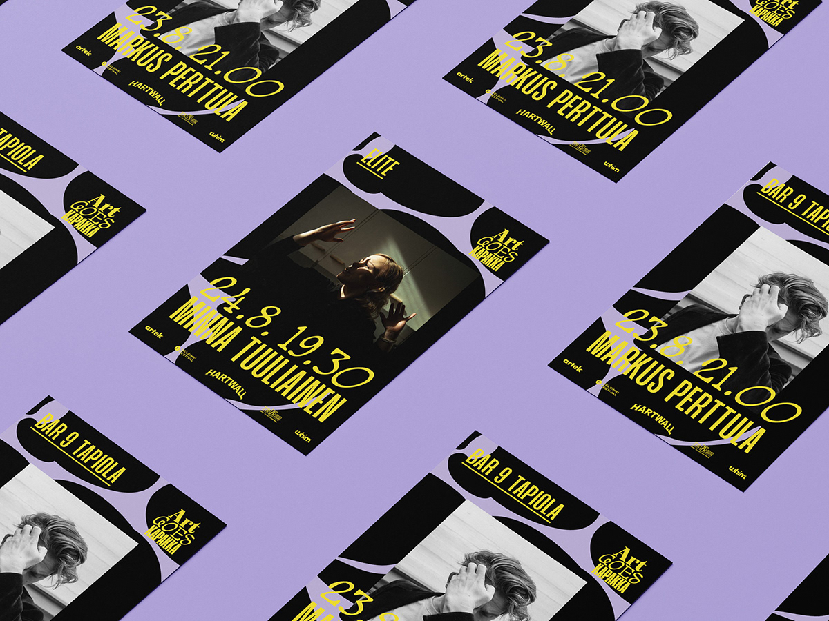
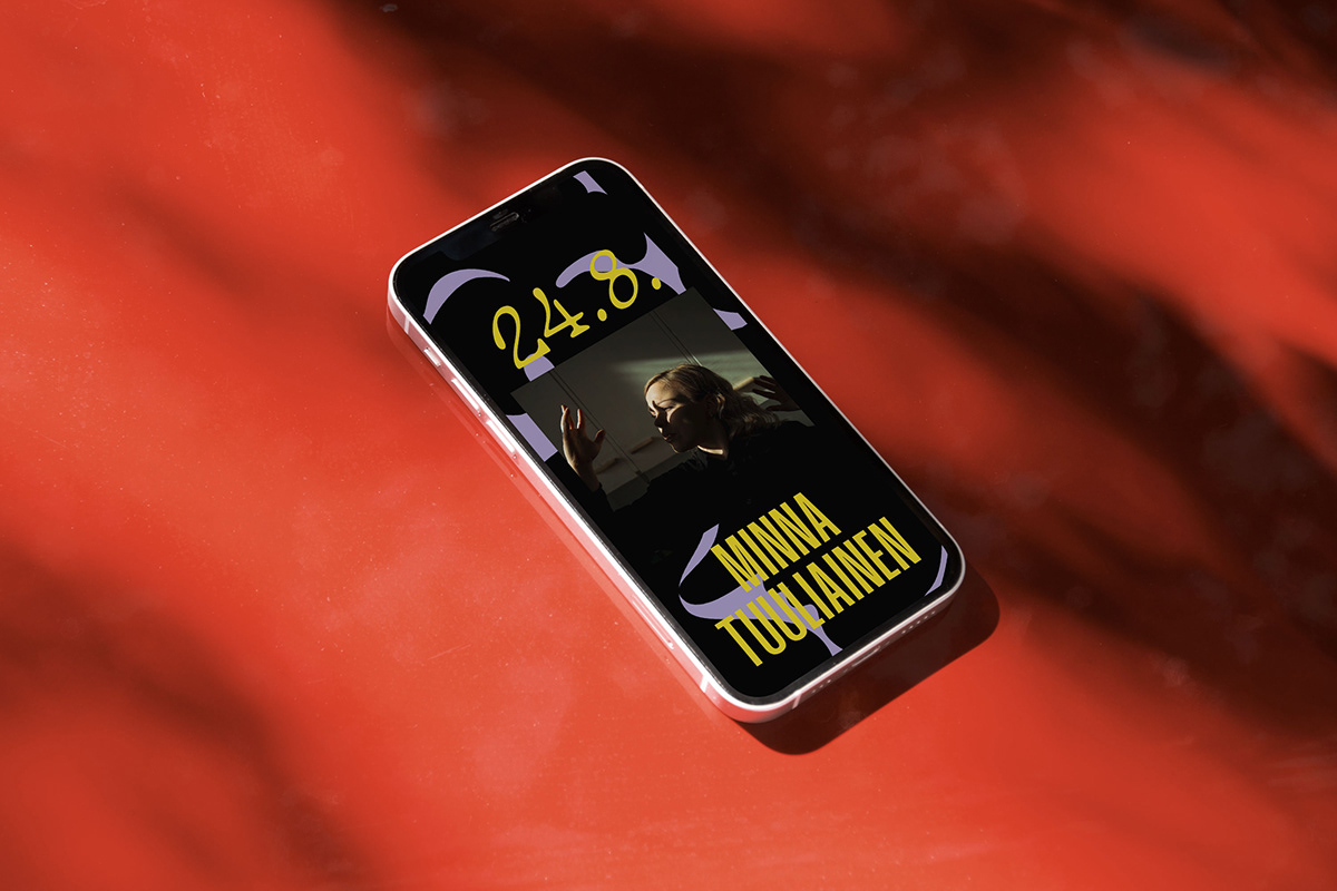
The festival wanted to update its visual identity to be more modern, fresh, and appealing to better engage with its audience, and that could easily be adapted for different communication and marketing needs.
With this in mind, we designed a visual identity that is essentially based on repeating the logo and typography used in it. We created a rich and playful logo that reflects the festival's diverse and interdisciplinary nature. The logo plays with three different fonts. From that selection, the unique and soft Tagada is used for numbers (such as dates and times), and the super-condensed Mango Grotesque is alongside it for headings. The visual identity introduces new colors each year to differentiate each festival. The graphic pattern in the background is also an element that can live and develop every year.


