The Pea
Brand identity developed for 'The Pea', a healthy, pea-based snack, developed by scientists at the John Innes Centre, Norwich.
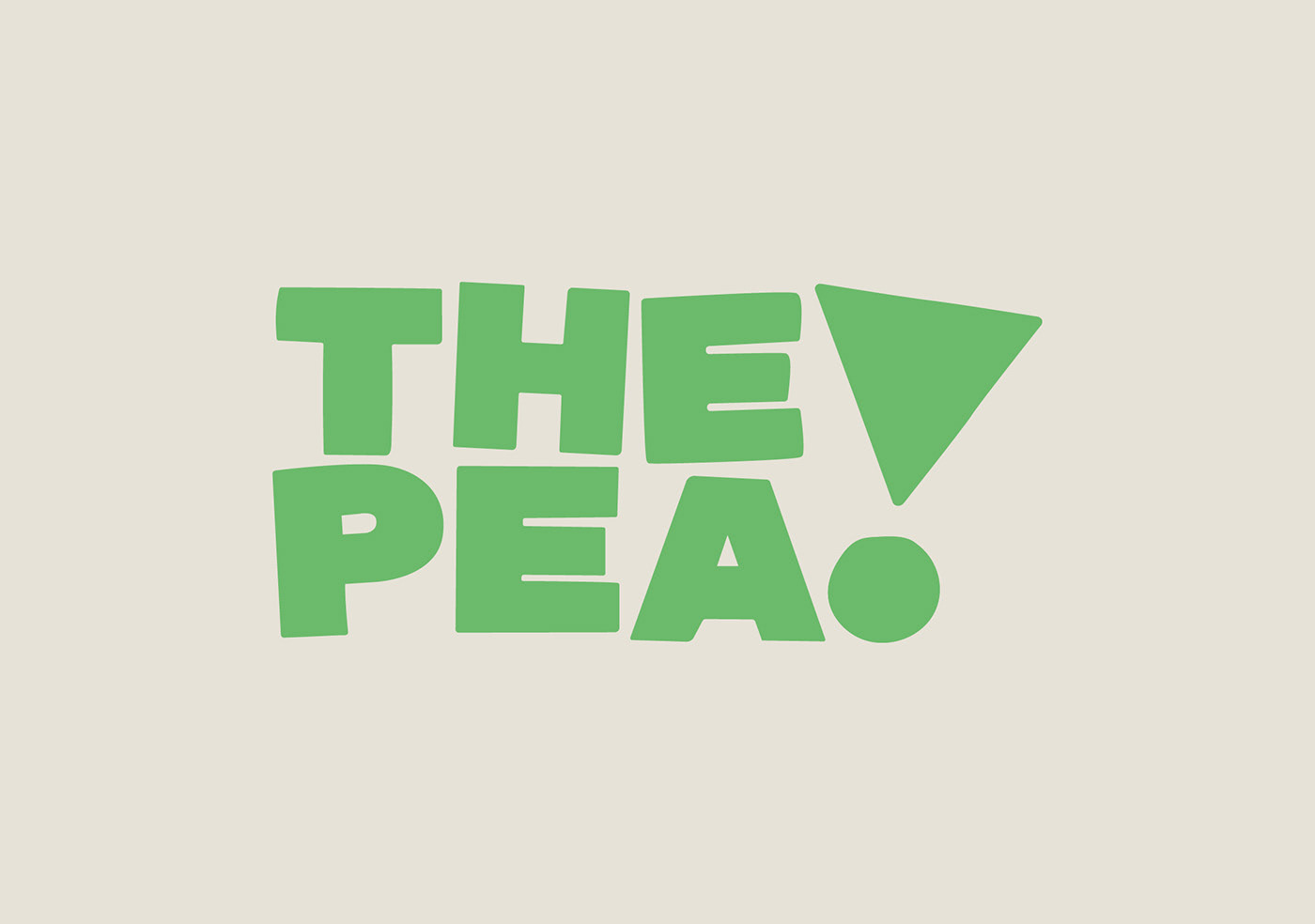
The identity builds on the bold statement set out by the brand name, that of being 'The Pea’, which is backed-up by the impressive science and unique health benefits of the product. To further elevate this, an exclamation mark was crafted to sit alongside the wordmark, to not only add emphasis, also acting as a downward arrow, helping draw attention to the real star of the show, the specific type of wrinkly pea used within the snack, referenced through the point of the exclamation mark. The downward arrow also references the fact that consumption of this particular type of pea can help consumers lower their glycaemic index (blood sugar levels), as it contains a high level of amylose starch which can help to prevent, manage and potentially even reverse type 2 diabetes.
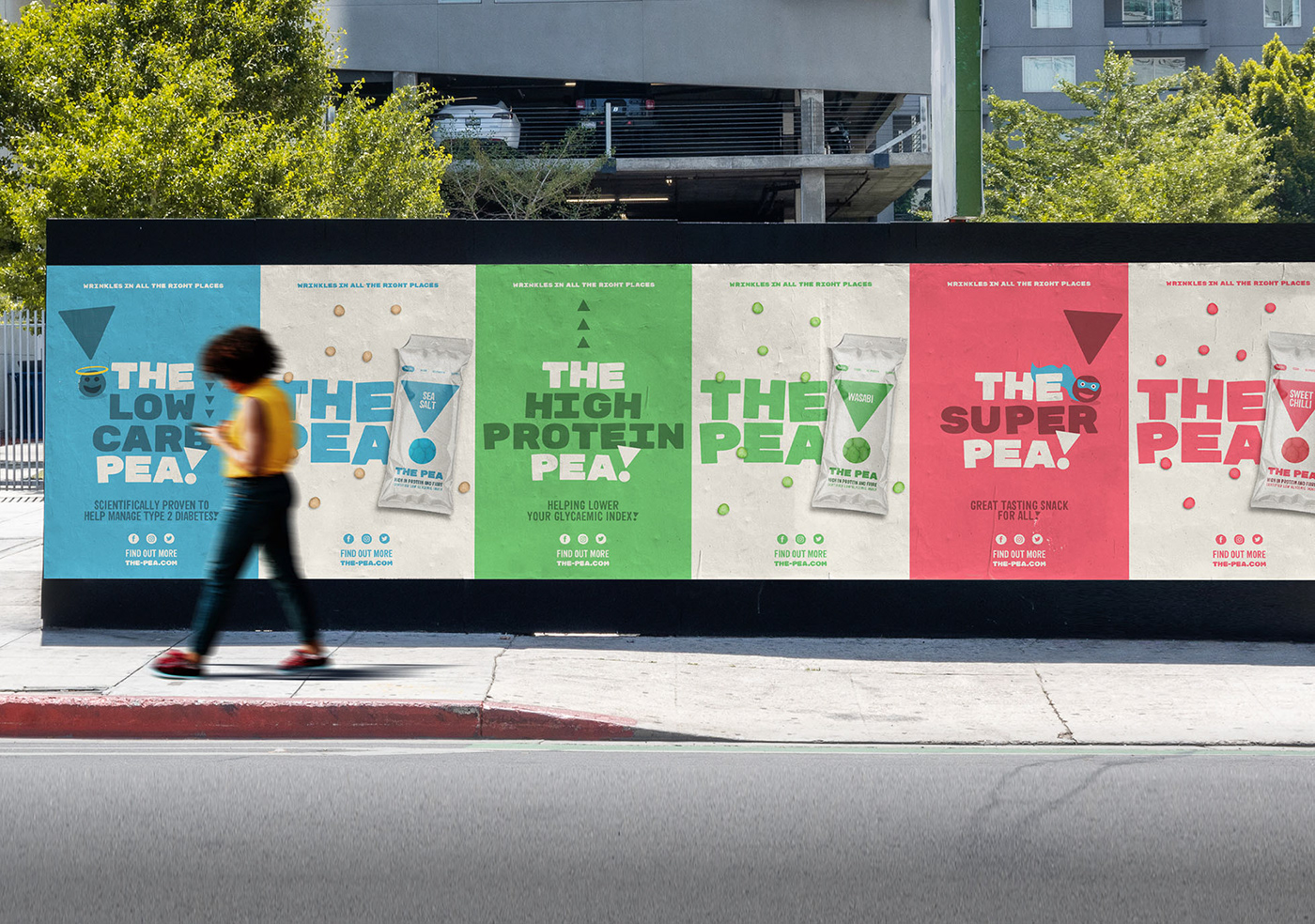
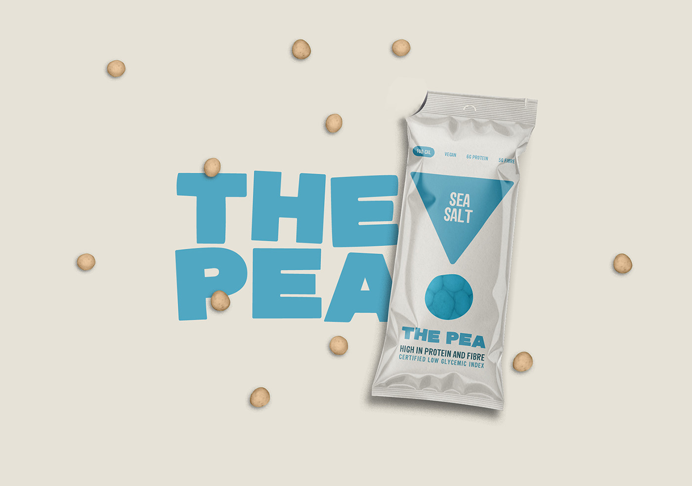
Product packaging features bold application of the brand (exclamation) mark, providing a dynamic yet flexible design system, allowing the product to introduce additional flavours over time, whilst retaining a consistent aesthetic and on shelf presence.
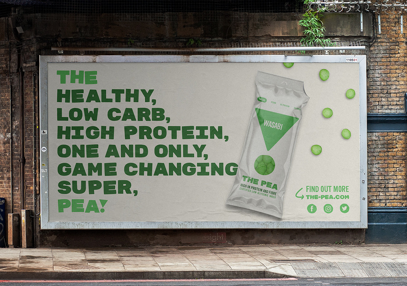
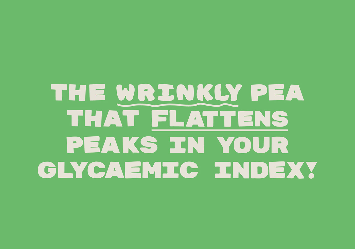
A number of assets have been developed to allow the brand to communicate it's unique benefits across various touchpoints. This includes the use of the brand name as a storytelling device in which to book end copy. This is implemented with a fun approach to the brands tone of voice, carrried across all applications, helping balance some of the more serious science behind the product. Additional outcomes of the project also feature a customised typeface, including a variable weight, allowing the user full control over the amount of wrinkles implemented.
A number of assets have been developed to allow the brand to communicate it's unique benefits across various touchpoints. This includes the use of the brand name as a storytelling device in which to book end copy. This is implemented with a fun approach to the brands tone of voice, carrried across all applications, helping balance some of the more serious science behind the product. Additional outcomes of the project also feature a customised typeface, including a variable weight, allowing the user full control over the amount of wrinkles implemented.