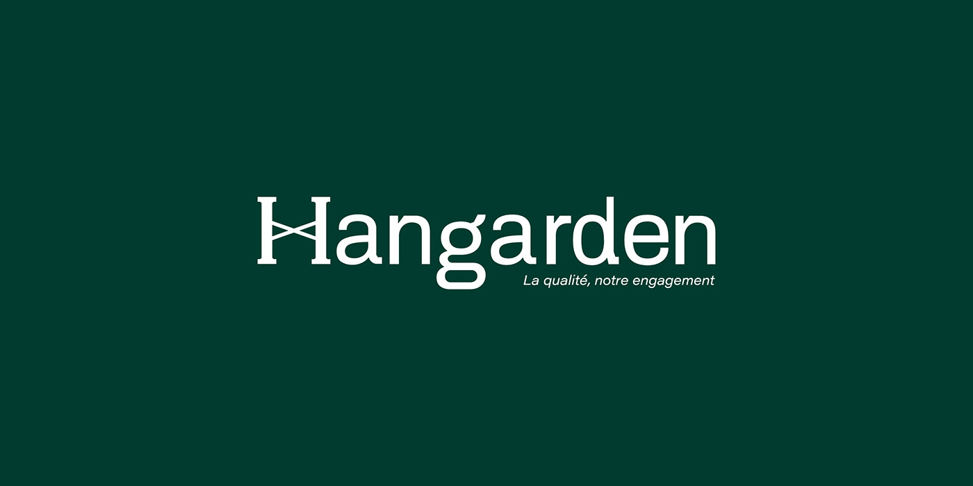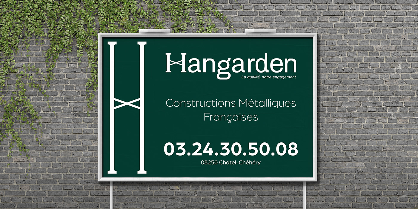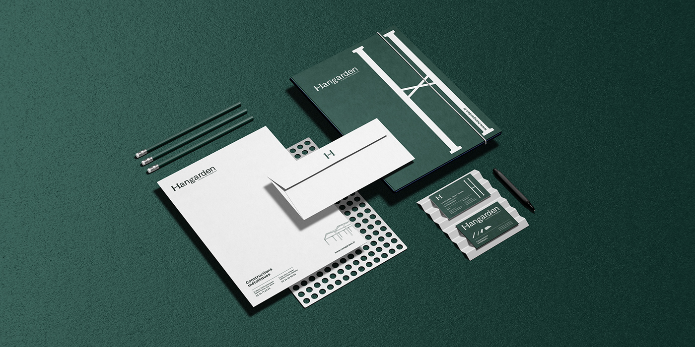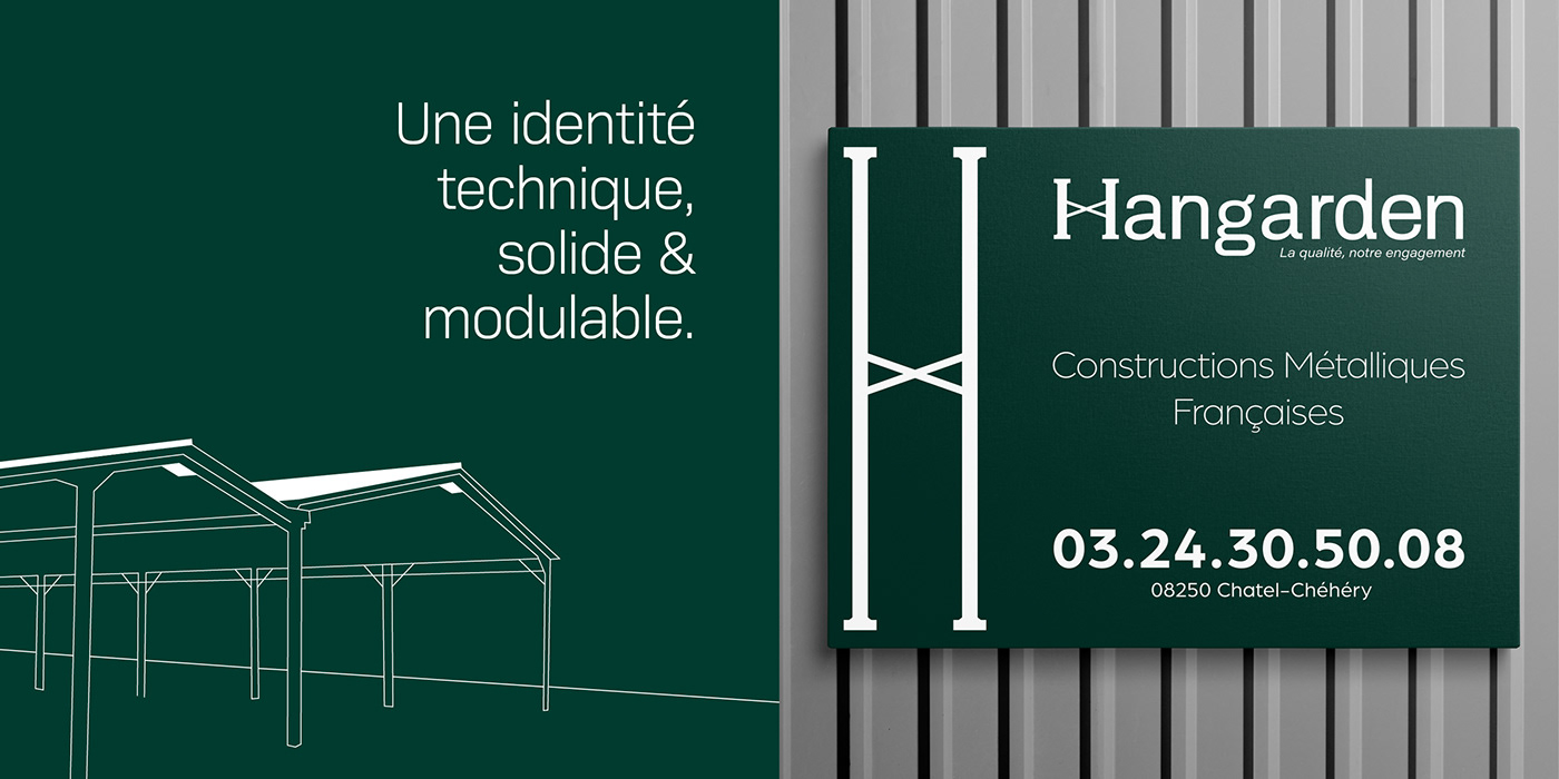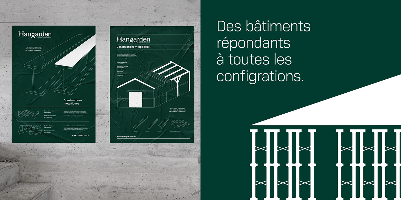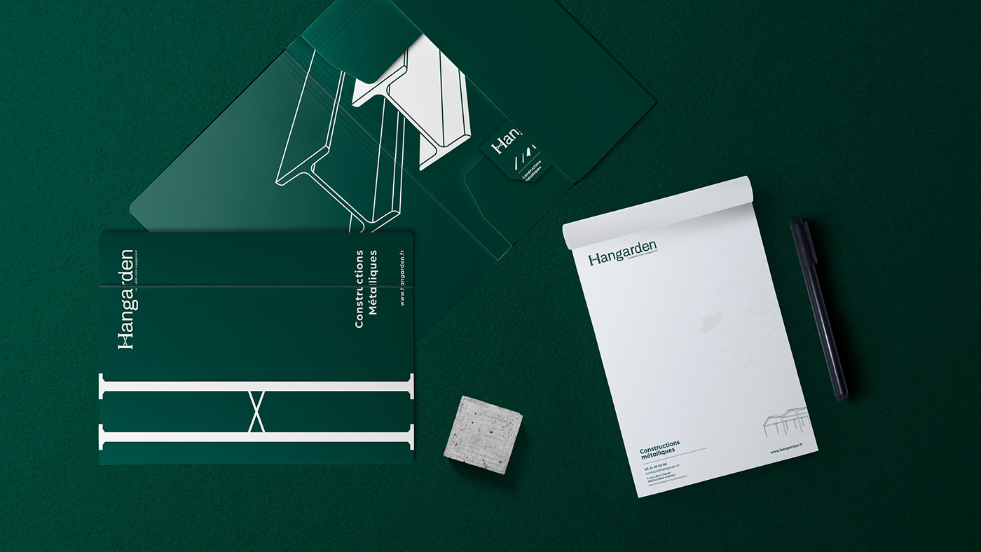
La structure comme essence de l’identité Hangarden
Hangarden construit des structures sur-mesure, nous avons choisi un language modulaire exprimant au maximum ce concept. Le logotype a été dessiné de façon à ce que le « H » personnifie la structure. Celui-ci représente la marque, et s’adapte à l’espace qui lui est demandé.
The Structure as the Essence of Hangarden's Identity
Hangarden specializes in custom structures, and we have chosen a modular language to fully express this concept. The logo has been designed in such a way that the "H" personifies the structure. It represents the brand and adapts to the space it is given.