


Insight Institute is a nonprofit organization that uses art-based programs and workshops to foster critical thinking and creative problem solving, specifically in the field of medicine. The program teaches participants how to gain insight by casting off habits and assumptions by improving attentiveness to visual clues, leading participants to examine and compare different perspectives and combining these pieces to achieve deeper understanding. This training measurably improves the likelihood of positive results and compassionate medical care.
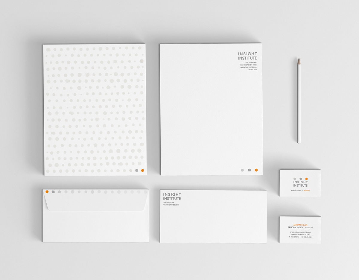
The design subtly communicates transformation, with an orange dot signifying the insight that the program trains participants to discover. Color psychologists associate orange with vitality, analysis and revelation, all very topical to the results this organization provides. While the progression of color communicates the process leading to the aha moment, the actual shapes illustrate the method by transforming from a messy paint drop to a round, solid circle. The typography is modern and authoritative, balancing out the “artistic” elements with the seriousness required in medical institutions.


Work done through Stokefire Branding & Advertising.


