Englishmen Vom Ritchie (drummer of German punk icons Die Toten Hosen) and Dick York’s early-’80s ‘pop-punk’ band Cry Dyann was recently reborn in Düsseldorf, Germany under the name Cryssis.
Embracing the implicit contradiction in the term ‘pop-punk’, I pitched an identity that is unmistakably punk yet unmistakably modern, rooted in both German formalism and English dissent.
t h e t y p o g r a p h y
The letterforms are based on 19th-century English sans-serif typefaces, a rebellious movement in typography away from the traditional serif forms of centuries past.
Initially rejected by the establishment, these amputated typefaces were branded ‘Grotesque’ in both England and Germany:

The logo itself is a visual metaphor for punk’s critique of the establishment.
It constructs a closed, geometric system and then disrupts it, the letters conforming before becoming disordered by the system’s destruction.
t h e s y s t e m
The system is constructed, piece by piece, with each geometric element wholly dependent upon the last. It is ordered and logical.
This is the establishment.

The pentagram, punk’s long-standing emblem, is established early: the inevitability of rebellion within a closed system serving as its very foundation.

t h e a r r a n g e m e n t
The letters conform to the system, thereby determining their status and relative importance within the establishment.
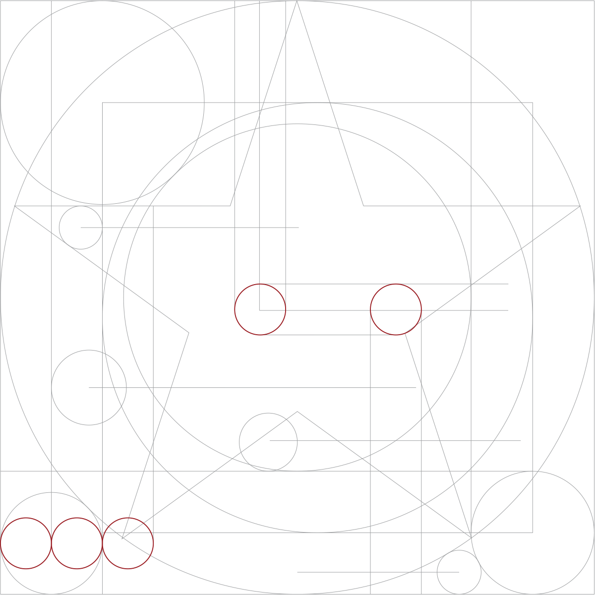

t h e d i s r u p t i o n
The pentagram, punk’s ambassador, introduces disorder to the law-abiding system.
Letters dislodge and break free of the establishment’s restraints.
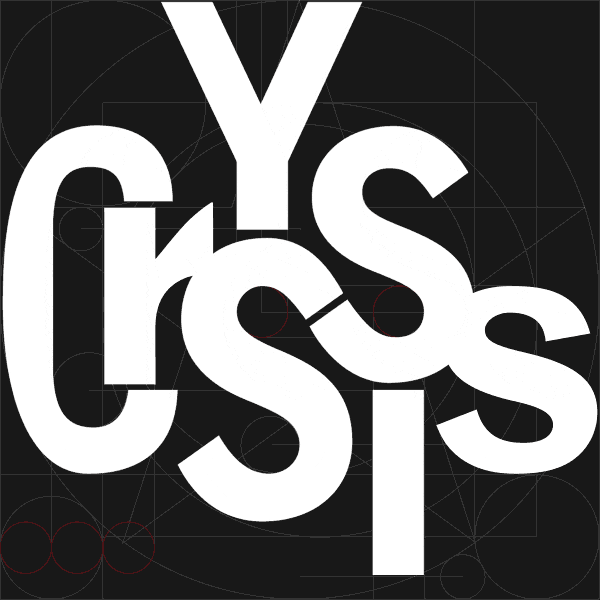
t h e r e s u l t

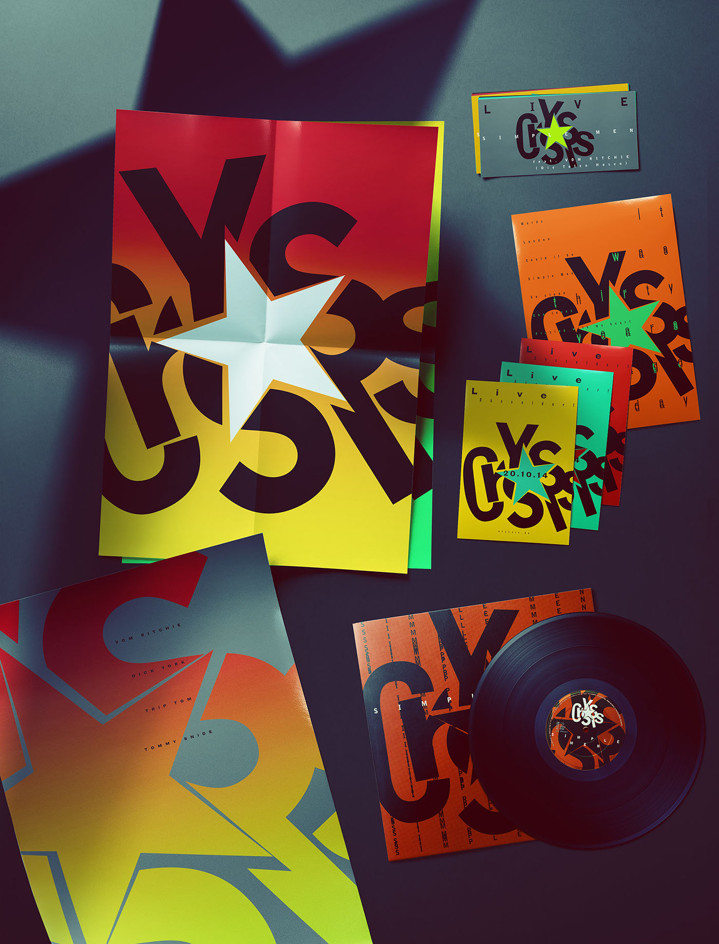
t h e c o l o u r s
Beyond black, no standardised spot or process colours are used. Colours are well out of gamut, colour inconsistency across various media a welcome phenomenon.
The colours are ostentatious and intractable. They are punk. Yet they are constrained by the norms of their respective media. They are pop.

t h e a p p l i c a t i o n s


Concept & Design
C a r l G e r a r d E l k i n s
Unfortunately, the band chose to go a more traditional route.

