


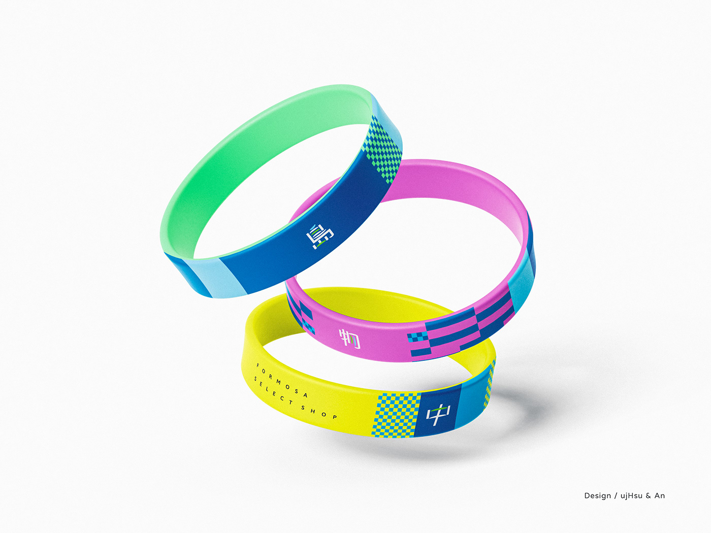
2022 文博 島中選物 主視覺
客戶 七二設計
設計 ujHsu, 八重藍鹿
更新計劃
接受七二設計創意總監Macaca邀約,進行2022年台灣文博會主題「島中選物」的LOGO更新計劃與主視覺設計。畫畫與設計不同。以畫畫的觀點做平面設計,有時會加入太多具象物使設計變太過複雜,中間的取捨需要研究與測試 ,這是LOGO更新設計案的困難點。試著解構原始設計,於網格重新組合文字,解決過於擁擠,大小例不一等問題,最後加入原設計的半圓形半島符碼,色彩上保留「群島共振」的主視覺配色,最初希望加上膚色系,補完這個色彩計劃中的遺漏,人味。共提供兩個版本設計做討論,希望新的logo設計能更清楚傳達原本的設計理念,並符合設計原則。
Painting is different from design. Graphic design from the perspective of painting, sometimes adding too many objects makes the design too complicated. Try to deconstruct the original design work, recombine the text in the grid, and solve the problem of excessive congestion and different sizes. Finally, add the semi-circular peninsula code of the original design, and retain the color matching of the original design. I hope that the new logo design can convey the original design concept more clearly and conform to the design principles.


主視覺提案 -
我們想像旅行箱是一個窗,是一個空港,是一個月台,想像著出境的心情。我們也幻想著行李輸送枱上的旋轉生活。最後的決定是一種幾何的島嶼。
Main visual proposal -
We imagine that the suitcase is filled with islands one by one, symbolizing whether to take an adventure or not. In fact, the decision is in your heart, not the environment.


我們玩了很多,在RGB,CMYK之間,然後我們做了決定,規範了使用的延伸圖案。
We have developed guidelines for the use of designs, including extended patterns that can be used.


see you.


