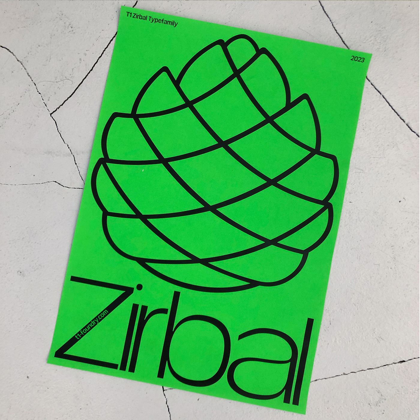
T1 Zirbal Typeface
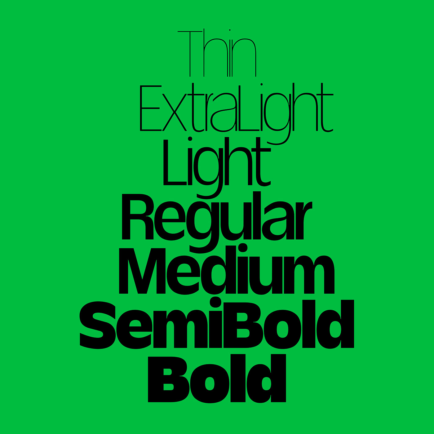
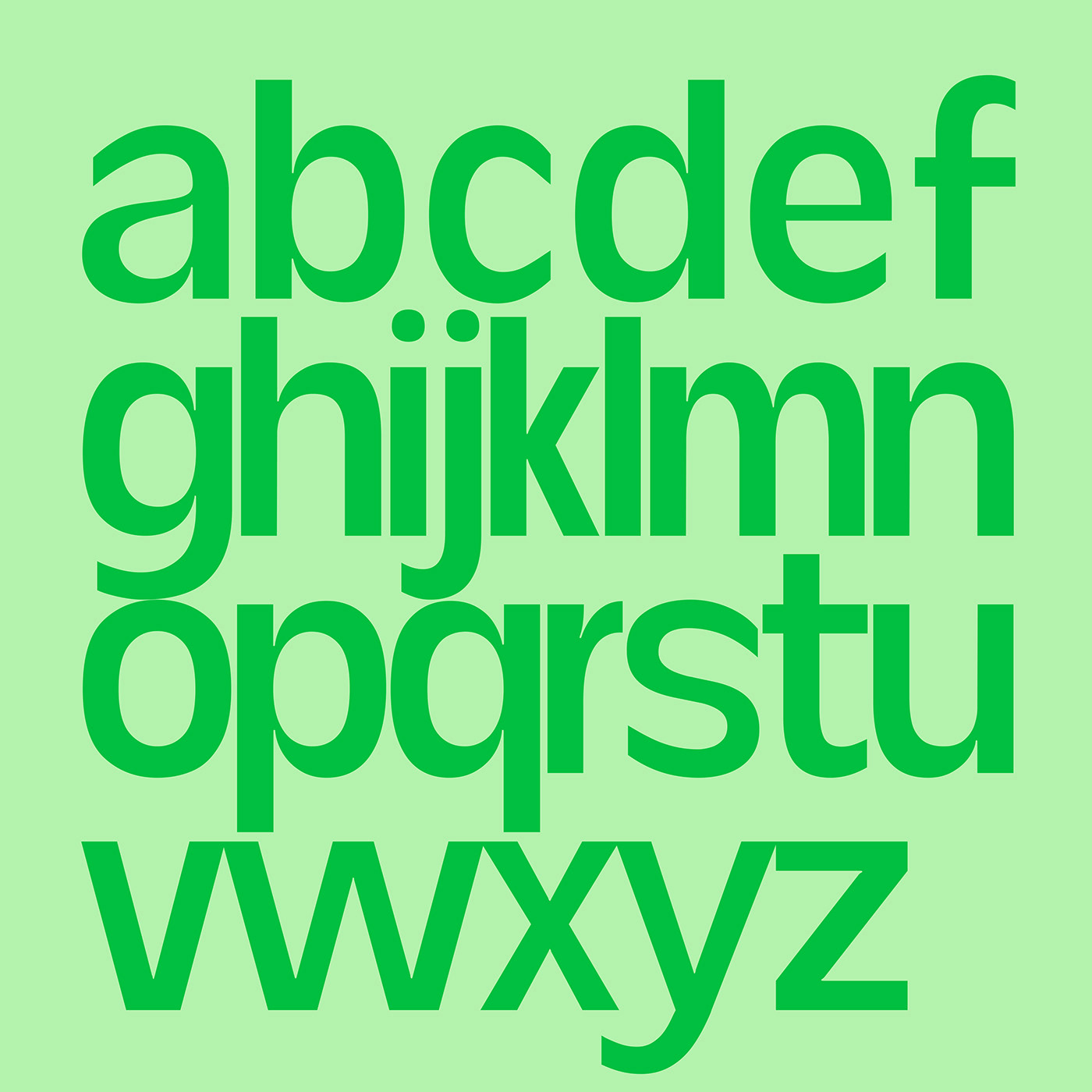
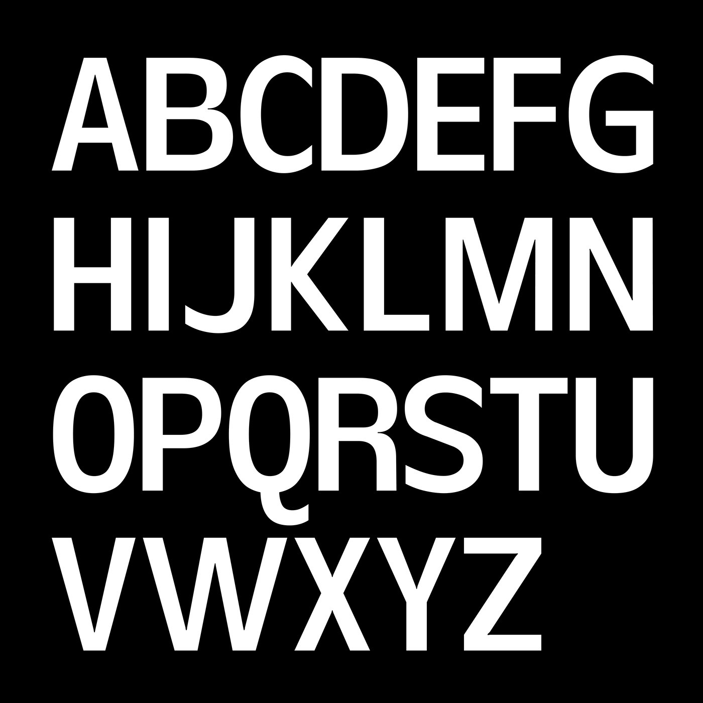
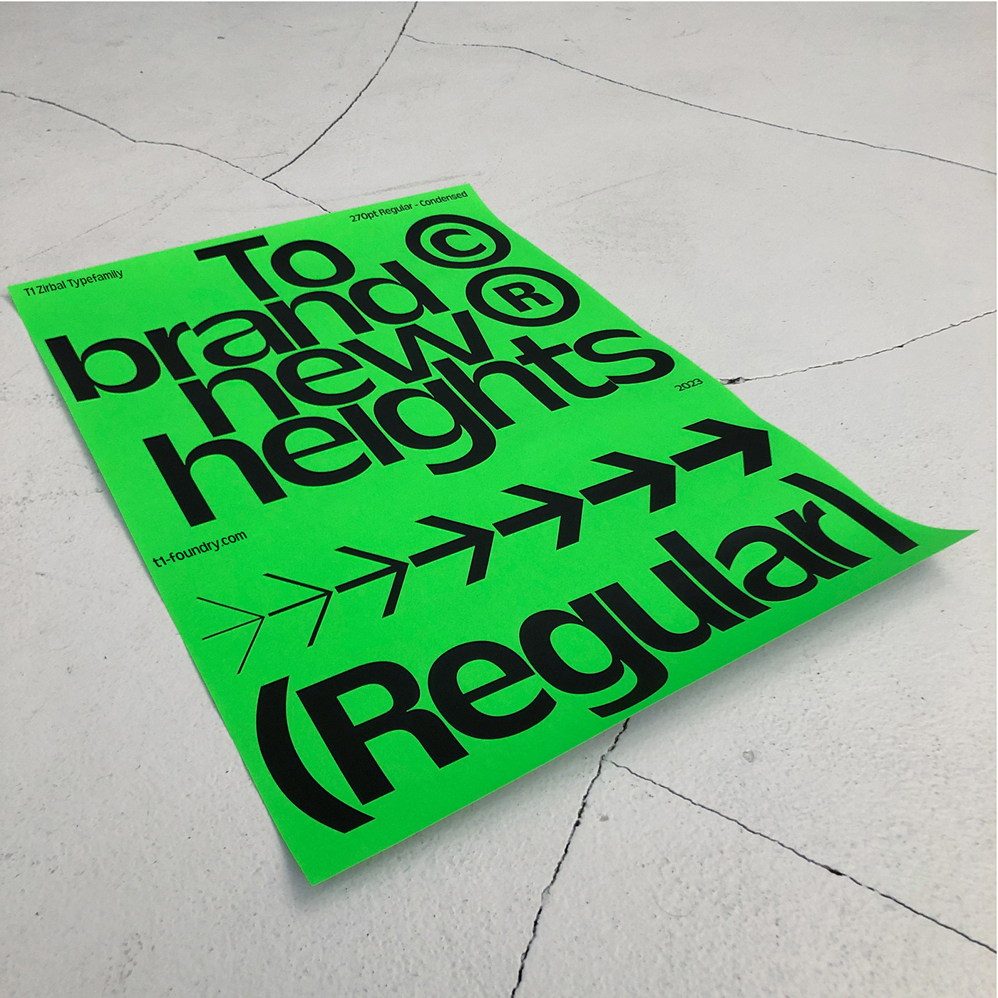
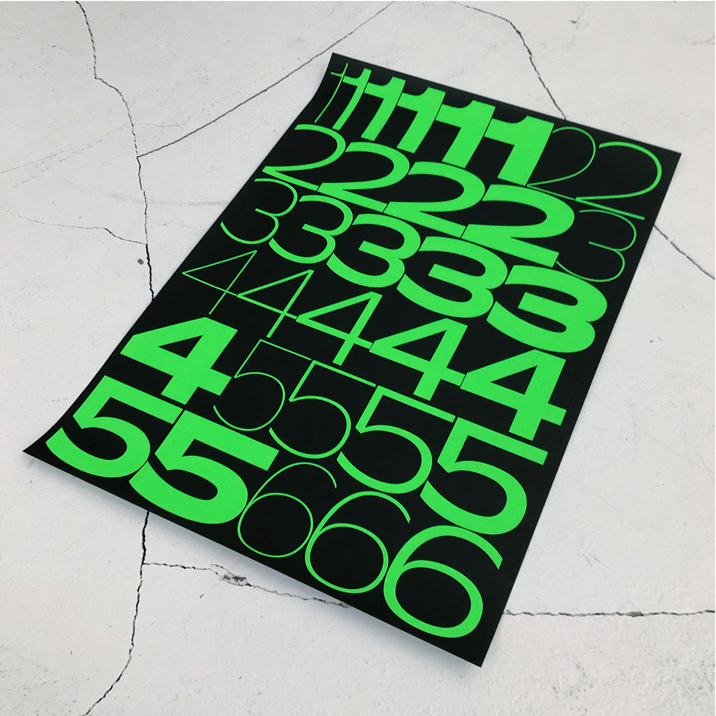
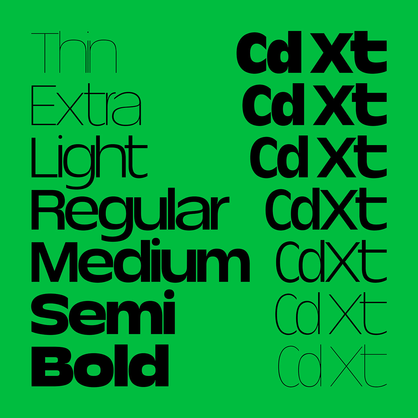
〔EN〕 The harsh weather of the subalpine zone, sharpened the extremely resistant and yet vibrant Zirbal to what it is today. Abiotic hazards cannot harm it, and so it exists symbiotically from its thinnest to its boldest weight. Zirbal is a robust display and headline typeface that can adapt to the most adverse conditions and formats. Whether extra wide or very narrow environments, Zirbal is convertible and can expand from Condensed to Extended. Like its namesake the Swiss Pine, with its sinker roots that reach into the deepest crevices of rock and anchor the tree, Zirbal is distinguished primarily by its very narrow spacing, which makes the typeface appear so robust yet contemporary. Like the cone of the Swiss Pine, another focus of this typeface is the fluid gender. This focus is expressed in a special (gender) feature of the typeface, which automatically adjusts the asterisk to match the previously running letter. Born in the alpine region – ready for the big world – it spreads its lateral roots to find use in a wide variety of applications. From headlines in magazines, to posters, labels, logos and entire brand identities, Zirbal is an ideal companion for your next design expedition.
〔DE〕 Das raue Wetter der subalpinen Zone hat die extrem widerstandsfähige und dennoch lebendige Zirbal zu dem gemacht, was sie heute ist. Abiotische Gefahren können ihr nichts anhaben, und so existiert sie in Symbiose von ihrem dünnsten bis zu ihrem fettesten Schnitt. Zirbal ist eine robuste Display- und Headline-Schrift, die sich an die widrigsten Bedingungen und Formate anpassen kann. Ob extrabreite oder sehr schmale Umgebungen, Zirbal ist wandelbar und kann von Condensed auf Extended erweitert werden. Wie ihr Namensgeber, die Zirbelkiefer, mit ihren Senkerwurzeln, die bis in die tiefsten Felsspalten reichen und den Baum verankern, zeichnet sich die Zirbal vor allem durch ihren sehr schmalen Zeichenabstand aus, der die Schrift so robust und doch modern erscheinen lässt. Wie der Zapfen der Zirbelkiefer steht auch bei dieser Schrift die Genderfluidität im Vordergrund. Dieser Schwerpunkt kommt in einem besonderen Merkmal der Schrift zum Ausdruck, dem Gender Feature, das das Sternchen automatisch an den zuvor laufenden Buchstaben anpasst. Geboren in der Alpenregion – bereit für die große Welt – breitet sie ihre Seitenwurzeln aus, um in einer Vielzahl von Anwendungen Verwendung zu finden. Von Headlines in Magazinen bis hin zu Plakaten, Etiketten, Logos und ganzen Markenidentitäten ist Zirbal der ideale Begleiter für die nächste Design-Expedition.
You'll find licenses and trial fonts here: