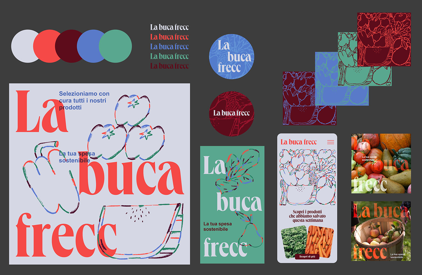
La Buca Frecc
Naming and visual identity proposal for an online supermarket based on fresh and local products - made in Italy 🇮🇹 The naming "La Buca Frecc", is a saying in Milanese and it means "The cold mouth".
The design tries to capture the essence of fresh and local products through illustrations handmade with a brand identity that’s light-hearted and eye-catching. For the logo, the font used is a Queens Compressed design by Selma Losch from Kilotype Foundry and it gives many different faces to the project as confidence, adaptation, and generous vibes.
Illustrations by @shutupclaudia