•••
When a Feature Misses Estimates
UX / Product Case Study
What does it mean if a promising feature underperforms? Two possibilities: (1) we got the solution wrong (2) we got the problem wrong.
As product makers, it is best to avoid rushing to the second conclusion. Like the burnt pizza analogy, a deficient solution might make us doubt the opportunity itself.
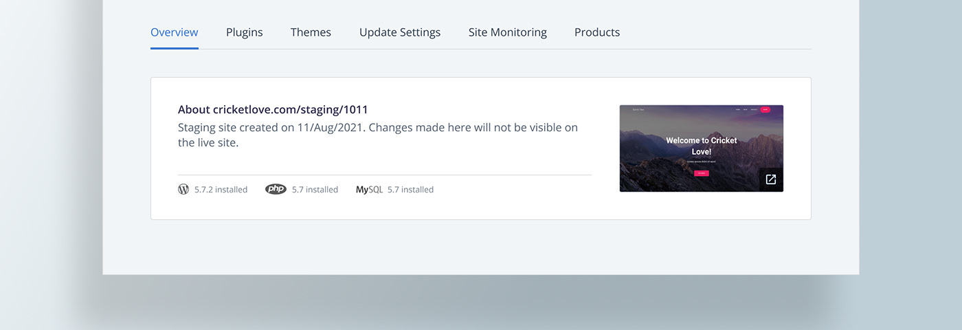
The case study presented herein demonstrates a similar situation we ran into at Bluehost Maestro. The feature launch in question, called ‘staging’ (aka sandbox or testing environment), had high expectations. But there seemed to be some lag in adoption even after 6 months from launch. Instead of writing off the opportunity, we decided to investigate if there were gaps in the solution. We did identify a few and even as I write this article, we are in the middle of that exercise.
Let’s look at the story from the beginning and understand the full case.
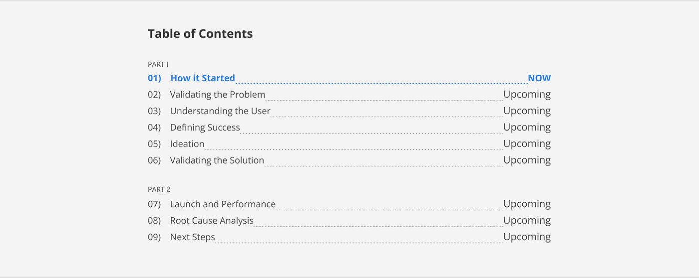
01 / How it Started
When it comes to what to build next, the popular method is discovery-driven. The product & design team interviews users to understand pain-points and comes up with a potential feature to build.

Alternatively, product teams might also be driven by company-wide OKR. In this top-down arrangement, you identify what features/ initiatives might meet your objective and then launch the most feasible one(s).


Research happens in this method too, but it is done to validate the opportunity. The questions for user interview are accordingly framed and needless to say, they are more focussed (narrow) even if they remain open-ended and non-leading.
In our case, it was OKR-driven. The top-level objective was to target web professionals as a key customer segment across all brands and regions. By the time it cascaded to us, our objective narrowed down to improving the stickiness of Bluehost Maestro, the brand that already catered to webpros. Incidentally, engagement had anyway been a key metric for us, so there was no shift in momentum with the new goal. We were already maintaining a wishlist of features that became the ‘key results’ to attaining the stickiness objective.
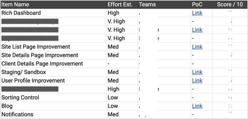
Feature wishlist. The right items would act as ‘key results’ in our OKR. Critical items hidden for competitive advantage.
To help decide what to build from the wishlist, we had to understand the cost-benefit associated with each item. Between us, the product team had a consensus to target low/med-effort, medium impact feature than a high-effort one, even if it appeared high in impact. Not that we didn’t want to take chances. As a new player, our strategy was to raise our risk appetite only after all essential items were in place.
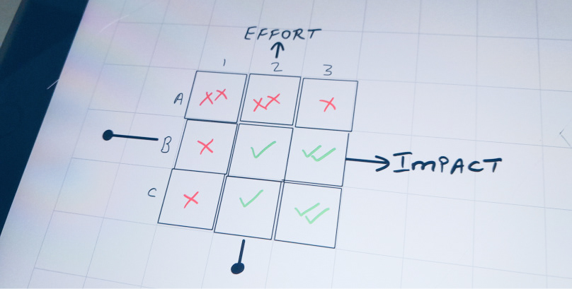
Cost-benefit matrix. Items falling in green tick boxes (B2, B3, C2 & C3) qualified.
"We were ok with a med-effort, med-impact feature than a high-effort one, even if it appeared high in impact. Not that we didn’t want to take chances. The strategy was to raise our risk appetite after all essential items were in place."
We also realised that ‘time’ and ‘effort’ estimates had to be considered independently. Low effort might not necessarily mean less time-consuming. That is because some items depended on overseas teams and needed collaboration. Usually, such collaborations resulted in more turn-around-time, even if the feature was inherently low-effort.
All in all, we factored value add, time and effort to answer “what to build next”. Two items seemed to check all the right boxes:
(1) List-page improvement: Make line-items more relevant, intuitive, better categorised.
(2) Staging feature: Also known as ‘sandbox or testing environment’ amongst webpros.
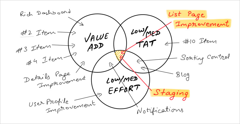
Evaluating wishlist items through Value-add, Time and Effort lenses
Between these two, item 1 was discarded as Maestro’s list page already underwent major redesign twice. It was still a value-add but got parked for later. We zeroed in on ‘staging’ and decided to validate if it was worth building.
02 / Validating the Problem
By now, we had identified a feasible feature to build. That is 1 of 3 principles satisfied as per IDEO’s desirability-viability-feasibility framework. From a business viability point of view, it made sense as well. Staging feature basically meant offering a duplicate, testing site (aka ‘sandbox’ environment) to web professionals for their WordPress sites. Just to begin with, it could be added to our hosting plans to boost sales without incurring significant overheads.
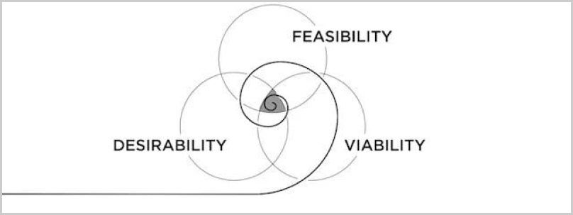
IDEO’s DVF framework. Source: IDEO blog.
Now what was left to check was the desirability quotient. Would users find value in it? Was there a big-enough problem, to begin with, that this feature addressed?
We decided to evaluate desirability using 2 routes:
• User interview
• Competitor analysis
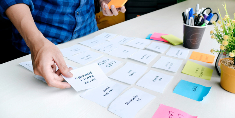
A chat with users validated the hypothesis. Users should find staging-like feature useful as they could test small and big changes before updating their main site. Some of them already used their local machines for that purpose. The ability to do that online was only an improvement, especially if the service was offered for free.
On the other hand, competitor analysis revealed that a lot of our key competitors already flaunted this feature. So from that perspective too, it seemed worth going after.
All in all, initial research convinced us to an extent that staging should make a good tech investment.
03 / Understanding the User
In principle, staging’s target persona would be no different than the average Maestro user. There was no segment to go after in terms of age group, gender, income, geography, professional experience, employment type (freelancer, agency or digital marketer) or any such background that, otherwise, might influence adoption. So long as they are still in the business of building sites for their clients, all users were expected to see value in the new tool and benefit from it.

Keeping that in mind, we refreshed ourselves with the traits we already knew about web professionals:
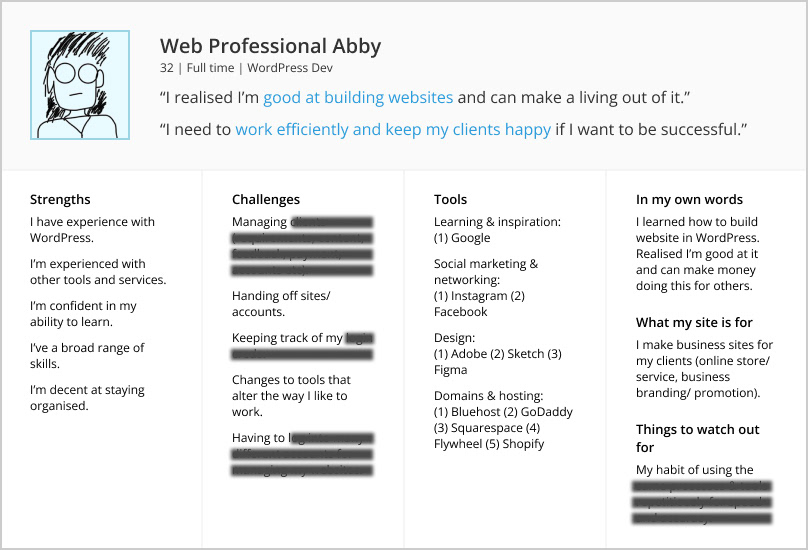
Persona of a typical user. Some information hidden for being business-critical.
04 / Defining Success
This part is a little tricky for any feature launch, since we don’t know the standard of good and bad yet. Typically, the product team comes up with numbers that stakeholders find reasonable. For staging, we wrote down the following as our success metrics.
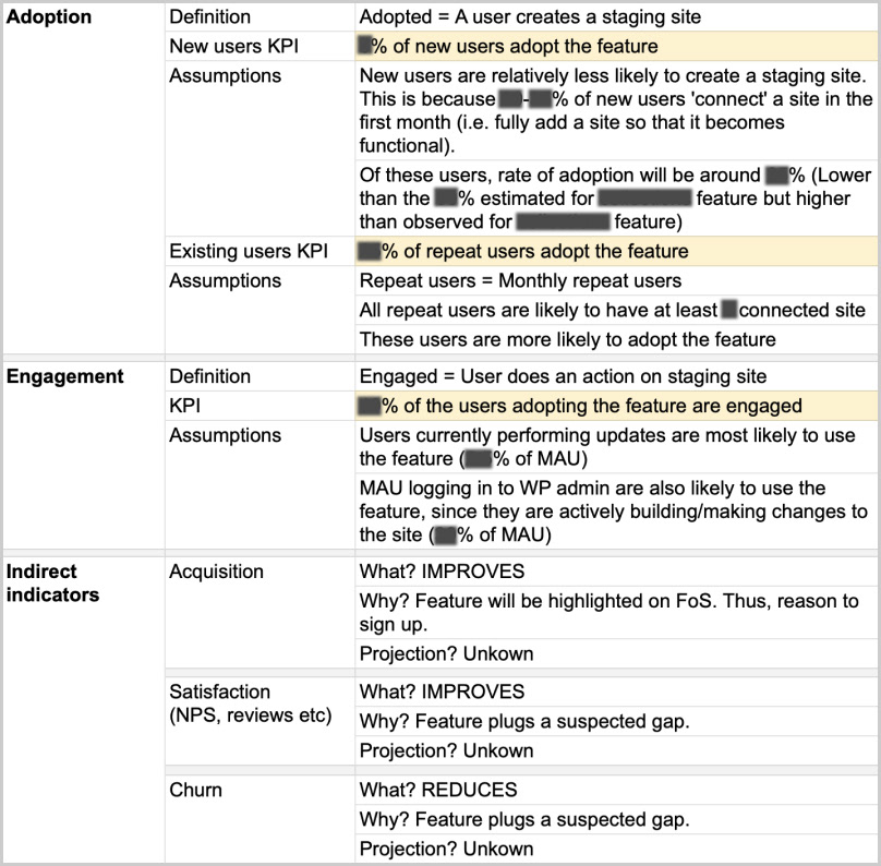
Success metrics for staging feature. Numbers hidden for confidentiality.
05 / Ideation
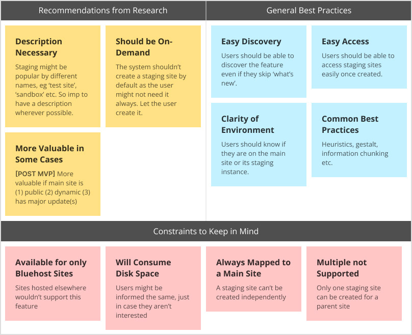
This is the part that personally excites me the most 🙂. Equipped with insights from preliminary research, there were a few design approaches we wanted to try out. We laid out the following guiding principles for creating user flow(s):
5.1) Guiding Principles for Design
5.2) User Stories
To understand what all user flows have to be designed, it is important to understand what functions are part of the MVP. This, in turn, derives from user stories, which are often written for developers. They are even more handy for the design team as it helps them plan things accordingly.
Here’s a popular template used for writing user stories:

Below mentioned are some of the high-level user stories we identified:

5.3) Information Architecture (IA)
Next, we moved to the “where will this function sit” question. Generally, a few considerations are taken into account to lay down the information architecture. Is it a new feature or an improvement? Is it independent or tied to something? Does it warrant a primary navigation? Does it naturally belong to an existing flow? Is there an industry standard to follow? How important is it for the user/ business? Is it related to user account? Etc.

In our case, staging feature was a function of ‘sites’, one of the two primary entities on Maestro (the other being ‘clients’). That means it couldn’t sit independently or be positioned as a primary navigation. Within sites, there were 2 possibilities to position it:
1) Under a site, as a subset: This would be a parent-child arrangement. Staging site nested under the main (live) site.
2) Parallel to a site, as an alternative: Both the main site and its staging instance are at the same level.
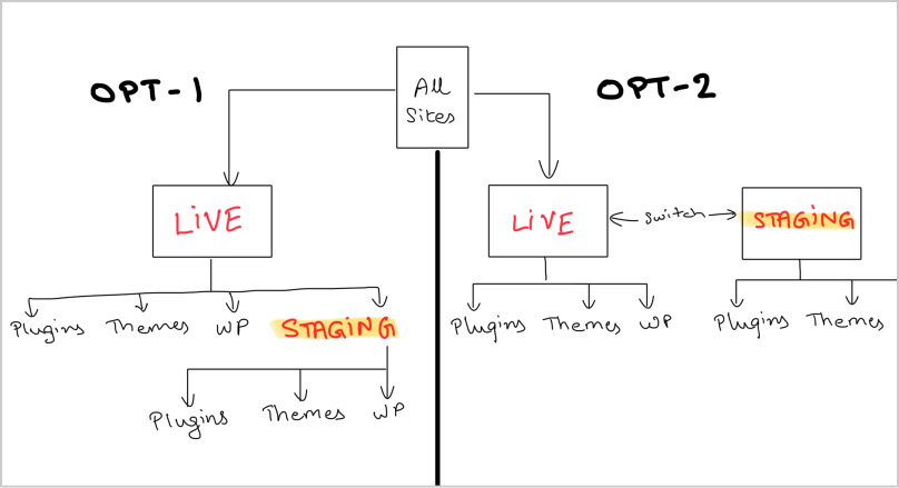
2 possibilities for IA
We noted that between the 2 arrangements, there was no set industry convention that might be followed to leverage familiarity heuristic. Different players did it differently. We decided to wireframe both.
5.4) Wireframe
Below are the 2 versions we created in the early draft.
V1 demonstrates staging as a child (subset) to the main site. It’s introduced as a tab on the Site Detail Page. User remains on the main site and navigates to the staging tab within that site.
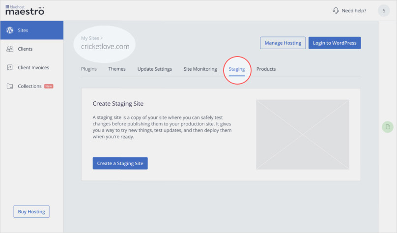
V2 demonstrates staging as an alternative to the main site. It’s introduced as a dropdown on the Site Details Page. User switches between LIVE (main site) and STAGING sites using that dropdown.
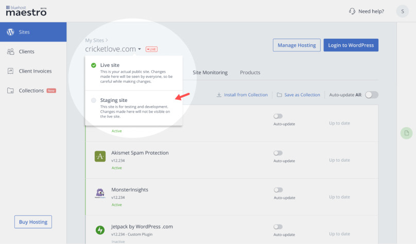
Between the 2 versions, there was no difference when it came to making noise about the feature. Whatever version went live, there would be an emailer sent to the user, a “what’s new” banner in the dashboard and a tooltip tour. Design versions were intended to differ only in the structure and not so much in discovery. This was important to ensure that there was only 1 variable in the picture — the design itself, as we evaluated different experiences.
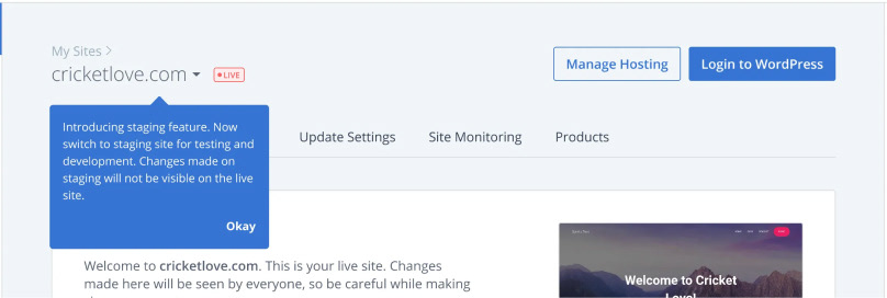
A tooltip would appear in the first-run experience to educate the user
The product and design team brainstormed over the drafts. One final version had to be shortlisted for usability testing because of both budget and time constraints.
We decided to converge on version 2 because of a number of reasons, the primary being that version 2 positioned staging as a site of its own, with its own WordPress installation and own root files. Yes, tied to the main (live) site, but not a part of it. Version 1 ran the risk of giving that impression which would have been factually incorrect.
With that consensus, we completed what was left of the flow and moved to usability test version 2.
06 / Validating the Solution
This was the final phase before feature launch. We prepared the interview script, decided on a sample size of 10 (+/- 2) participants and emailed a few users with screener questions for usability test. We also got to UT 3 internal folks who were WordPress professionals as a bonus. In the end, 9 Maestro users and 3 internal staff webpros took part in it, making it total 12 participants.
Below is the actual prototype they interacted with:
Prototype used for usability test. Feel free to click and interact.
The results were encouraging. We got decent scores in major aspects, including design and value. At the same time, we received rich insights and feedback on areas of improvement which enabled us to fine-tune things.

Snapshot of usability test findings
Post all necessary corrections, we wrapped up the MVP. The feature got developed and rolled out to 100% audience on 18 November 2021.
07 / Launch and Performance
Now came the time for reality check.
We usually look for early trend in the first 30 days from launch. However, first few weeks are also when post-QA issues can pop up in production. Things are expected to pick up after 15–30 days from launch, once hot fixes, if any, are deployed.
To recall our success metrics, there were 3 indicators we were interested in:
(1) New User Adoption: n% of new signups create a staging site within 45 days.
(2) Repeat User Adoption: n% of existing users create staging site within 30 days
(3) Engagement: n% of users who have adopted, do any activity on staging site.

Let’s zoom in on adoption to get a sense of how staging broadly fared in both the short and long term.
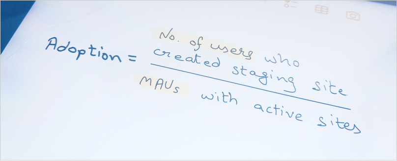
At a high level, adoption for a calendar month = no. of users who tried staging / total MAUs with active sites.
Consolidated data (data not split into new and repeat users) revealed that only a 1/4th of what we estimated created staging in the launch month of November. This was something to take note of, but we wanted to wait and watch for at least 60 days. Things started improving month-on-month and by 120 days, the gap between expectation and reality closed by a half.

Staging adoption: 4-month data
Subsequently from 5th month onwards, things became erratic and didn’t seem to follow any clear pattern. The graph looked like this over the next 12 months, from Nov 2021 to Oct 2022:
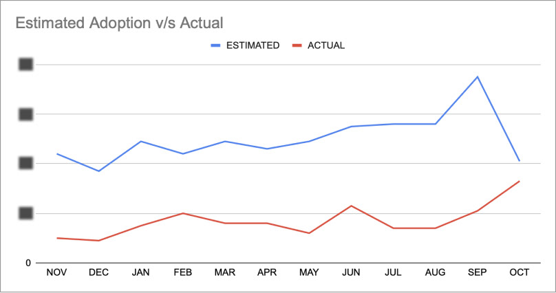
Staging adoption: 12-month data
While adoption had its share of ups and downs, it was clear that the bare minimum was never met. It was time to switch hats from analyst to investigator mode.
08 / Root Cause Analysis
Before we began evaluating ‘why’ the feature under-performed, we wanted to be very sure of two things:
(1) That we didn’t over-estimate: We had put up conservative numbers for success, to the point that any further reduction would make it meaningless. To set some context, the estimates put for some of the previous launches were more than twice and even thrice than staging’s. There was a unanimous view that the team didn’t over-estimate.
(2) That the opportunity was genuine: At one point, we did start doubting if the problem really existed and was worth chasing. Two independent surveys checked our apprehension. One indicated that the use case of managing sites was strong. It’s when you are managing a (live) site when staging gains more value. The second survey was more direct and cited staging as the second biggest necessity for web professionals.
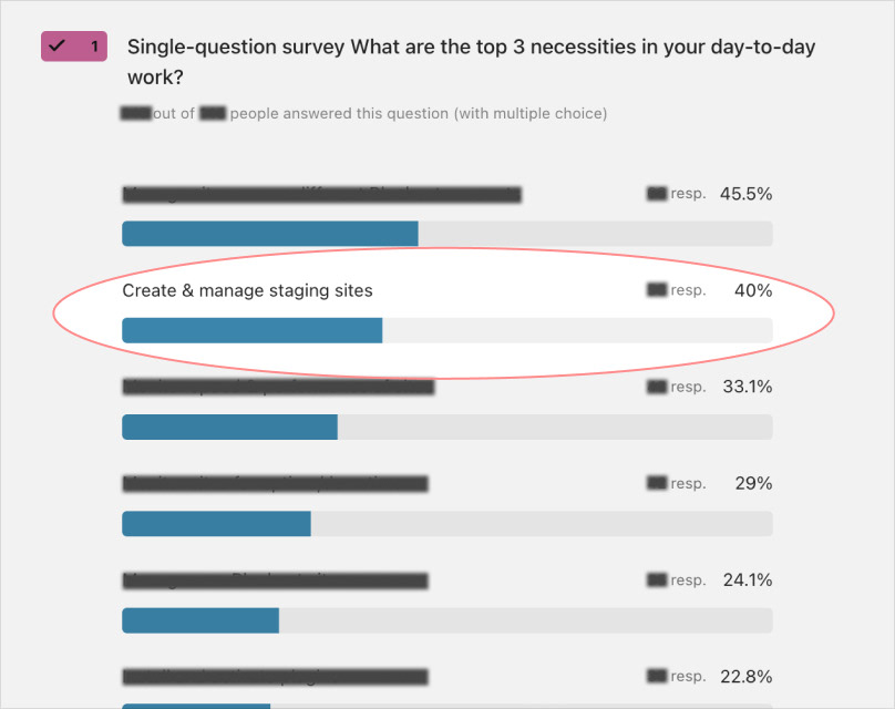
Post launch surveys continued to make a case for staging.
Once satisfied with the above answers, we proceeded to understand what got missed while solution-ing. There were a bunch of usual suspects in our radar:
(1) Discovery — Users aren’t noticing it in the first place, so adoption is low.
(2) Clarity — Users are not understanding it, hence not trying it out.
(3) Ease of use — Users want to use it, but it’s not easy.
(4) Value — Users are not finding value in it, so not interested to try it out.
(5) Timing — Users are not being nudged about staging at the right opportunities.

At least 2 items got ruled out by our usability test (UT) result — #2 clarity and #3 ease of use. All 12/12 participants were clear about what staging meant and all of them created staging site without any particular trouble. They rated usability high as well.
#1 Discovery (education) was still a suspect, because that aspect wasn’t tracked enough in the UT. The task given made participants go one level down to the site detail page. In reality, users spent far more time on the home page which was one level up. We felt we could have done a better job of education over there. In fact, an independent user interview suggested that discovery was indeed a culprit to some extent.
To understand #4 value and #5 timing, revisiting initial interviews helped. We were reminded that respondents seemed to exhibit very distinct behaviours in 3 different situations — (1) building a site (2) managing a site and (3) redesigning a site:
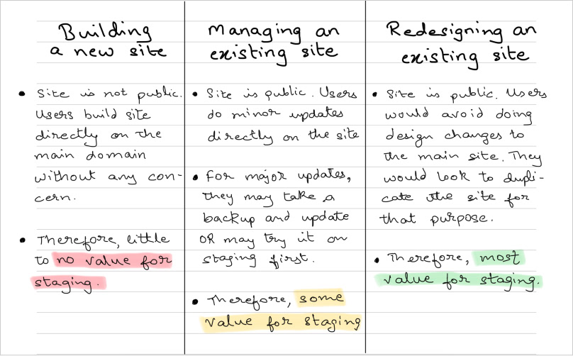
3 use cases of website building. Need for staging differed significantly between them.
In the case of building a new site from scratch, staging had no value. That’s because the site was not public yet, so the need to have a test site for making changes didn’t arise.
Webpros built the site directly on the main domain name without any concern.
We had this info pre launch too, but our assumption was that only some sites on Maestro would be like this and not all. Now, in hindsight, we wondered if it was actually the predominant case. At least 2 users had mentioned that they mostly built new sites and rarely got redesign jobs.
We realised we needed to modify our initial hypothesis. It maybe that most of the sites getting added to Maestro are new sites being built from scratch. Only a few were existing sites that were added for manage or redesign purpose.
With the revised hypothesis, one thing became clear — staging would be of little value for most sites getting added to Maestro. We had to get our timing right in promoting staging. The moment the site was done being built and launched to public view, we go all out making noise about staging.
09 / Next Steps
By now, we got an idea of areas to improve — discovery, value and timing. As mentioned in the previous part, we are still in the middle of this exercise at the time of writing this article. But there are some concrete measures on our mind which can be taken as next steps.
(1) Improving feature discovery would be an ongoing process. We could improve on design, copy, comms etc. Multiple teams will get involved.
(2) For value, we need to devise a way through which we know the type of site being added to Maestro. If it’s an existing (public) site, that’s when we double down on highlighting staging.
(3) Devise ways to identify that a site under construction is finished and launch-ready. One simple way is to track WordPress’ “coming soon” status — if the user removes it, the site’s become public. Another could be introducing ‘handoff’ feature. Webpros handoff site related details to their clients at the end of project. If they engage with the feature, that would be our cue to upsell staging since the site’s likely got finished.
Apart from the above, some other insights have also come to the fore. Things like whether the site’s static or dynamic, low or high-traffic etc. are understood to influence the need for having a duplicate site. We are in the middle of that investigation and intend to come back with, hopefully, a better version of staging.
That rounds up the end-to-end case study of staging feature on Bluehost Maestro. Feel free to comment and share your thoughts. Let us know if you feel something more can be done or could have been. We’d be all ears!
...


