I participated in a proposal to create
a visual identity for the city of Brasília.

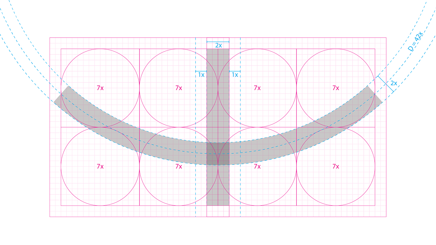
I drew inspiration from two iconic details that can be found throughtout the city.
Cobogós (a type of stylized brick used around the city) and the famous "tesourinhas", the entrances and exits of the main aveneus of the city.
Cobogós (a type of stylized brick used around the city) and the famous "tesourinhas", the entrances and exits of the main aveneus of the city.
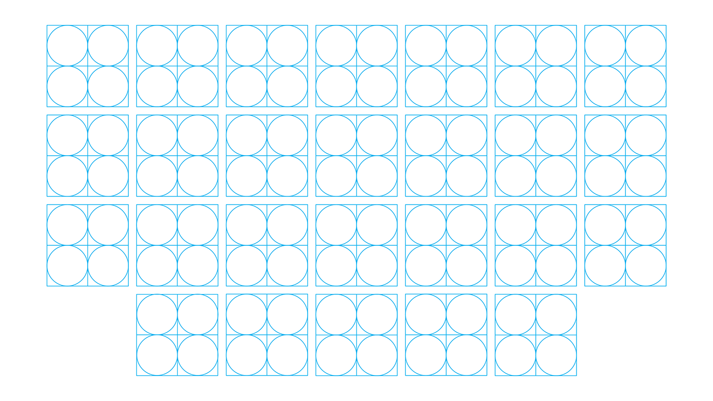
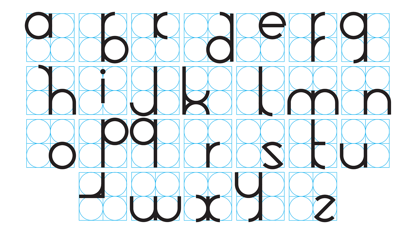
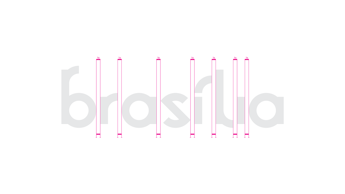
I used the construction of the cobogós and tesourinhas to create a grid, and with this grid designed a custom typeface.
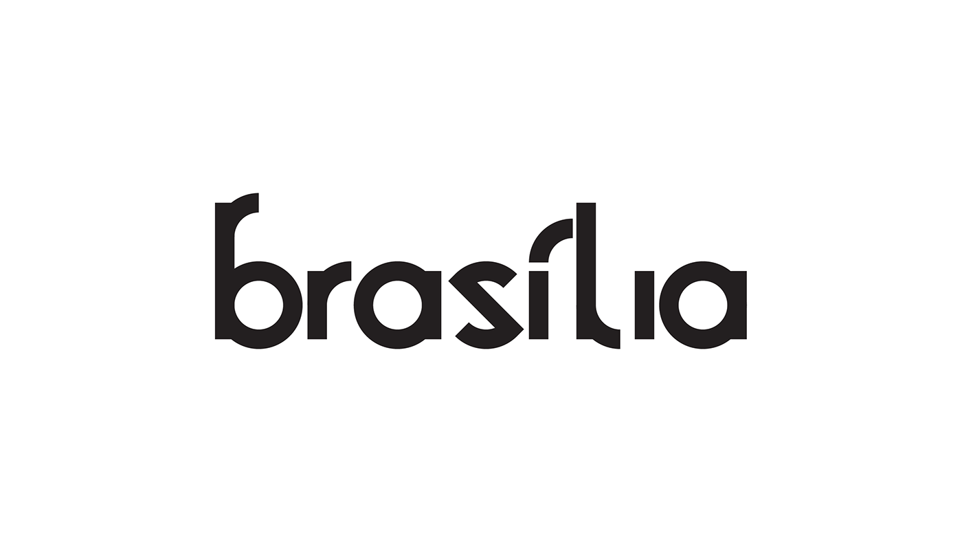
With all the letters created I used them to create an iconic wordmark as the first focal point of the visual identity.
The construction of the letters follow the grid in every detail.
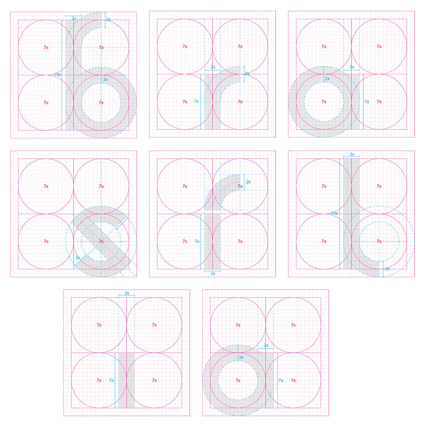
the kerning of the wordmark also follows the grid, ensuring an even spacing between the letters. For the rest of the alphabet, the kerning is ajusted by half when necessary.
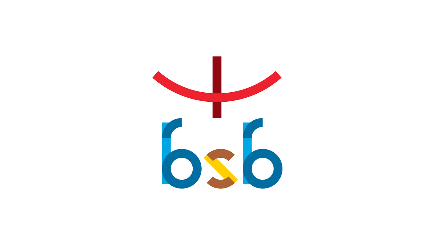
to acompany the wordmark, I also designed a logo following the emblematic shape of the city. Also drawn following a similar grid to that of the custom typeface.

with the construction of the wordmark and the logo, I then defined a color scheme for the final lockup, the colors representing the seasons and landscapes of the city.
The way I designed the typeface I could bring two shades of each color and really showcase the unique construction of the geometric letters.
The way I designed the typeface I could bring two shades of each color and really showcase the unique construction of the geometric letters.


To really test and see how the typeface would work in real life I used it to showcase every satellite city that surrounds Brasília and that make up the Federal District.


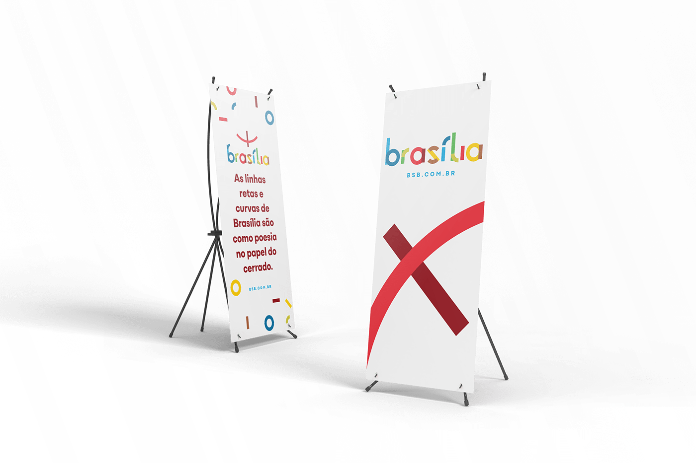
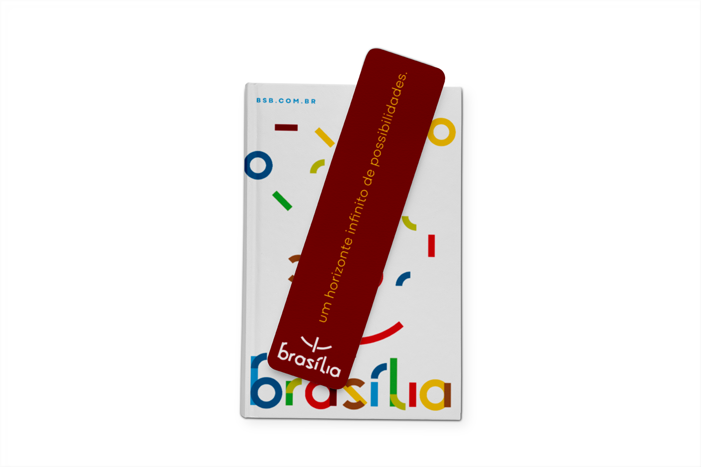
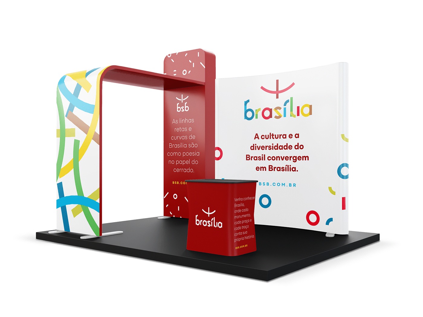
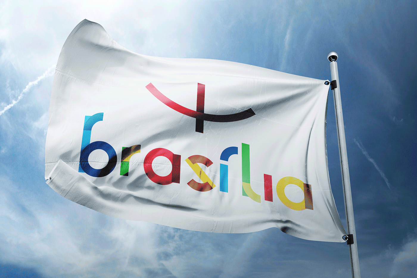
And to finalize the proposal, I animated the logo and made a few mockups showing the entirety of the visual identity with the custom typeface as the focal point, with all the colors, supporting typography and supporting visual elements.