Al-Aml
Occupational Therapy Service's
Al-Amal's services are rooted in fostering learning and growth for children and individuals with disabilities in a nurturing environment characterized by optimism and achievement. Their brand embodies a vibrant and cheerful personality, radiating energy, enthusiasm, confidence, determination, and Perseverance to reach the goals.

Through a meticulous study of the Al-Aml character, we have developed a logo concept that embodies its
personality as follows:
Arc The curved line
represents a supportive environment fostering growth and learning, characterized
represents a supportive environment fostering growth and learning, characterized
by comfort, care, and safety.
Smiley face
The upward curve of the smile expresses happiness and positivity, capturing
the emotional well-being that individuals experience under Al-Aml's care.
Supportive Hand
The gracefully curved hand signifies support, empathy, and empowerment, conveying
the nurturing role of occupational therapists.
The smiling face, curved line, and supportive hand all contribute to a sense of safety, optimism, and
guidance– qualities that are essential in a learning and therapeutic environment for children and disabled.

The flowing lines, circular structure, and seamless integration of the elements create a sense of unity, mirroring the holistic approach that Al-Aml character embodies, which encompasses physical, emotional, and social aspects.

The logo design employs clean lines and circular shapes, yielding a contemporary and professional appearance that facilitates recognition and differentiation.

In general, the logo encapsulates the core of occupational therapy, portraying values of compassion, support, warmth, and affability.

To make the logo more flexible, we designed four versions to show it: "Arabic, English, Stamp, and Symbol ver."

Clear Space
To define the minimum required space to enhance the logo's visibility, should employ the letters "a" and "m" for the English version, and the letter "مــــــ" for the Arabic version, as depicted:

Brand value_ visually
"Empathy, Innovation, Collaboration, Excellence, Integrity, and a Holistic approach"
stand as the foundational pillars Al-Aml prioritizes within its services.
We've meticulously brought each of these values to life by designing meaningful
visual shapes that indicate each one, to be used for visual identity
These forms seamlessly integrate with the Al-Aml logo structure, resulting in a
coherent representation of the brand.

Scheme color
We've carefully selected a vibrant color scheme that encapsulates the brand's essence
as follows:
Royal blue symbolizes growth and learning, while Melon infuses the brand with optimism and energy. The soft blue reflects a sense of calmness and balance, and finally, the neutral gray balances the color scheme.

Typography
The professional appearance and readability align in IBM Plex Sans font seamlessly with the identity and brand character, making it a perfect fit to convey the brand's message in a clear and impactful manner.


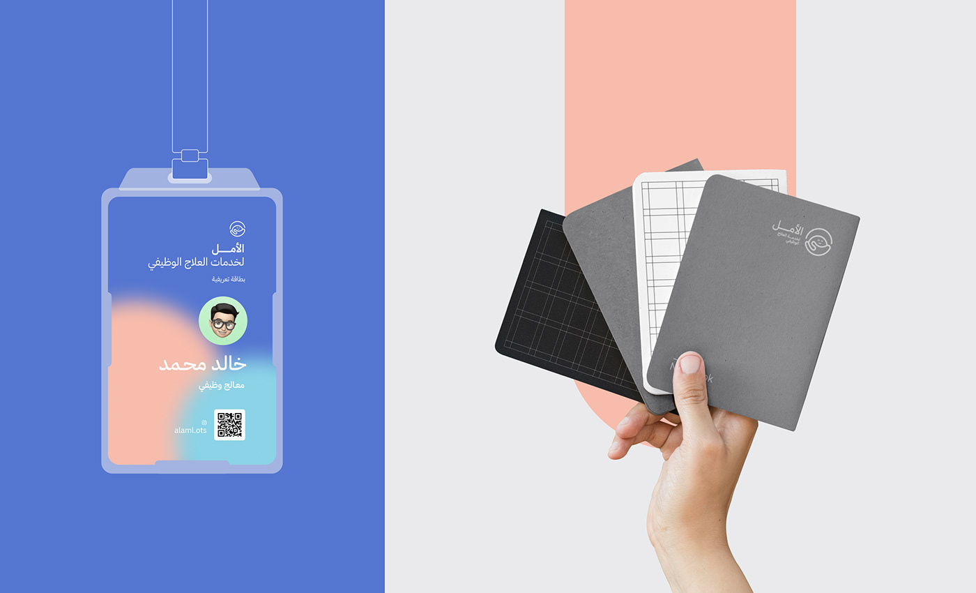
Gallery_