After a period of rapid growth and the opening of new gyms, Beyond Bouldering embarked on a rebranding journey to reinforce their identity. The goal was to create a bold, inclusive representation of Beyond Bouldering as South Australia's largest indoor climbing community — a safe space for people to train, strengthen and condition their bodies and minds.
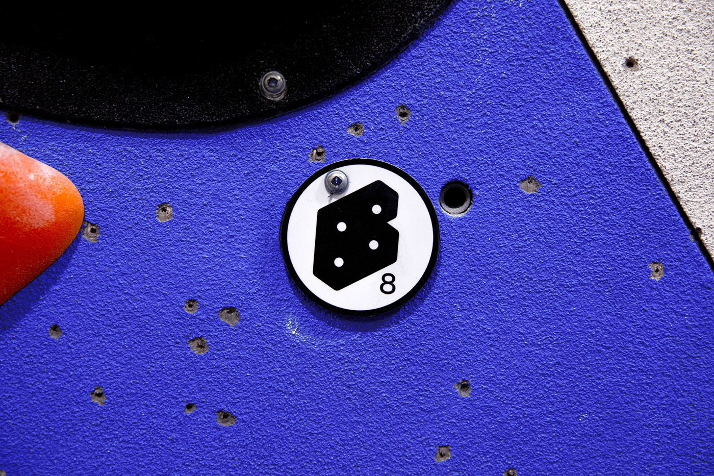
Beyond Bouldering successfully launched the updated, bolder 'Beyond' logotype as their primary graphic element, accompanied by a new supporting symbol. The symbol draws inspiration from bouldering walls' bolt holes and the shape of climbing holds. The once-disparate colour palette was unified by a bright ultramarine blue hue, complemented by vibrant secondary colours.
Beyond Bouldering successfully launched the updated, bolder 'Beyond' logotype as their primary graphic element, accompanied by a new supporting symbol. The symbol draws inspiration from bouldering walls' bolt holes and the shape of climbing holds. The once-disparate colour palette was unified by a bright ultramarine blue hue, complemented by vibrant secondary colours.
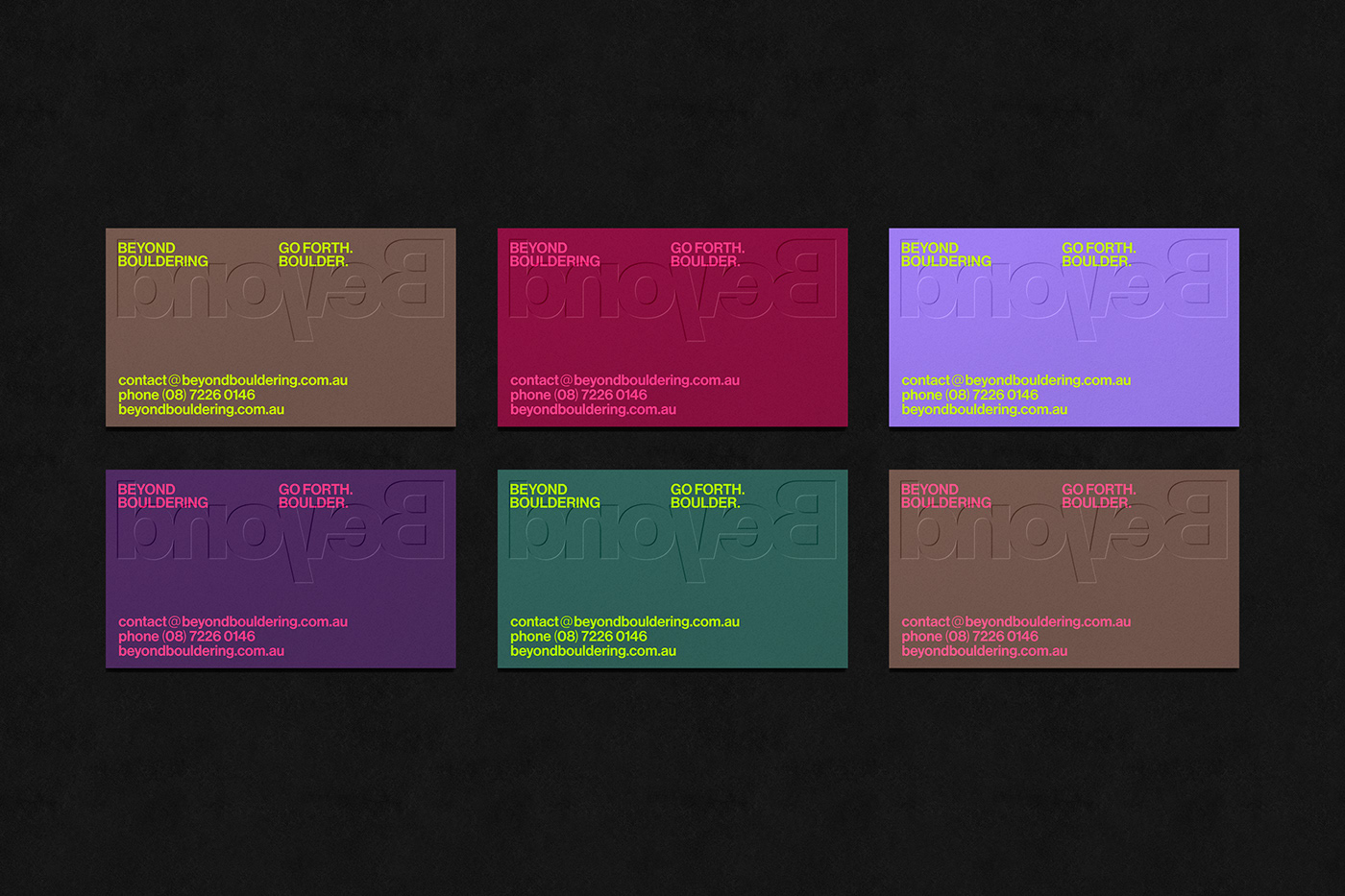
The new brand was carefully designed to be adaptable across different gyms, clothing and marketing channels, fostering a unified climbing experience.