


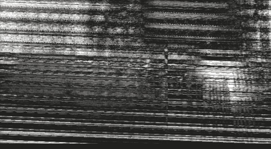
Ø Inspiration.
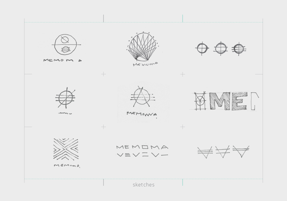
Ø Sketch Process. These are some of the sketches that explain the way we follow to develop the logotype. The diagonals of the -M- letter and the horizontal lines of the -E-, -O- and -A- was our starting point to set the logo. On the way, concepts like noise, interference and some more was added, until the logo was completed.

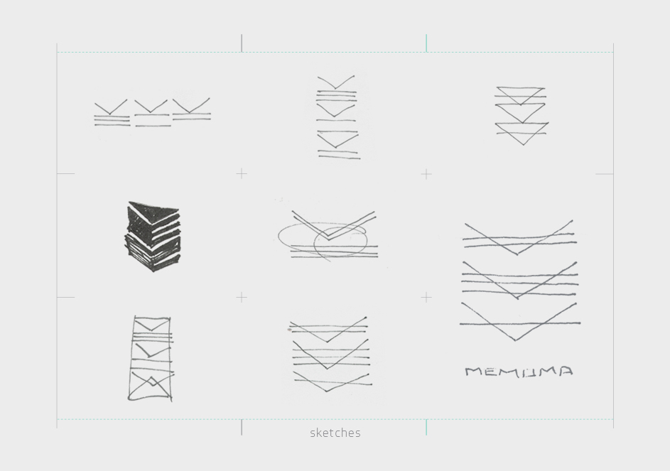
Ø Configuration of the logotype from the diagonals above, attaching concepts like noise, dynamics and TV interference.
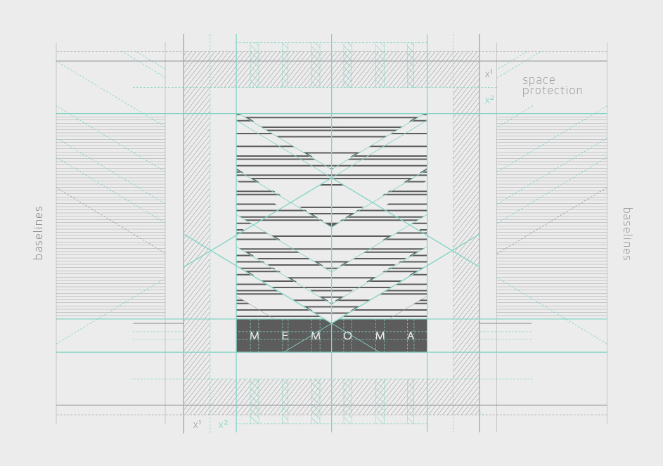
Ø Logotype settings, guidelines/baselines and space protection.

Ø Color system.
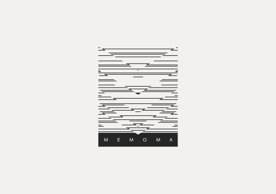
Ø MEMOMA Logotype.
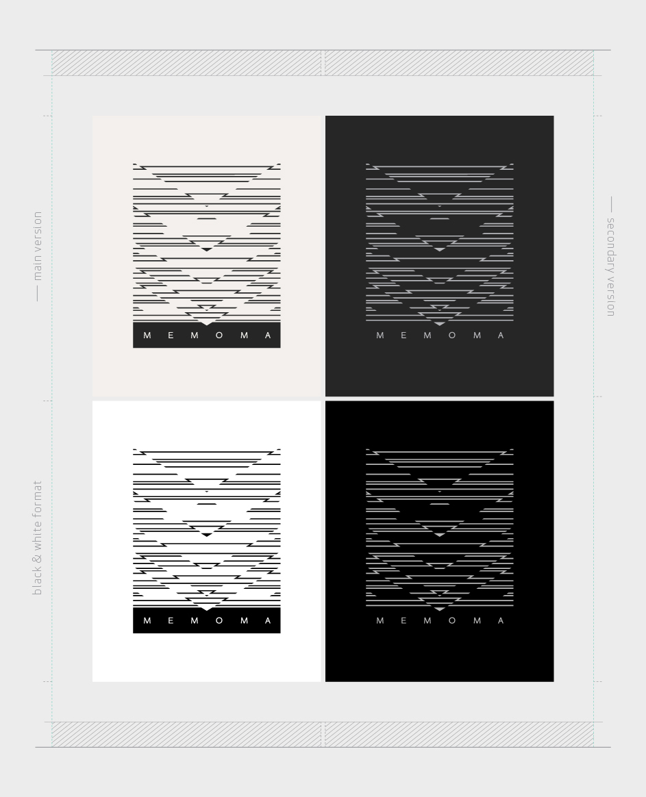
Ø Color variations.

Ø Type selection of on-line and print format / Three different uses whithin the Brand system: Sentence, headers/fields, body text.


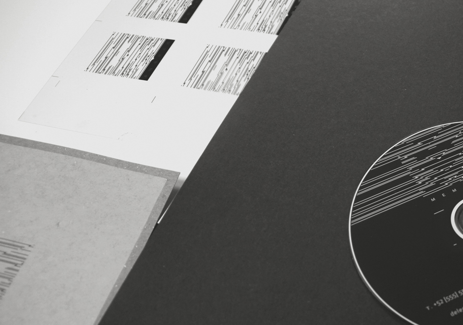


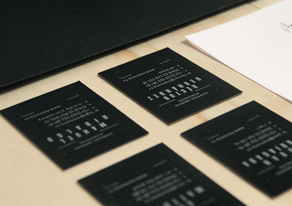


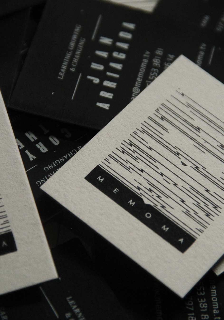


Ø Print process and stationery: business cards, letterhead, envelope, CD/DVD and CD/DVD box.
Ø We thank Arturo Negrete of Color 75 ° for the quality, interest and support.


