

I designed a new logo for Pointblank Design Studio in Cape Town, South Africa (Apr 2014).
The logo stands for "straightforward", "honest", and "to the point". It had to be big and bold, but simple, with gray, black and bright orange as the main colours.
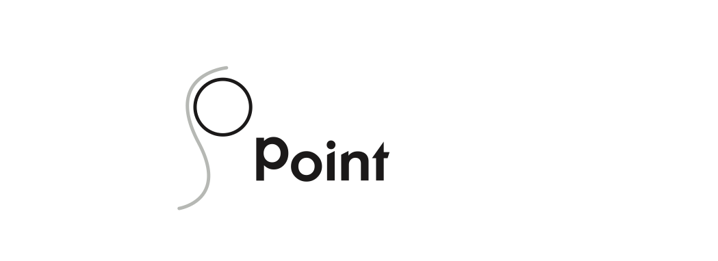
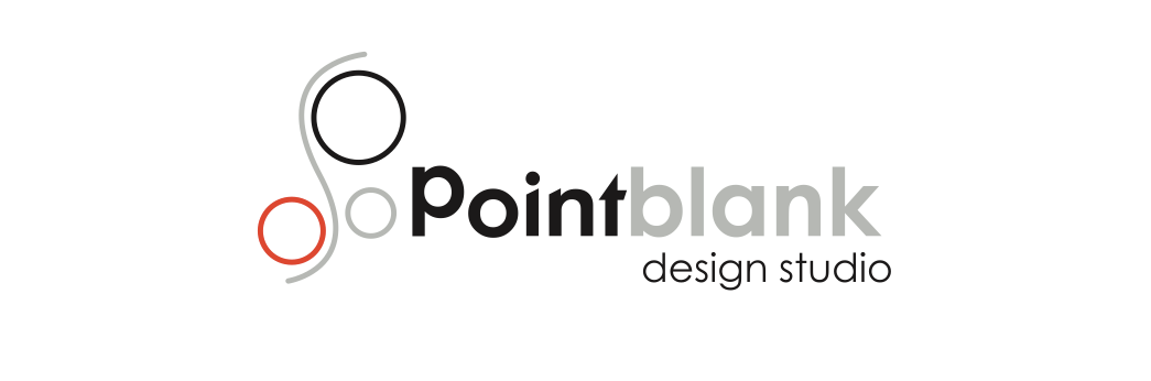
The first circle with the line represents a "P" for Point.
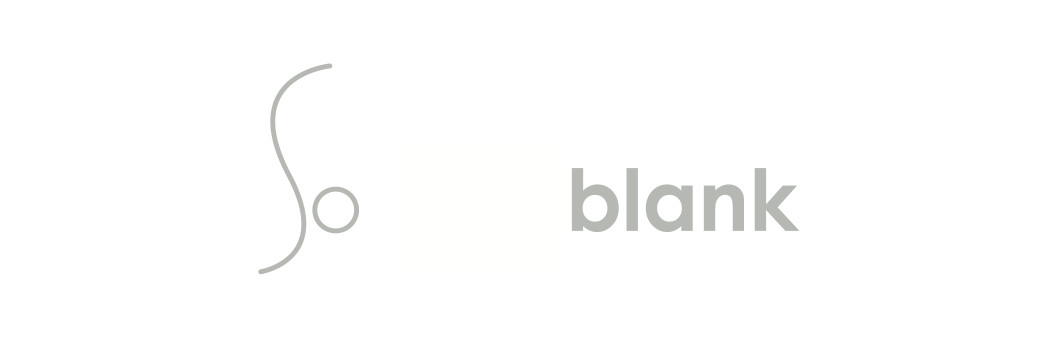
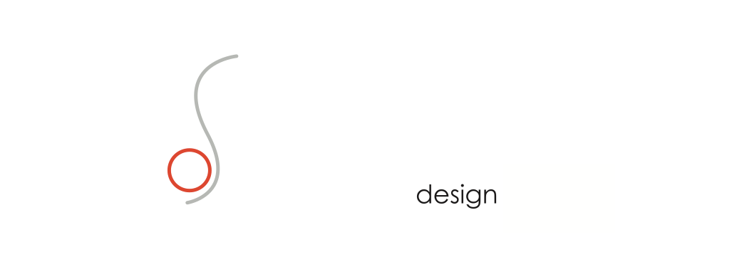
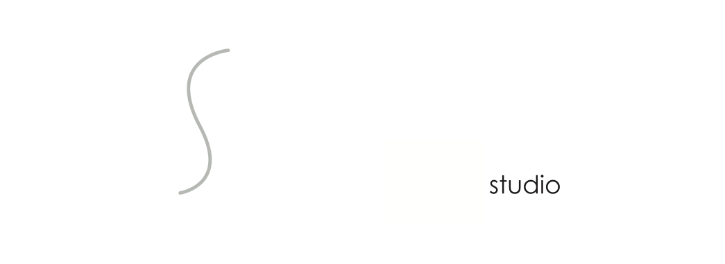
The second circle with the line represents a small "b" for blank; the third circle with the line a "d" for design and the line is also an "s" for studio.
The second circle with the line represents a small "b" for blank; the third circle with the line a "d" for design and the line is also an "s" for studio.
The circles can be seen as different design disciplines, like graphic design, web, etc, with the line suggesting movement between these different disciplines, as the company operates in all of them.
The icon is clean and simple.
The font I've used for "Point" is a simple font, but has sharp edges making it "pointy", where as the font for "blank" is plain with square edges, but the b and a is round to link with the circles in the icon (as well as the "o" in "point"). I've replaced the "P" with a mirrored b from the second font.
Since "blank" is French for white, I've made the word 'blank' light gray. The two colours make it stricking.

The circles can be incorporated anywhere, and the logo can work on colour/black, in gray scale, and can easily be adjusted to fit any background colour.
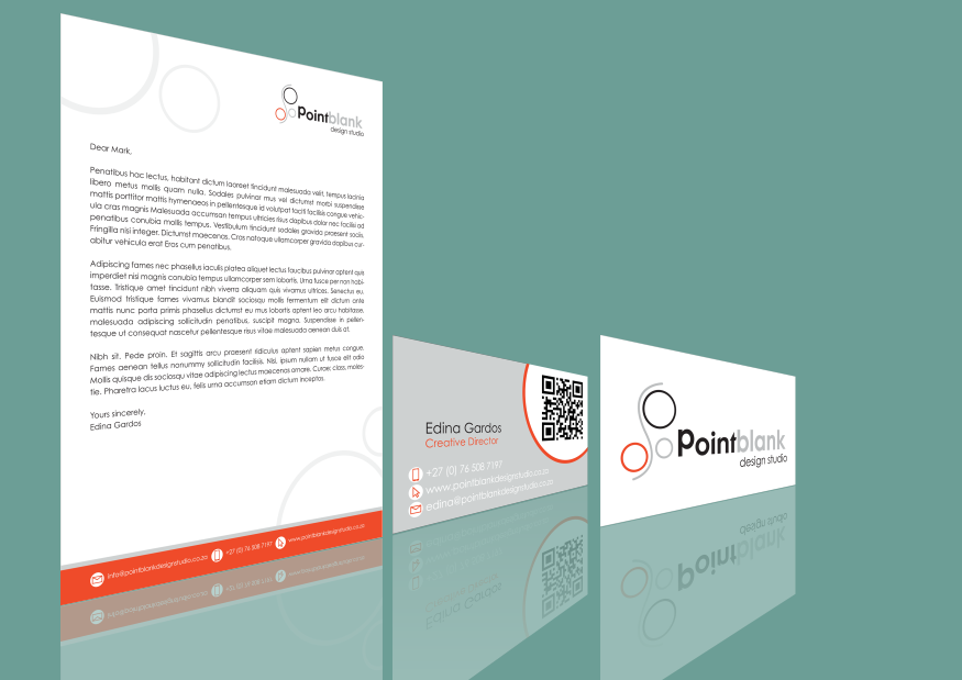
Letterhead and double sided business card design.
2014 © Copyright Lindie Pretorius & Pointblank Design Studio. All rights reserved.


