


Tamani: The Intersection of Elegance and Convenience in Supermarket Retail
Amidst a plethora of supermarkets, Tamani emerges as a distinguished entity. It epitomizes a harmonious blend of elegance and convenience, seamlessly integrating top-notch quality with refined style. Whether one seeks to fulfill their grocery needs or explore the latest technological innovations, Tamani stands as the premier destination of choice. Our foremost objective in crafting Tamani's identity lies in accentuating colors that exude comfort, instilling confidence and promoting well-being. Thus, we have strategically incorporated green as the primary hue, comprising 65% of the color scheme, along with the vibrant touch of yellow, symbolizing joy, happiness, and a deep-rooted connection to nature.

Let's start with logo...
Tamani is a professionally designed logo that embodies simplicity and clarity, ensuring its appeal to diverse audiences. It features a leaf icon, representing health and nature, in a visually pleasing manner. The logo's minimalistic approach allows for easy recognition and effective communication of its core values. With Tamani, we aim to create a lasting impression that resonates with individuals and groups alike, promoting the importance of wellness and the beauty of nature.

Our logo may be used in Natural Green, Darker green, and light gray

Clearspace

Icon


Colors...
Our lead color is Green.
It’s confident, vibrant and Natural.
We use it carefully in everything we do.

Primary colors

Secondary colors

Typeface...
Campeche Display
We have one typeface we use for all of our headlines Compeche Family.
Nexa
Our secondary typeface is Nexa Family. It is used across all body copy when we need to be a bit more clear and digestible versus expressive. We use Inter Medium for the most part, but will occasionally highlight keywords or phrases in Inter Semi Bold.

URW Geometric Arabic
We have one arabic typeface we use for all of our headlines across all body copy when we need to be a bit more clear and digestible versus expressive. We use Inter Medium for the most part, but will occasionally highlight keywords or phrases in Inter Semi Bold.

Pattern...
Leaf icon

Doodle

Mockups...


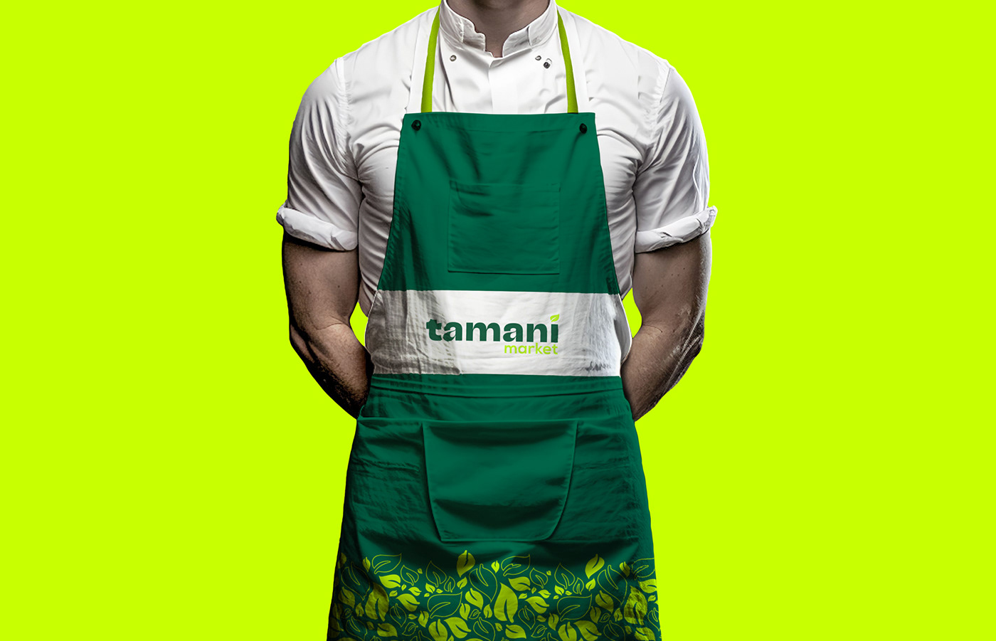


Tamani Market
Industry: Beverages
Agency: Meld® Studio
Art Direction and Execution: Ahmad Aljazzar
all copyrights reserved to meld studio
Thank You!


