


Q - S P A C E
[queer space]
—visual identity:
logo & key visual
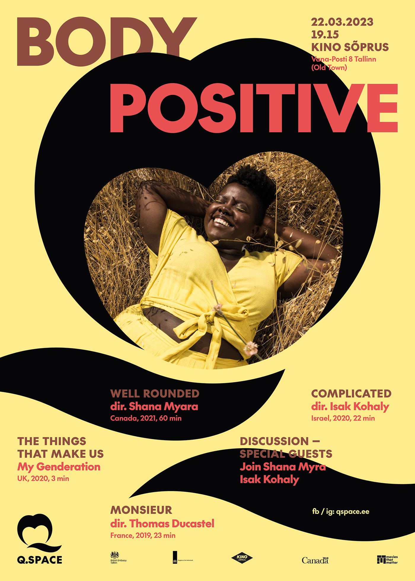
LGBTQ+ / feminist / human rights focused organization based in Estonia
For Estonia LGBTQ+ issues are still difficult (even traumatic) to talk. It remains unarticulated and quite invisible. Therefore visual identity of Q-space was supposed to uplift people, create empathy and make people feel proud.


The symbol stands not only for a seagull but also for letter Q meaning queer.
It could resemble heart (love) as well.


