


This was my first attempt at Kinetic Typography. With a lot of mistakes, timing issues and luck, finally the video was ready within 7 weeks.
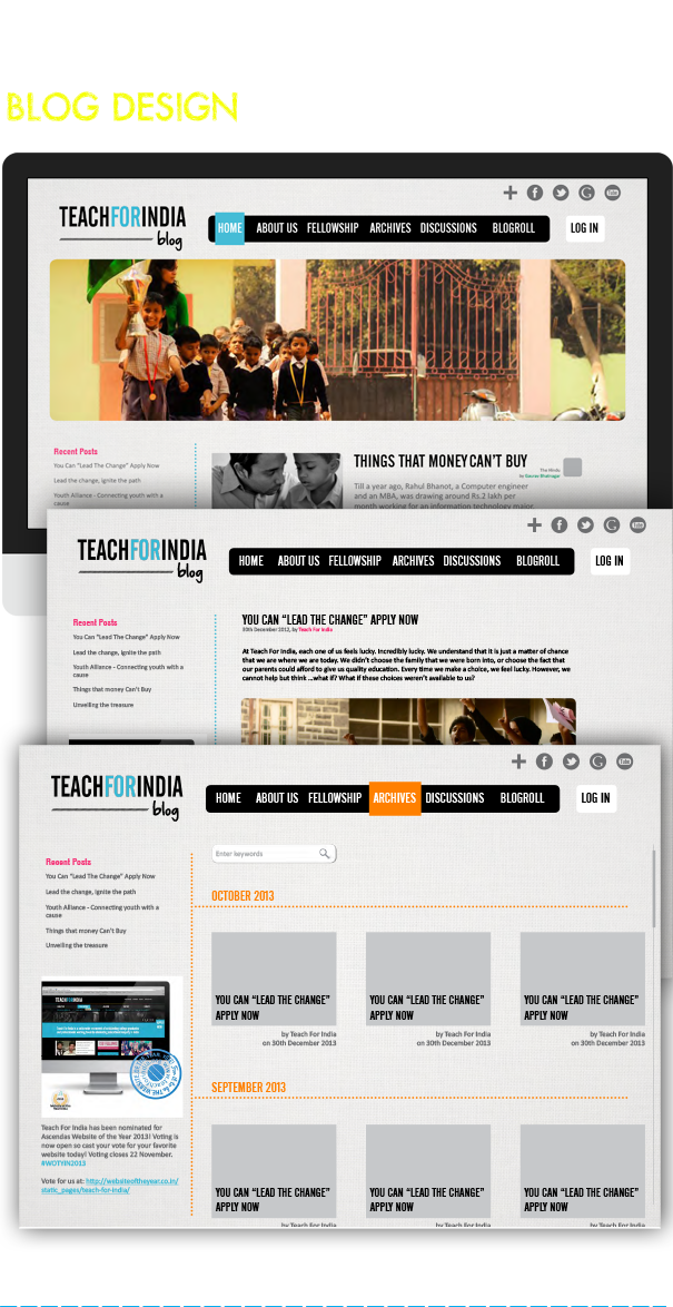
A blog is the basis of emotional value of an NGO, that relies on it's social objective. It had to be something different, firendly for all ages, happy and most importantly caring. My objective was to bring out the joy of blogging for the fellows and the simplicity of reading for the partners.

Fellows of Teach For India usually experience a lot of chaos for jobs, once after an intensive two years' fellowship is over. There is also a lot of emotional connect towards the organisation, that they find hard to get rid of. This portal was designed to organise their data towards jobs, having sections for even employers to post jobs. The UX was designed in such a way that it does not talk about the organisation much and makes connecting the dots between various employment related information easily accessible.

An everyday-activity of being in a place like Teach For India as their Design Associate was to continuosly keep creating social media posts, news keeps coming in and it needs to continuosly pop up on your screens for notifications.


