Title: 720 Degrees
720 was a project to ensure the sustainability of Bees. With the number of bees decreasing, 720 Degrees is a company using honey in various products from health to skin care. They use the profits from these products to put back into bee conservation that focuses on growing the bee population.
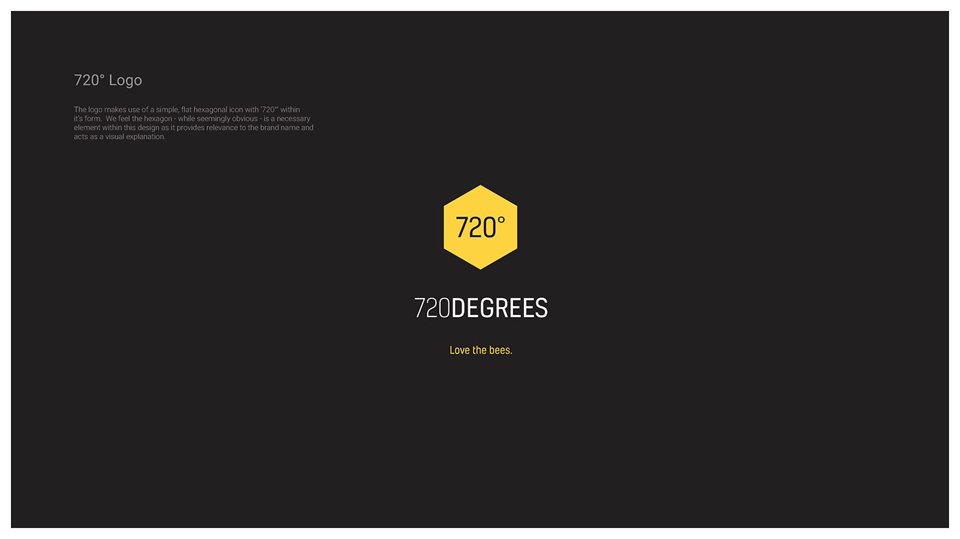
The logo makes use of a simple, flat hexagonal icon with 720°' within its form. We feel the hexagon - while seemingly obvious - is a necessary element within this design as it provides relevance to the brand name and acts as a visual explanation.
Each sub-category of 720° is visually defined by a simple, descriptive icon which fits perfectly into the hexagonal form of the original logo. This is symbolic of 720° being the holding company and creates fluidity and uniformity throughout the brand.
While each icon is uniform in its birth, each will develop its own unique style and identity that will set it apart from the mother brand. Clear distinctions can be made with the use of colour, layout, treatment of type and imagery.
Industry:
- Sustainability
- Health & wellness
- Slogan
- Brand Identity and guidelines
- Sub-Catagories
- Infographics
- Packaging