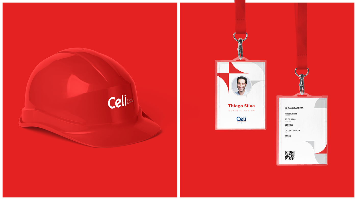
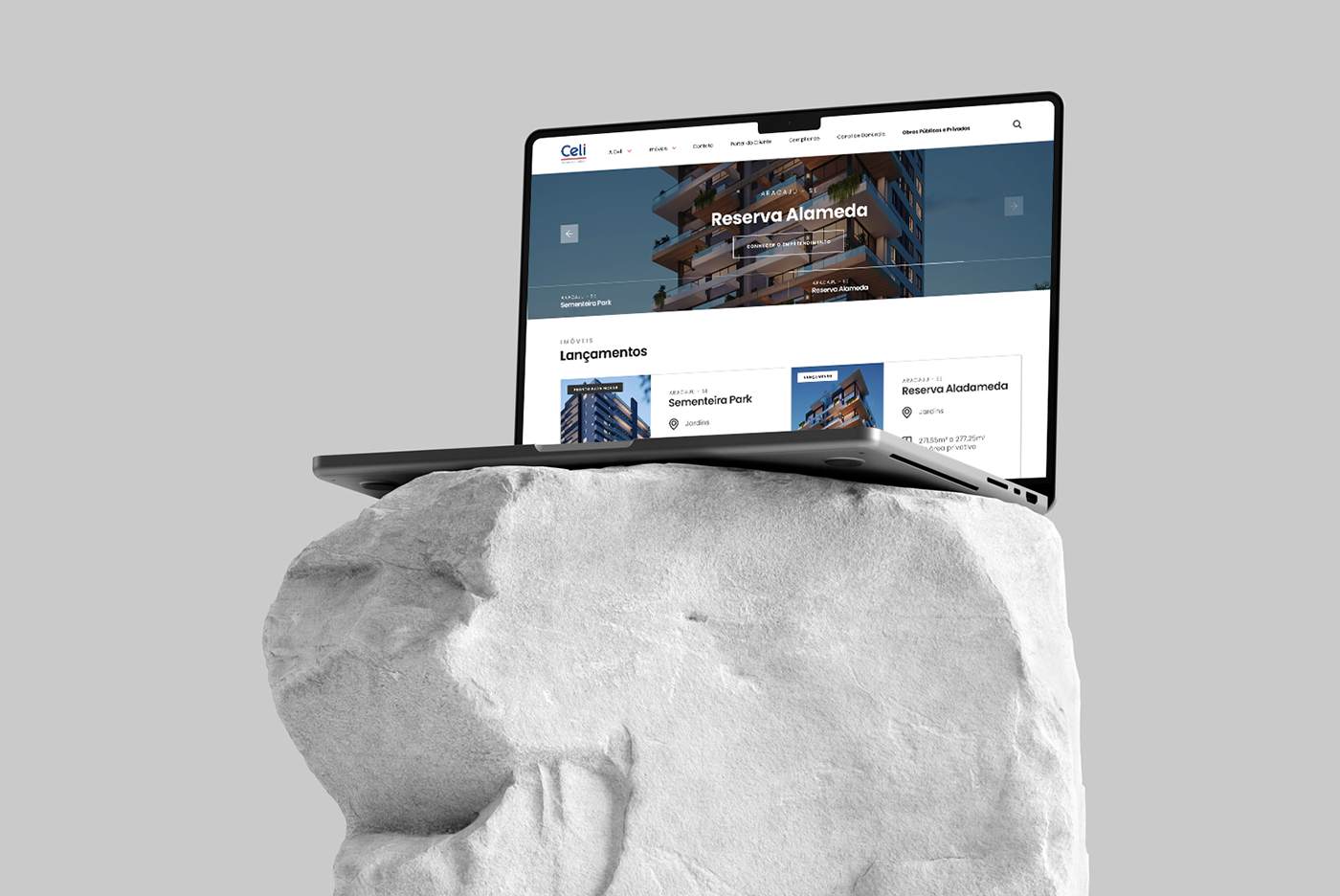
A Construtora Celi, fundada em 1968 pelo engenheiro civil Luciano Franco Barreto, como uma empresa sergipana que se destaca nacionalmente no setor da Construção Civil. A empresa possui matriz em Aracaju e atua em diversas cidades do país. A Celi investe constantemente em novas tecnologias e na qualificação de seus colaboradores para a realização de obras de engenharia civil, abrangendo empreendimentos imobiliários, edificações públicas e particulares, obras industriais, construção de conjuntos habitacionais, saneamento e infraestrutura básica, pontes e viadutos. A empresa preza pela solidez financeira e segurança nos investimentos, transmitindo segurança, confiança e credibilidade aos clientes.
EN_
Construtora Celi, founded in 1968 by civil engineer Luciano Franco Barreto, as a Sergipe company that stands out nationally in the Civil Construction sector. The company is headquartered in Aracaju and operates in several cities across the country. Celi constantly invests in new technologies and in the qualification of its employees to carry out civil engineering works, covering real estate developments, public and private buildings, industrial works, construction of housing complexes, sanitation and basic infrastructure, bridges and viaducts. The company values financial strength and security in investments, transmitting security, trust and confidence to customers.
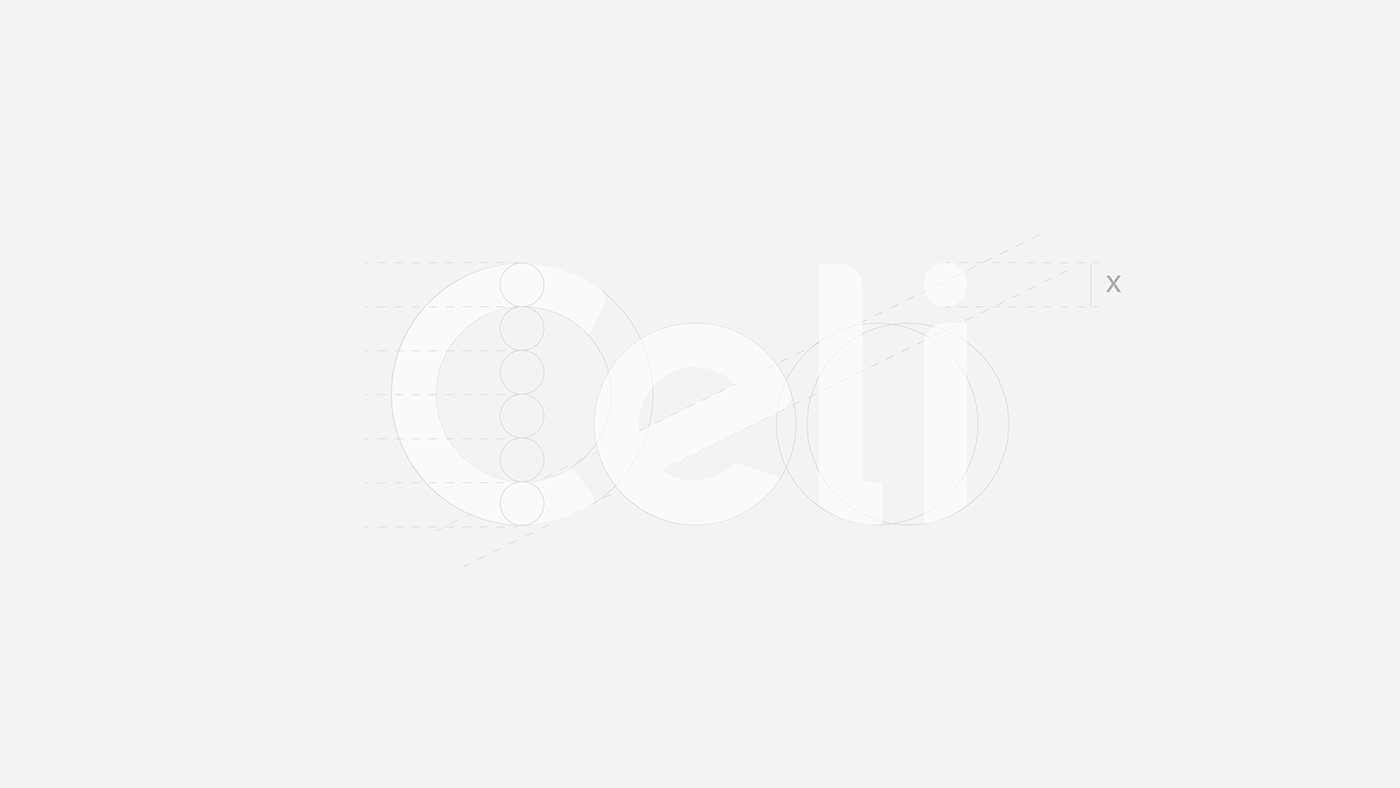
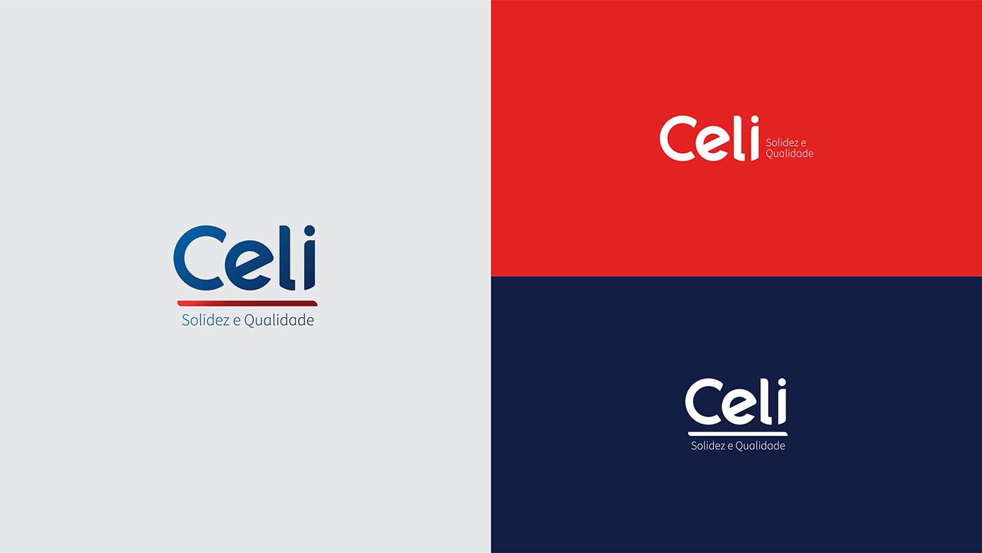
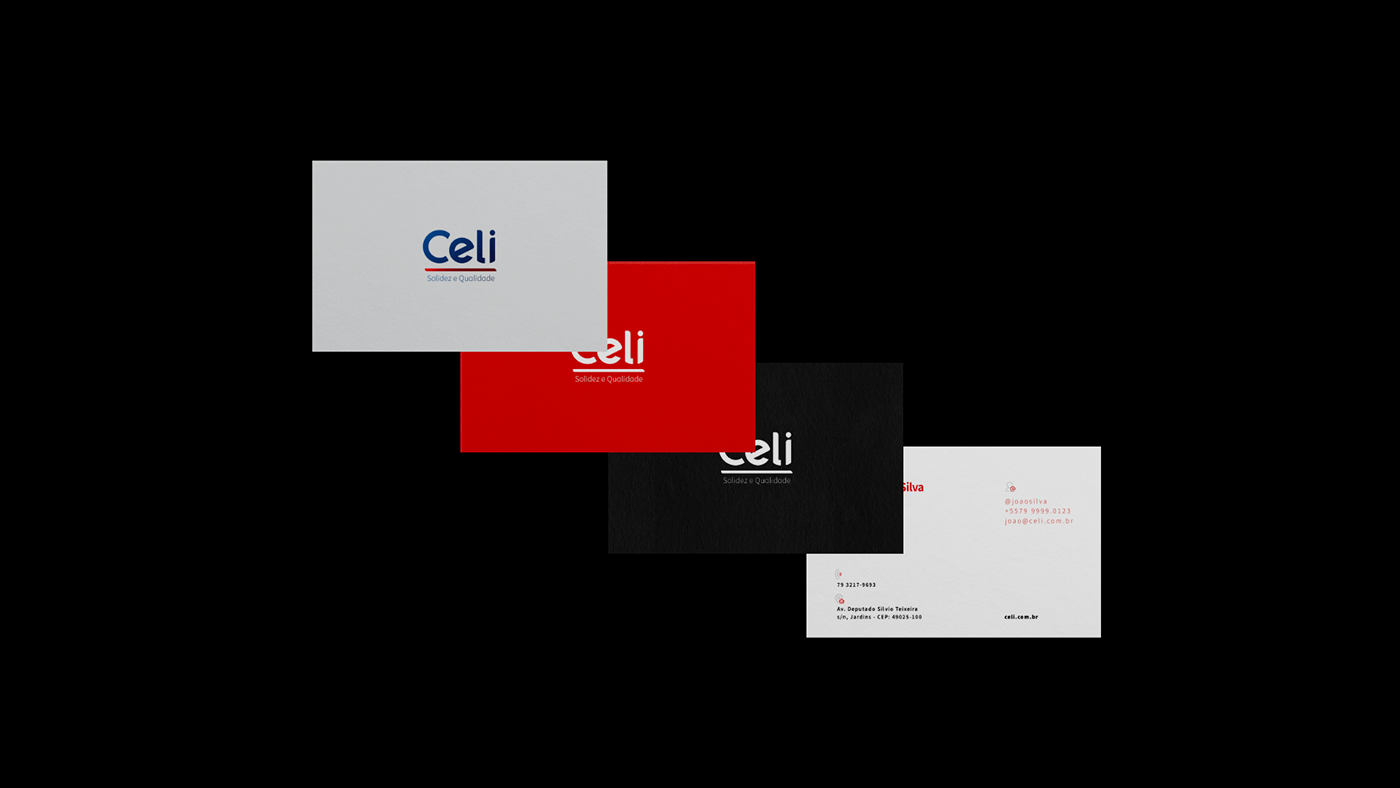
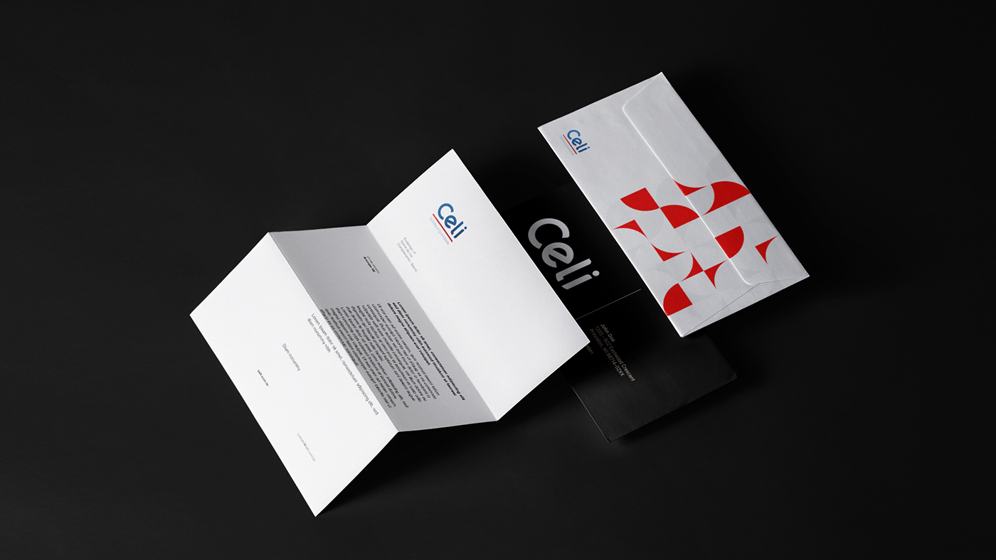
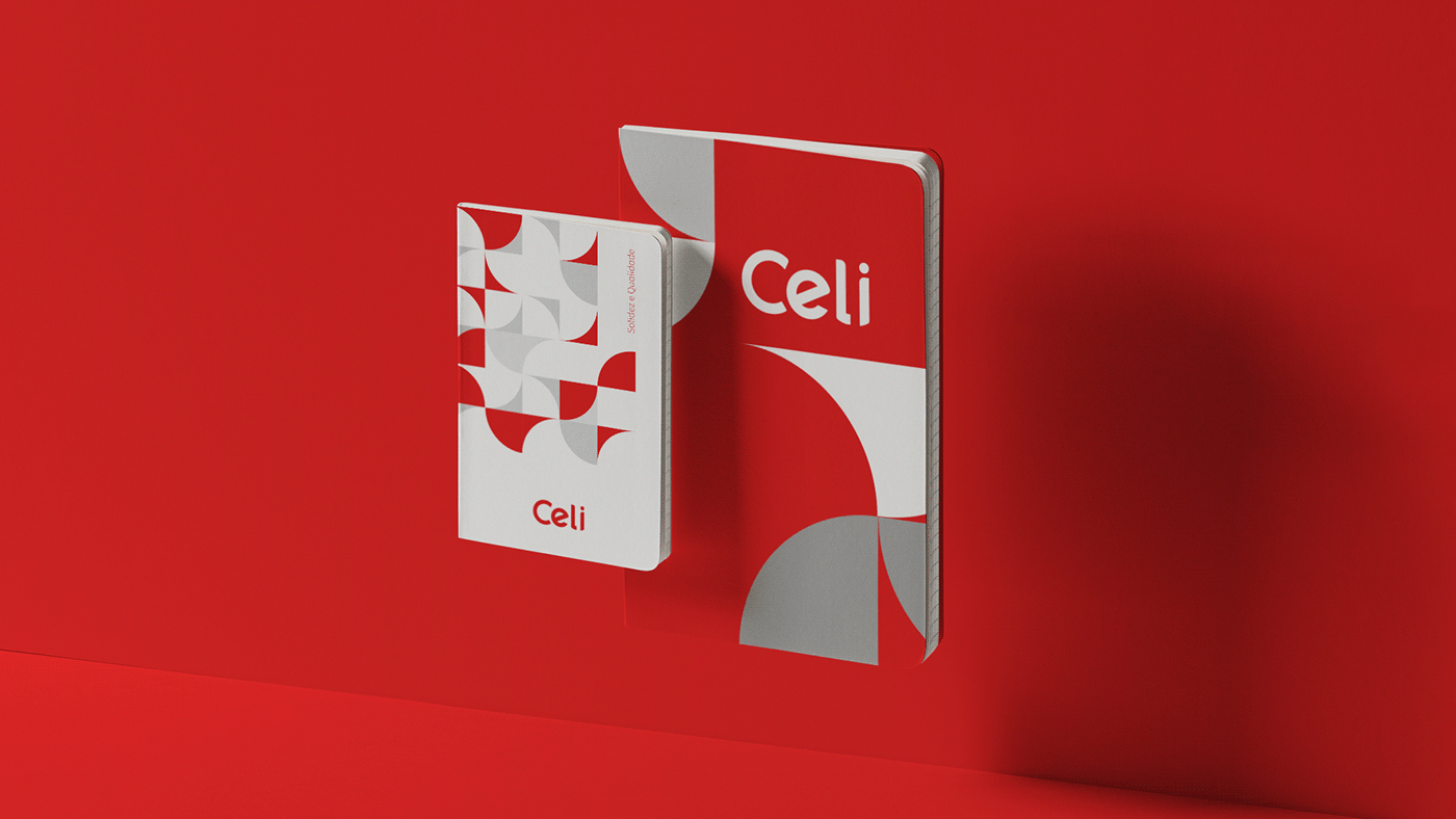
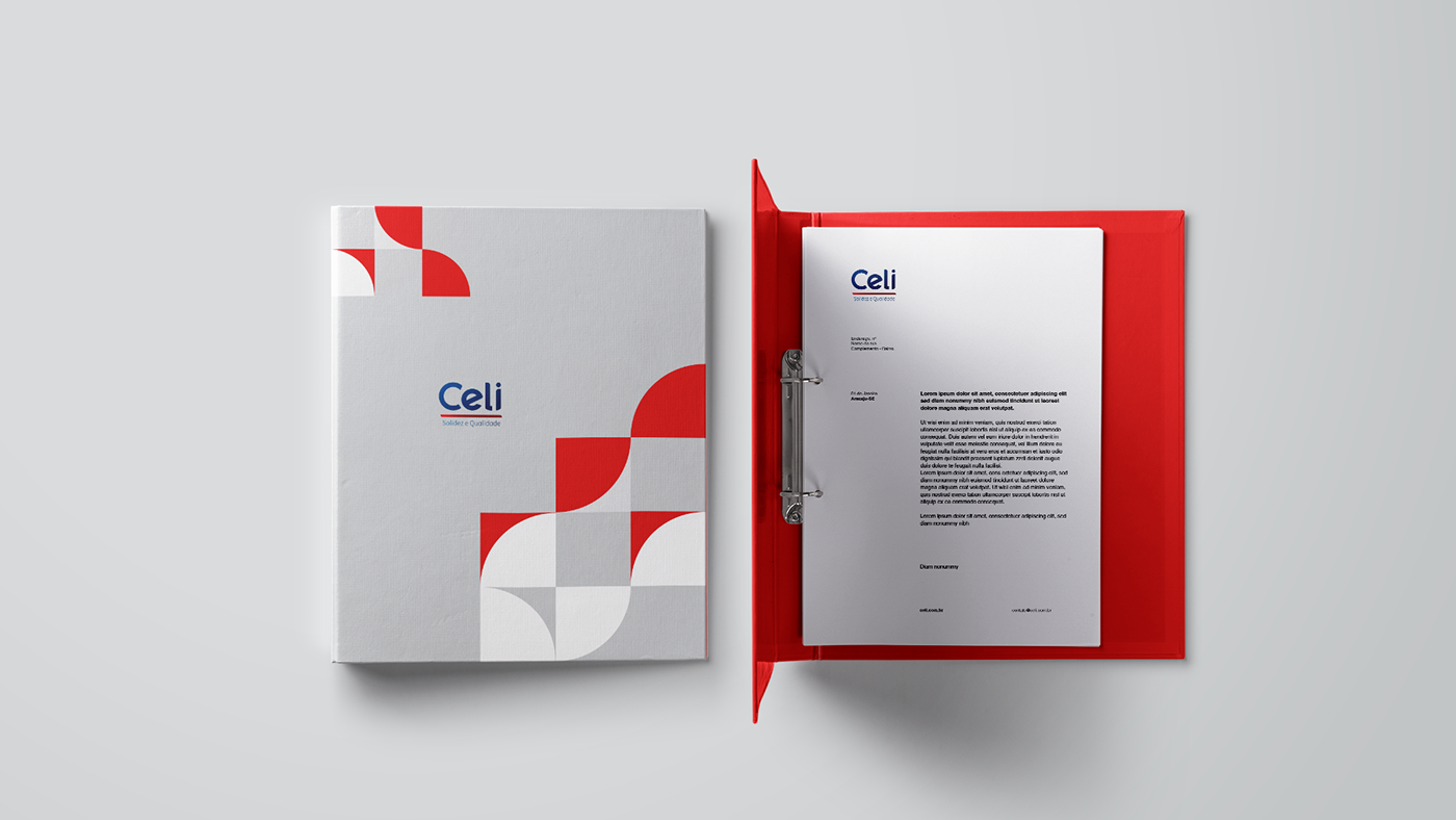
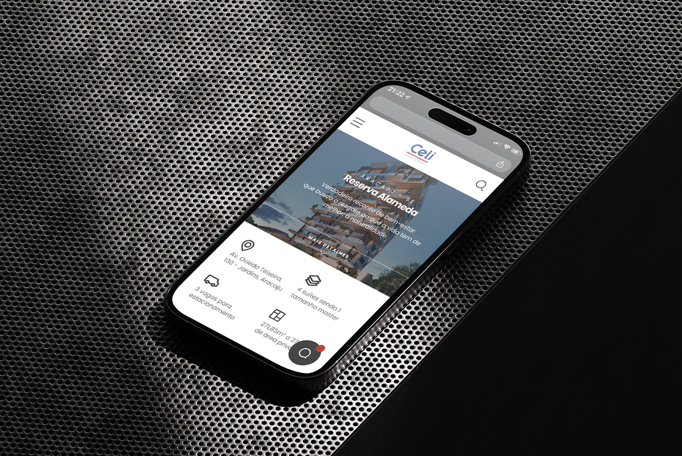
O nome Celi é forte e familiar a todos, por isso a solução foi torná-lo mais nítido e moderno.
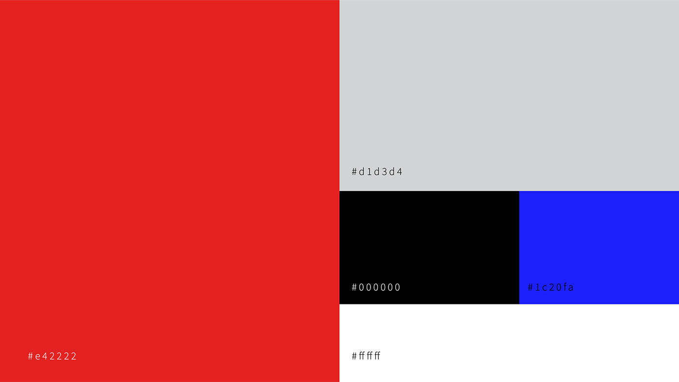
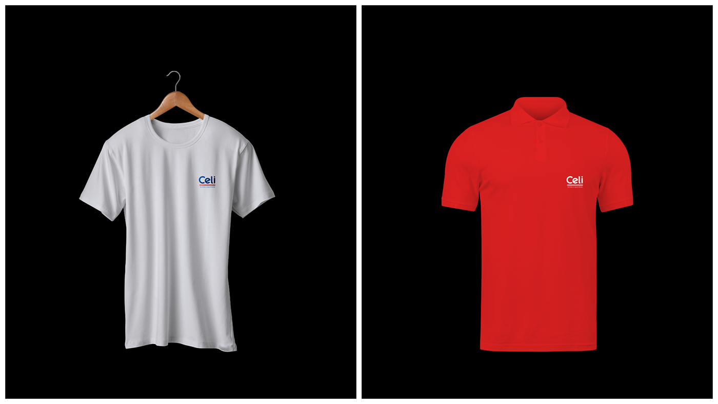
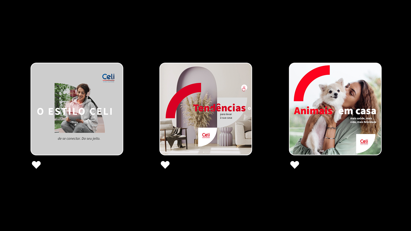
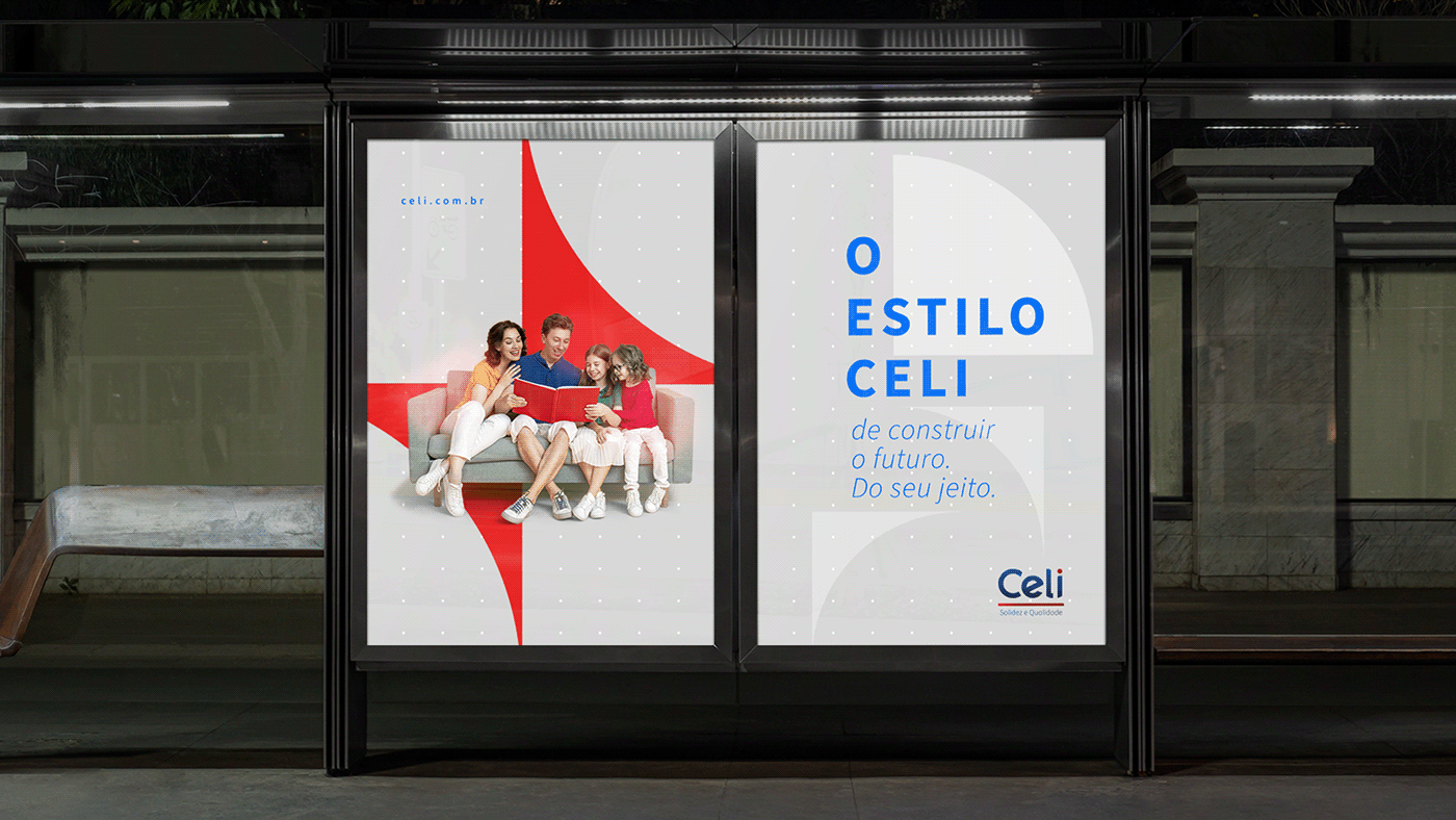
Em cima das cores atuais, definimos novos tons para a identidade, que fornecem uma hierarquia limpa e de fácil entendimento, tanto em materiais impressos quanto em elementos digitais.
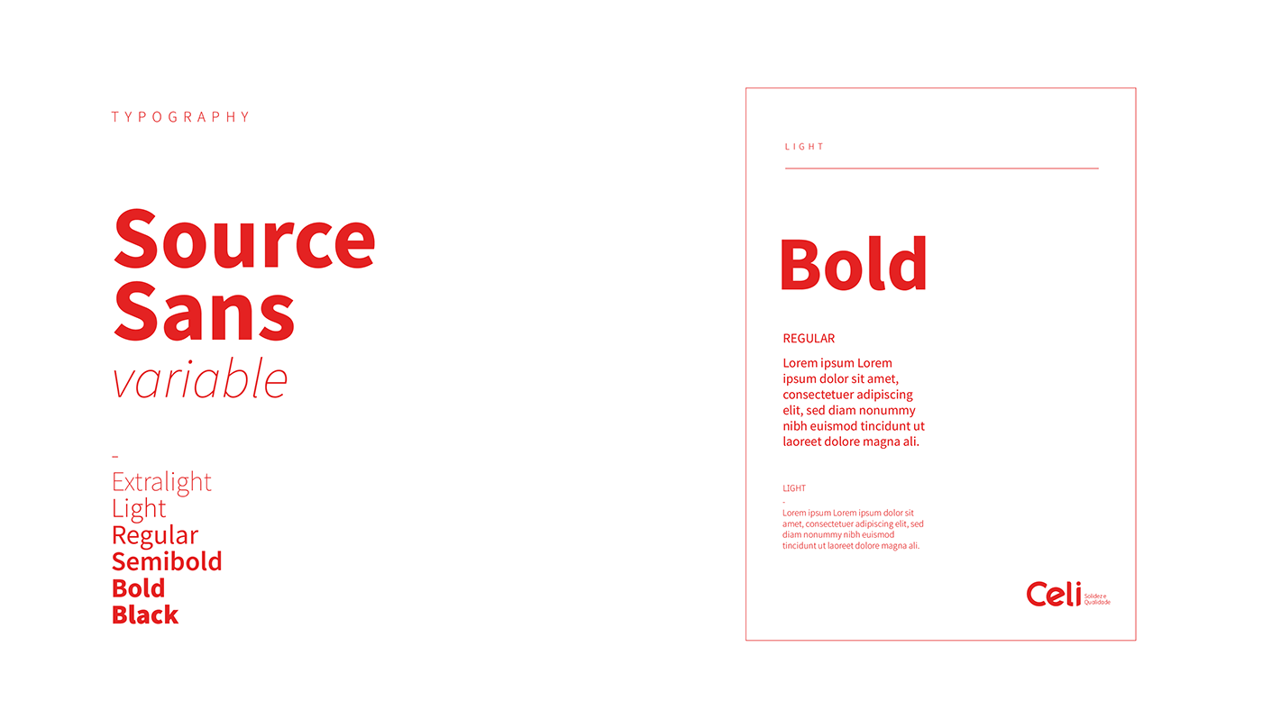
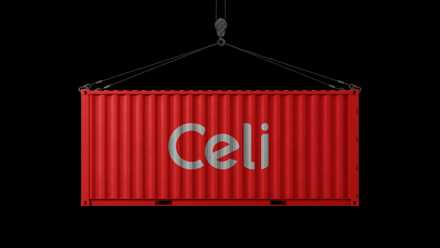
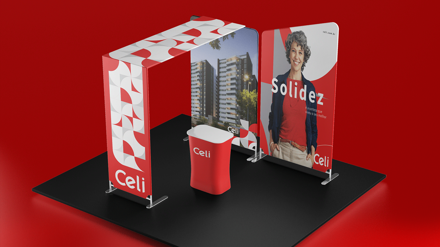
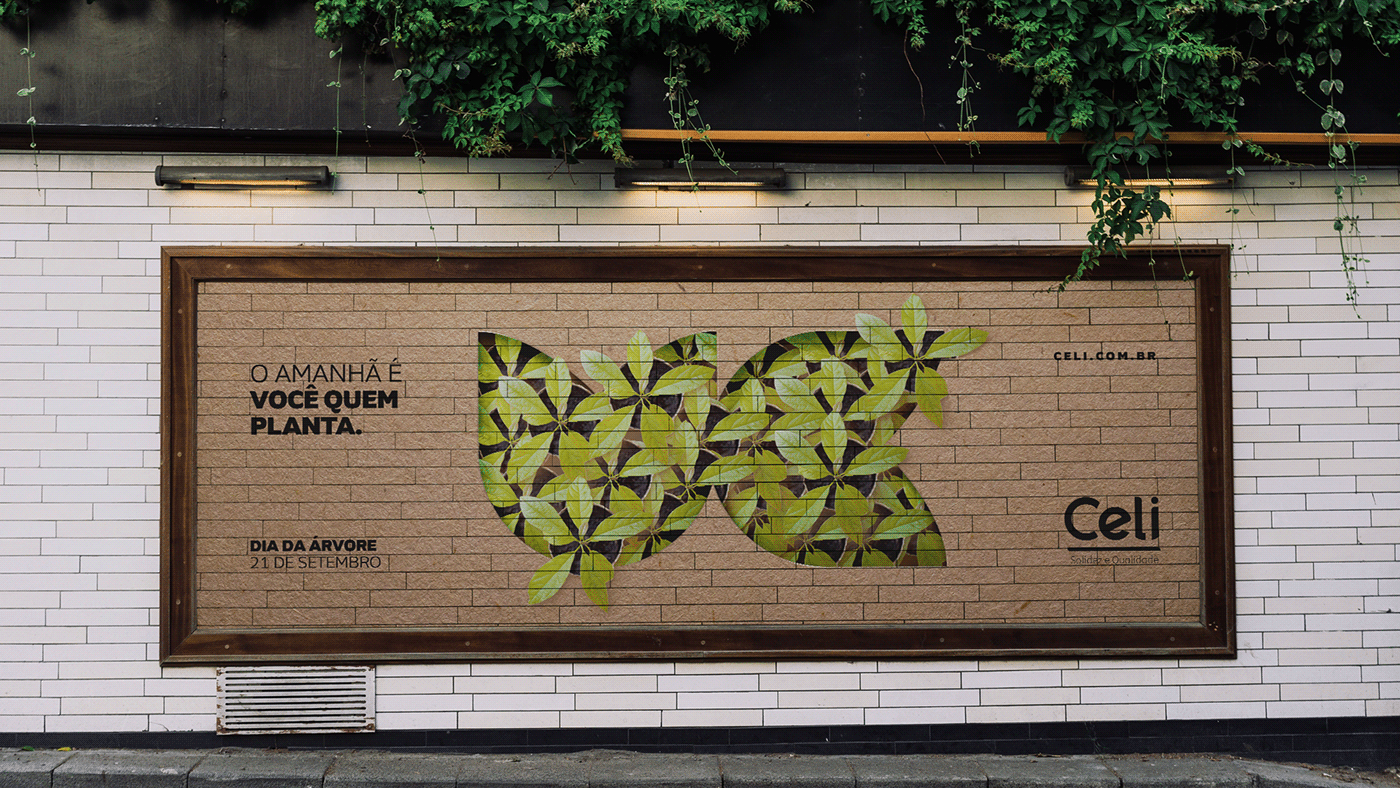
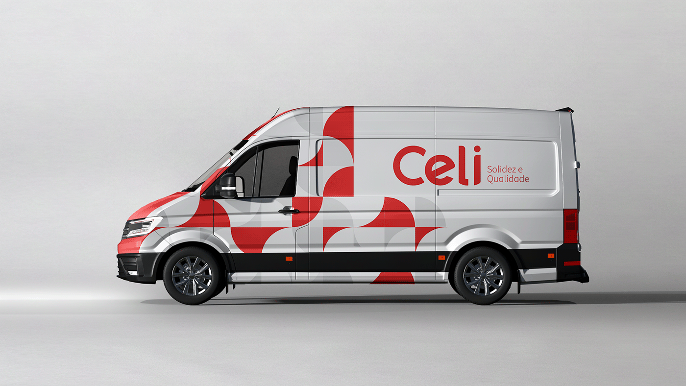
A família tipográfica também foi pensada para caminhar junto aos valores que a empresa carrega consigo, por isso a escolha de uma fonte sóbria, moderna e legível. Por fim, partindo do elemento chave (o círculo), foram desenvolvidos grafismos de apoio para fortalecer e compor a nova identidade.
EN_
The Celi name is strong and familiar to everyone, so the solution was to make it clearer and more modern.
On top of the current colors, we defined new tones for the identity, which provide a clean and easy-to-understand hierarchy, both in printed materials and digital elements.
The typographic family was also designed to walk with the values that the company carries with it, hence the choice of a sober, modern and readable font. Finally, starting from the key element (the circle), support graphics were developed to strengthen and compose the new identity.