


Training to Life (TTL) is a holistic training program based in Barcelona that helps their clients achieve physical and emotional wellness through a methodic process that integrates a healthy and sustainable lifestyle where nutrition and mindfulness are key to achieve wellbeing.
With TTL, you’ll get a workout plan combined with the nutrition that’s right for you and with the counseling that will help you build a sustainable healthy lifestyle.
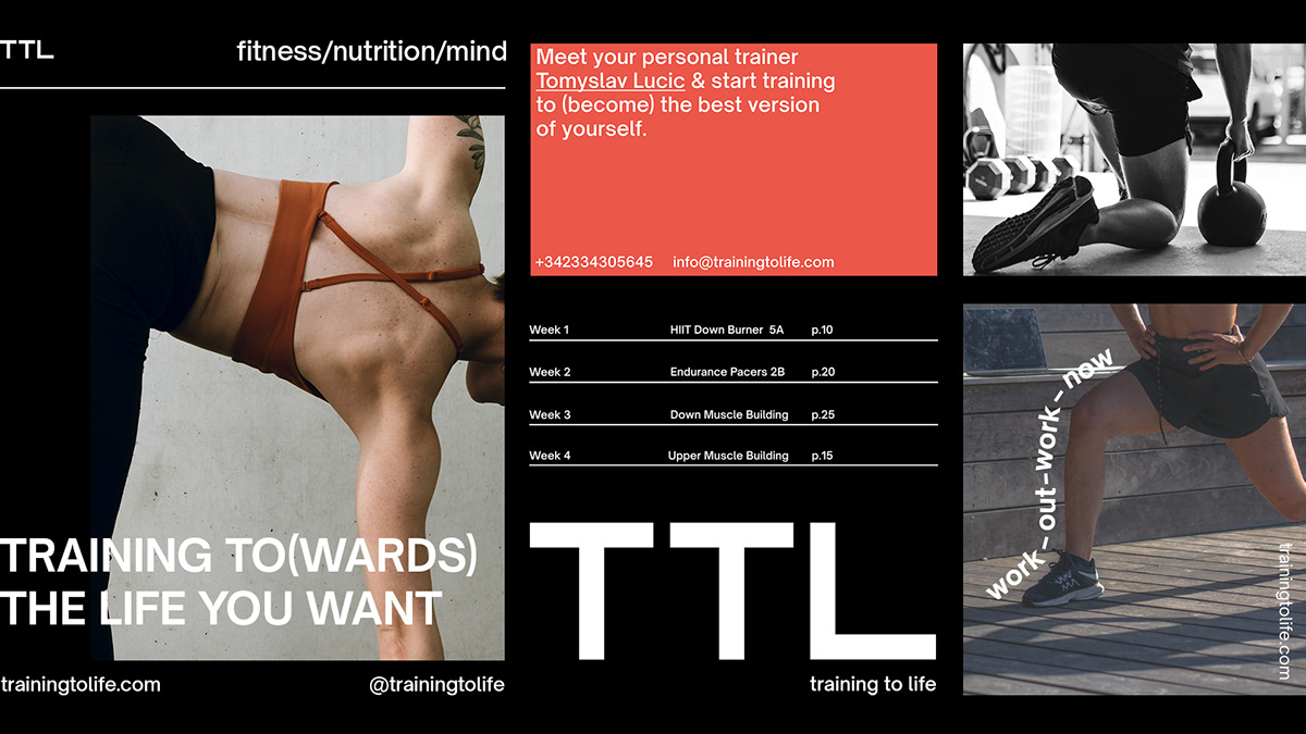
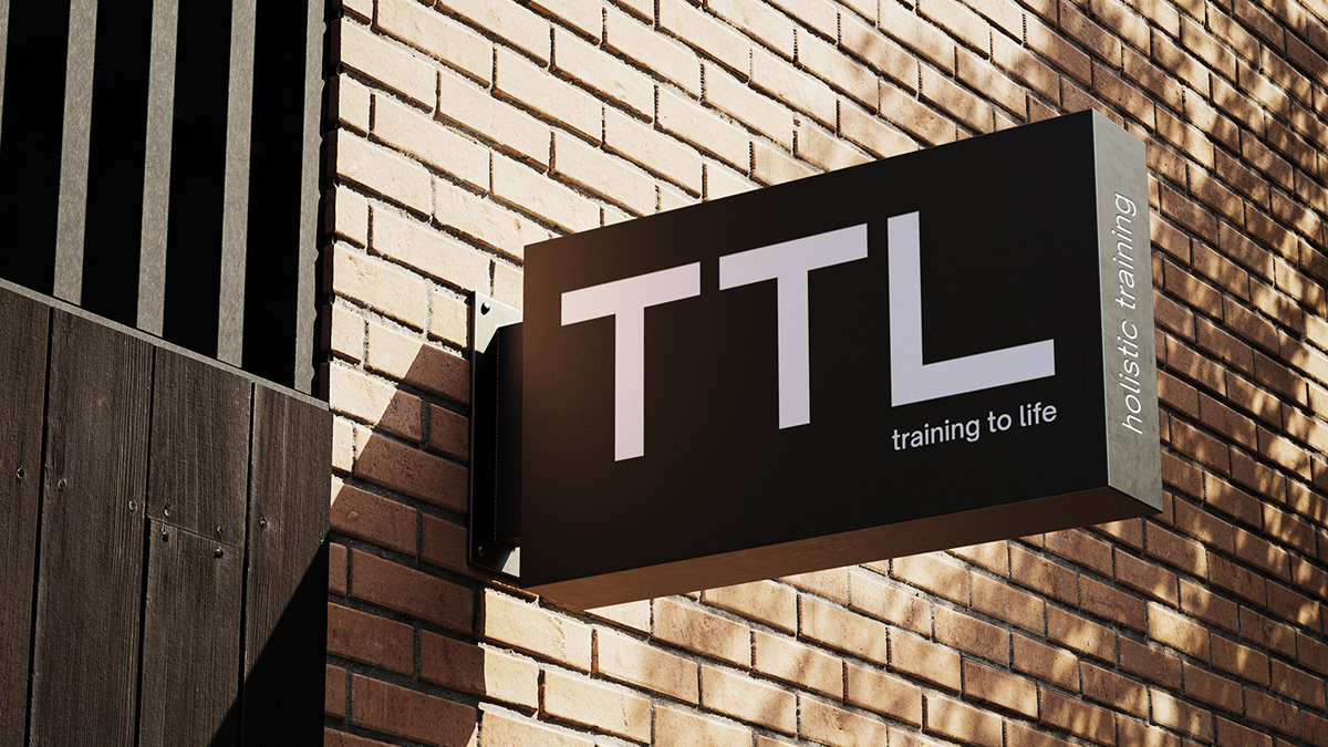
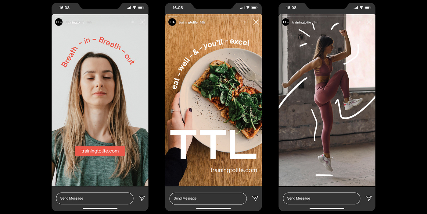
Their visual system includes a variable logo that was built from Gigantic FS, a sans serif font designed by Ridwan Fadilah that distinguishes itself by its geometric appearance and boldness, illustrating the direct tone of voice that TTL uses. The secondary font is Open Sauce Semibold, a compact typeface designed by Alfredo Pradil that allows us to display the full name of the brand as well as specific content (fitness,nutrition, mind) through a flexible descriptor that varies in order to highlight the different core elements depending on the intention behind the content creation of TTL.
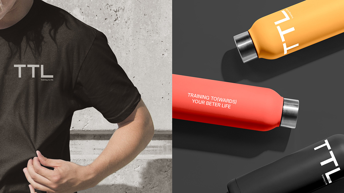
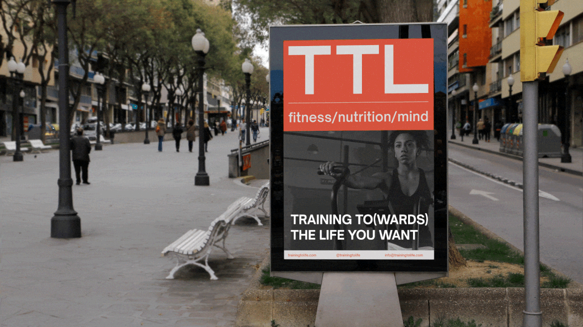
Through all of its touchpoints, the TTL layout grid comes from the logotype, creating a consistent structure that ties TTL’s digital and printed products together.
With TTL, you’ll get a workout plan combined with the nutrition that’s right for you and with the counseling that will help you build a sustainable healthy lifestyle.
Their visual system includes a variable logo that was built from Gigantic FS, a sans serif font designed by Ridwan Fadilah that distinguishes itself by its geometric appearance and boldness, illustrating the direct tone of voice that TTL uses. The secondary font is Open Sauce Semibold, a compact typeface designed by Alfredo Pradil that allows us to display the full name of the brand as well as specific content (fitness,nutrition, mind) through a flexible descriptor that varies in order to highlight the different core elements depending on the intention behind the content creation of TTL.
Through all of its touchpoints, the TTL layout grid comes from the logotype, creating a consistent structure that ties TTL’s digital and printed products together.
For this project, we developed every visual and strategic aspect of the brand, from naming, brand proposal, to service communication and every visual aspect.
Sr. Designer & Art Director: Camila Curiel
Designer: Ariana Irady
Art Direction, Branding, Graphic Design
Sr. Designer & Art Director: Camila Curiel
Designer: Ariana Irady
Art Direction, Branding, Graphic Design


