

The UX Process (or the "Design Thinking Process") for the Project is depicted in another Project post, "A UX DESIGN PROCESS + CASE STUDY FOR THE CDPH".
Proceed here to take a peek at it.
Proceed here to take a peek at it.
Recap


We've done the wireframes (Above)
Style Guides
There was no direction from the California Department of Public Health (CDPH) on what to utilise for the style of the website. What this meant to others is that we could use any colour, font, and graphics we want.
No. I thought it was best to preserve the colours they were already using—for the following reasons:
No. I thought it was best to preserve the colours they were already using—for the following reasons:
• Their institution has an established branding identity (the colours, the logos, the fonts, et al.). It would be expensive to change every existing piece of branding present they have on their buildings, doors, rugs, notebooks, and those really nice giveaway mugs.
• There was nothing wrong with their colours. They're actually following a split complementary rule. As well as branding must be a client decision after all (regardless of their disinterest in these matters)
Colours
To find the best colours for the website, I had to stick to branding and to stick to branding, I needed their current logos.


Logo Variations: They didn't give me the master files for these logos, but because I'm so good at what I do, I made the vector files of their logo from scratch. Identifying the exact fonts for every typography used in the logos was easy.
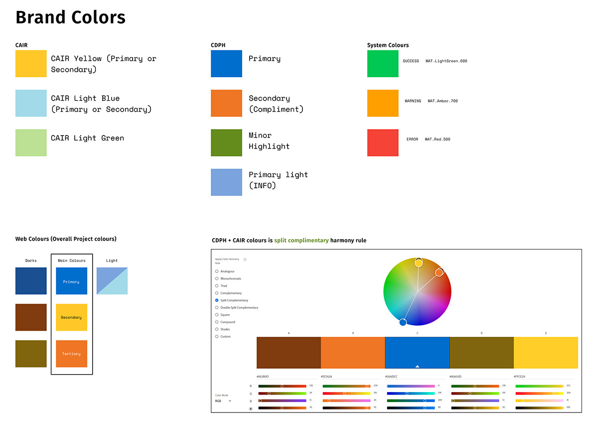
Taking from ideas from the brand colours, I narrowed down to using Pantone© 300 C (Blue) and 109 C (Yellow)
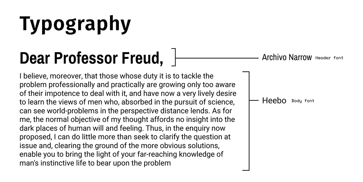
Having figured out our Colours and Typography...
My Primordial Concept


The Prototype
Best viewed in desktop or devices with a mouse pointer. Prototype may be inoperable on Mobile. Figma Mobile doesn't support on Hover events.
A Little History...
Building The Modernized CDPH Immunization Website, or as we call it: “project CDPH-IZ-MOD” (and later formalized to "CAIRHub") was supposed to be a rehash of the first two projects that the company made: the PBMS and the CAIR-ME sites (below)


These are the original M Corp success stories: Our good boss Arman and his team churned this out quickly and delivered it. However, the fast delivery has drawbacks, which you can see on the website. Lack of design, Material Theming was non-existent (it's Using Angular's default Pink + Indigo) and lacks a design-accessibility critical component of Responsive Web Design.
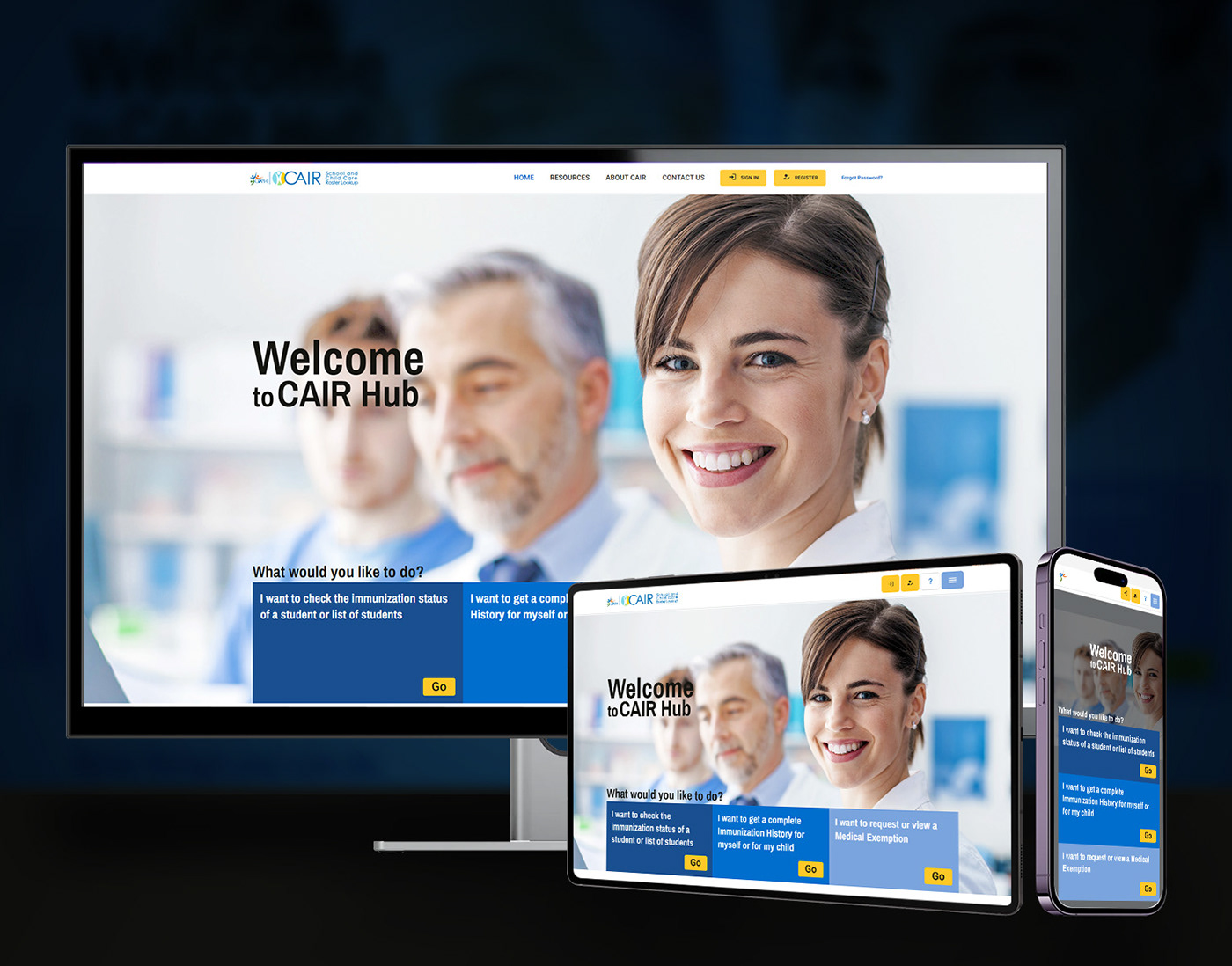
This is what my CAIRHub (CDPH-IZ-MOD) solved.
Specifications:
Tech Stack: Angular, C#
Notice: The live production site will be drastically different because of various client requests, and changes in requirements. Authentication is required to view the full site, and to have access, you need to be a part of CDPH or have business in Public Health.


