


GALVANIZE
Building from Legacy
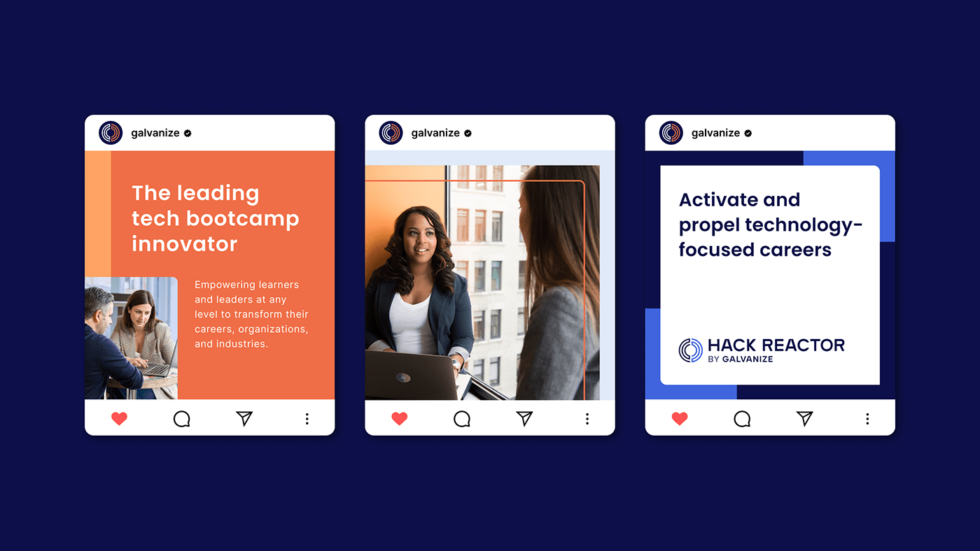
Galvanize and Hack Reactor tasked us with bringing the two distinct brands together to gain recognition as a family of brands vs separate entities. We developed a brand strategy to strengthen recognition across services through our discovery and audit findings. This led us to evolve and update Hack Reactor’s logomark as the unifying symbol for both brands due to its audience’s brand recognition.
We then developed an identity system that leveraged both brands' equity through color and graphics, iconography, and a photo style that could be used by both brands to further connect the family of brands. Each got its own unique color in order to further visually strengthen the brand language while giving the audience a clear signal distinction of which segment of the company they’re communicating with.
Our success in unifying the two brands and strengthening recognition across services, while maintaining the equity of each, brought significant value to our client. The brand guidelines we created with creative direction given to the Galvanize team, supported other partners in building out the new website, and will support the internal teams in their marketing efforts as the company grows.


Client
Galvanize
Creatives
CCO: Dava Guthmiller
Associate Creative Director: André Carnevale
Strategy Director: Miriam Stone
Galvanize
Creatives
CCO: Dava Guthmiller
Associate Creative Director: André Carnevale
Strategy Director: Miriam Stone
Strategy: Sara Leslie
Designer: Xiaoxiao Ma
Design Intern: Montana Siddle
See the full case study at Noise13.com


