

Very rapid development of business cards
It’s often been said that my best design work is fear-driven...that is, it is created in the panic of a rapidly-approaching deadline. In my previous career as a professional engineer, this was known as “rapid prototyping” or “simultaneous engineering”...most normal people, however, would simply call it “procrastination”.
I was faced with an opportunity for some fear-driven design last week...as I was getting ready for an evening design event, I discovered that I had run out of business cards. There was no time to obtain new cards from the printer, nor did I have access to exotic card stock. I needed to design & produce an acceptable card in about an hour, using only the materials in my home studio.
Fortunately, I did have a supply of Canson 55 lb translucent vellum remaining from an old school project. It gave me the idea of printing on both sides of the vellum so that back would be visible through the card when viewed from the front.
Since typographic deconstruction is a particular interest of mine, I immediately seized upon the idea of working it into the card design. I took one of my existing experiments in deconstructed type – the Derrida poster – and generated a series of typographic images cropped beyond the point of recognition, in a manner similar to the later work of Abstract Expressionist Franz Kline. These croppings were printed across the back of the vellum sheet to create a unique background image for each card when cut.

Stack of cards. The translucent vellum creates a layering effect, allowing the typographic detail of the cards beneath to show through.

Four cards partially overlapping each other, showing four different croppings of deconstructed type.

Four variants on the background image. The front of each card is identical. By using different croppings of the back image, each card becomes unique, with no two exactly alike.
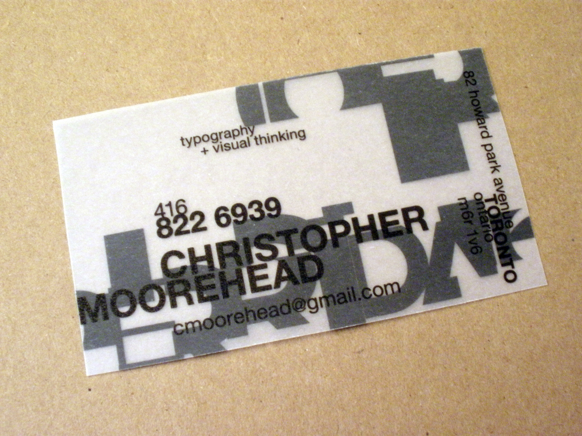
Card front detail. All type set in Alte Haas Grotesk, a soft-edge Helvetica variant designed by Yann Le Coroller.

Card back detail. The cropped, deconstructed type image is printed as if reflected in a mirror, so that it appears correctly through the vellum when viewed from the front of the card.

Detail of front of a second card, using an image with a greater level of deconstruction.

Back of second card. The deconstructed type is HTF Gotham, a very well-designed but unfortunately overused typeface. It is, however, rarely seen like this.


