Vitruv - The pursuit of perfection.
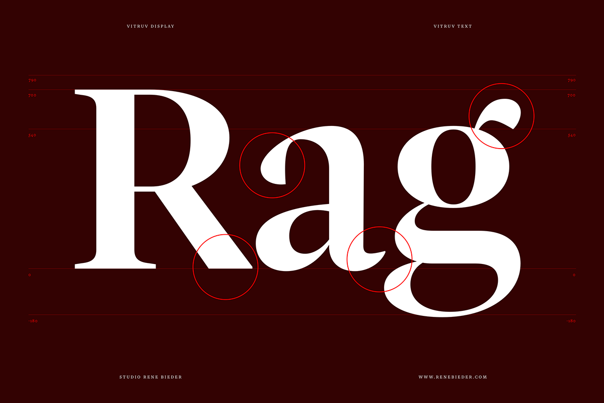
Named after the ancient architect Vitruvius, and namesake of Leonardo da Vinci's famous Vitruvian Man drawing, the typeface seeks to unite ideal proportions. It combines Garamond DNA with a high x-height to create a modern interpretation of french renaissance antiquas and the timeless masterpieces of the 15th and 16th centuries. It is available in two optical text sizes (display and text) with 12 weights plus matching italics.


Characteristics
Vitruv combines classical elements of french renaissance antiquas with a large x-height. It is available in two optical sizes (display and text).


Alternates
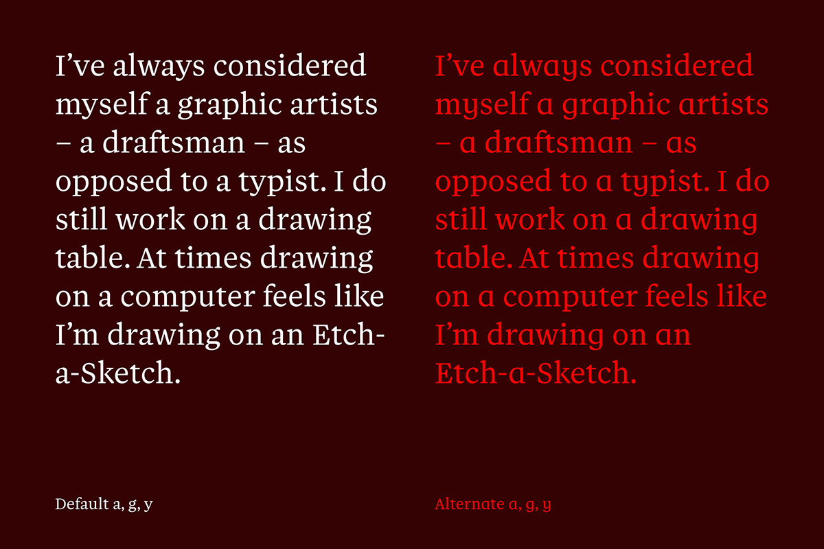
Vitruv comes with a hand full of alternates to allow you to customize the appearance of a paragraph. By applying these alternates, a unique brand font can be created with very little effort.


Ligatures
In order to avoid colliding characters, Vitruvs italic styles are equipped with many ligatures that create a nice eye-catcher when set in large sizes.


Languages
The family comes with with various language-specific characters and supports more than 200 languages based on the Latin character system.
Language extensions are available on request.


Opentype
Vitruv is equipped with modern Opentype features such as small caps, fractions, tabular figures, oldstle figures, contextual alternates and many more.


Styles
Vitruv is available in 6 weights weights with matching italics making it a truly versatile tool. All styles are optimized for digital and print use.


