Off the back of the success of our branding for Portuguese restaurant Bar Douro, founder Max Graham came back to us for help launching a street food spin-off to attract a wider, more youthful clientele.
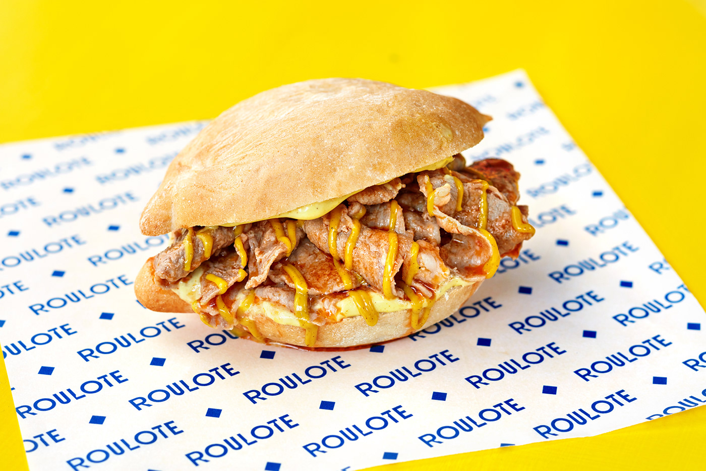
The popup was to be called Roulote, named after the street food carts in Portugal's cities, catering to a younger party crowd. The offer was simple, the classic pork Biffana (an iconic sandwich served from roulotes and tascas across Portugal) and an Octopus Roll which was a twist on cachorros (hot dogs) served from roulotes outside nightclubs.
For the brand, we started to look at the Roulote and its role in Portuguese nightlife culture. It was a place where friends meet, where lovers meet, and where passion happens.
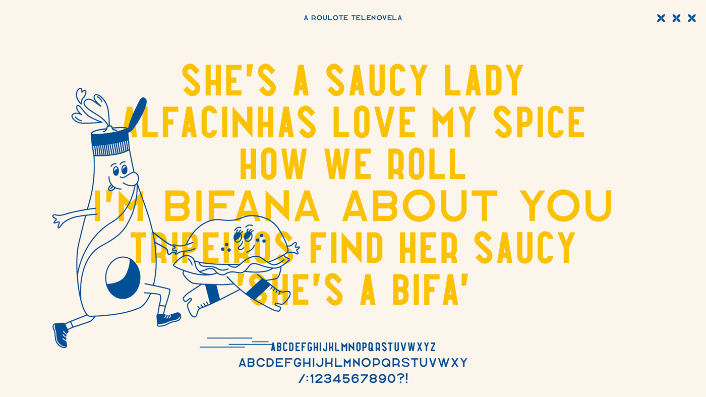
Roulote’s brand story plays on coming-of-age relationship experiences that many customers can relate to. The joy, the awkwardness and the ups and downs of a (new) relationship - our twist was to put the product, the Bifana and other characters centre stage. The brand was to be a Roulote Telenovela (soap opera), borne from Portugal’s love affair with the Bifana. For the launch illustrations, our cheeky Bifana starts a love affair with the Savora mustard (a staple condiment at a classic roulote stand).
Roulote’s brand story plays on coming-of-age relationship experiences that many customers can relate to. The joy, the awkwardness and the ups and downs of a (new) relationship - our twist was to put the product, the Bifana and other characters centre stage. The brand was to be a Roulote Telenovela (soap opera), borne from Portugal’s love affair with the Bifana. For the launch illustrations, our cheeky Bifana starts a love affair with the Savora mustard (a staple condiment at a classic roulote stand).
The resulting brand is energetic, characterful, authentic and honest. A deep dive into the street culture and nightlife of urban Portugal.
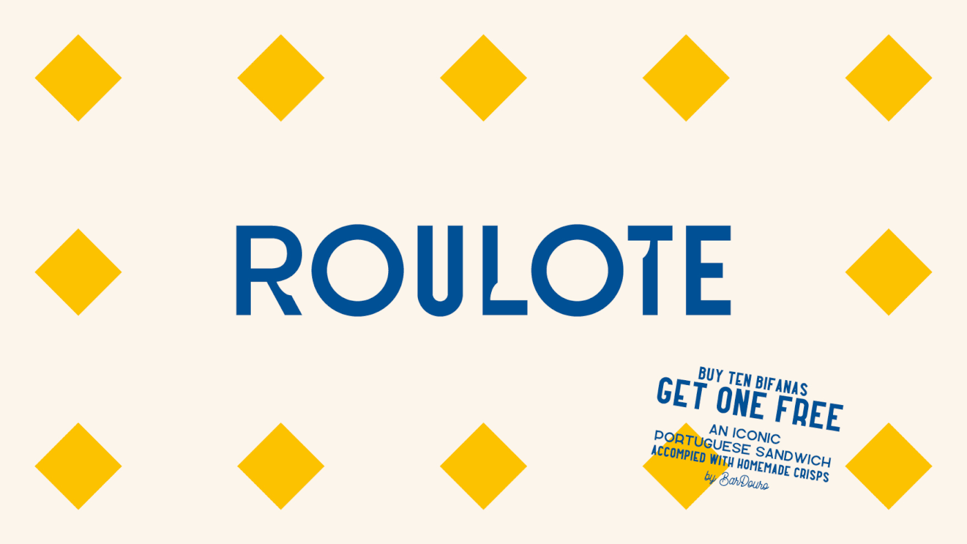
We were very keen to keep this cheeky and more relaxed offering still firmly connected with the more heritage, quality feel of Bar Douro’s branding. The R, L & T letters of the bespoke word mark were directly inspired by the serif lettering of Bar Douro, in this case, ‘bite marks’ were added to the letters. Energetic and cheeky Illustration and copy is juxtaposed within a system inspired by traditional Portuguese tiles and colours. By a process of reduction, we are able to take elements of these traditional tiles and give them a nostalgic, fast-food aesthetic. The kind of patterns familiar in diners and on cheap plastic tablecloths.
Full of energy, humour, and character, the brand is a tongue in cheek look at Portugals' love affair with the Bifana.
Full of energy, humour, and character, the brand is a tongue in cheek look at Portugals' love affair with the Bifana.
Services: Branding, Packaging Design, Illustration, Web design


Behind the scenes
1. Illustrations: a cheeky representation of the characters/food. As well as being a nod to the relationship between the customers and the products (The Portuguese truly love the Bifana), the story humorously portrays the relationships between products and ingredients (Bifana and mustard go hand in hand).
2. Typography: We designed a bespoke typeface that helps bring the story to life. Inspired by Portuguese street signs, it's a mix of condensed and extended letterforms.
3. Portuguese street culture was reflected through colour palette, pattern but also short punchy copy inspired by Portuguese slang.