

CRAFT BEER - 33Y
33Y, short for 0.33 milliliters and Youth, is a one-of-a-kind beer brand exclusively available in bars and restaurants. The brand's slogan, "Beer can also be an elegant drink," speaks to its unique selling point of targeting a more sophisticated, discerning youth market. Crafted with an unusual taste that pairs well with main courses, 33Y is not your typical beer and is not available in stores. It is a brand for beer enthusiasts and connoisseurs of good taste who appreciate its exclusivity and specialty. 33Y's target audience is conscious youth aged 22 to 35 with an average income range of $800 to $3000. By positioning itself as a premium beer for a sophisticated audience, 33Y sets itself apart from traditional beer brands and appeals to a unique segment of the market.
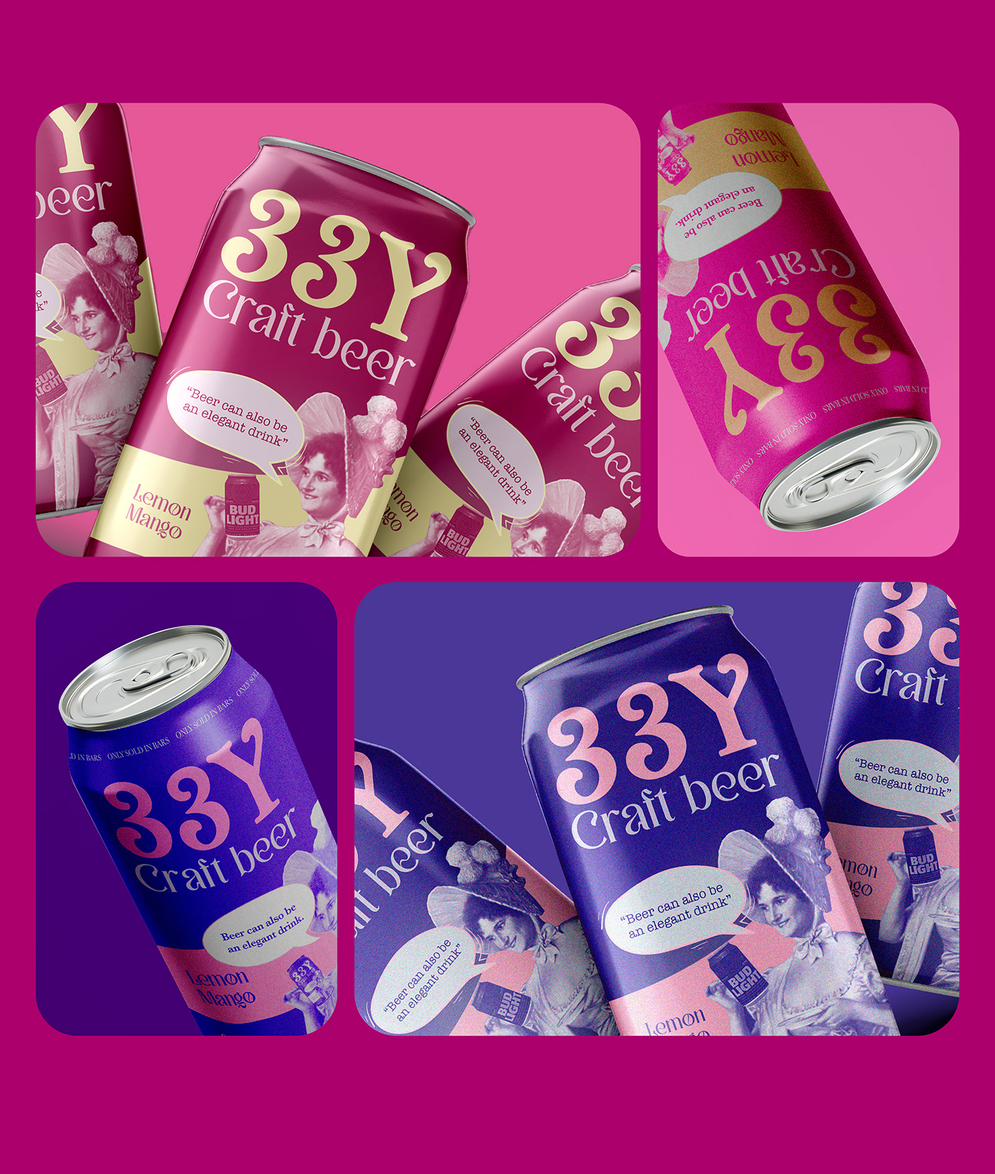


SOLUTION
The client's brief called for a logo that was simple, minimalistic, and font-based. The brand's required colors were bright but muted. To capture the essence of the brand, I used the metaphor of the Victorian age when it was believed that sticking one's little finger in the air while drinking tea added an air of elegance and regality. Elegance is one of the main characteristics of this brand.
To bring this concept to life, I designed a font logo in a Victorian style, with a Victorian woman holding a 33Y beer can and delicately sticking her little finger in the air. The brand colors are a muted pink and violet, which adds to the overall sophistication and elegance of the design. By combining the Victorian aesthetic with the brand's unique selling point of elegance, the design successfully captures the essence of the brand and appeals to its target audience.


