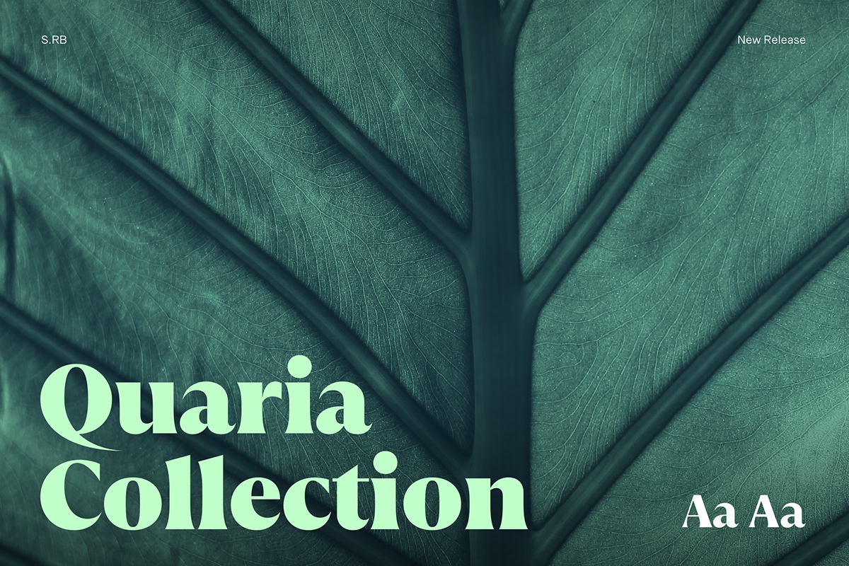
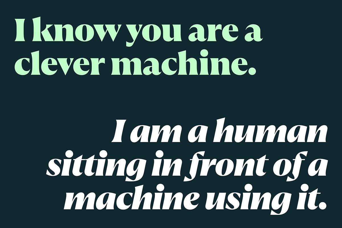
Quaria - A typeface in the change of time.
How do you combine the elegance of a serif typeface with the sturdiness of a sans serif? Finding my own answer took me three years. Quaria's DNA combines opposites, drawing from the rich pool of typographic elements from the last 200 years without dedicating itself to any specific era. It is a modern hybrid that can be both elegant and powerful. Quaria is inspired by the book covers you can find in antique shops (german: Antiquariat), a place where epochs collide, opposites are united and knowledge is exchanged.


Characteristics
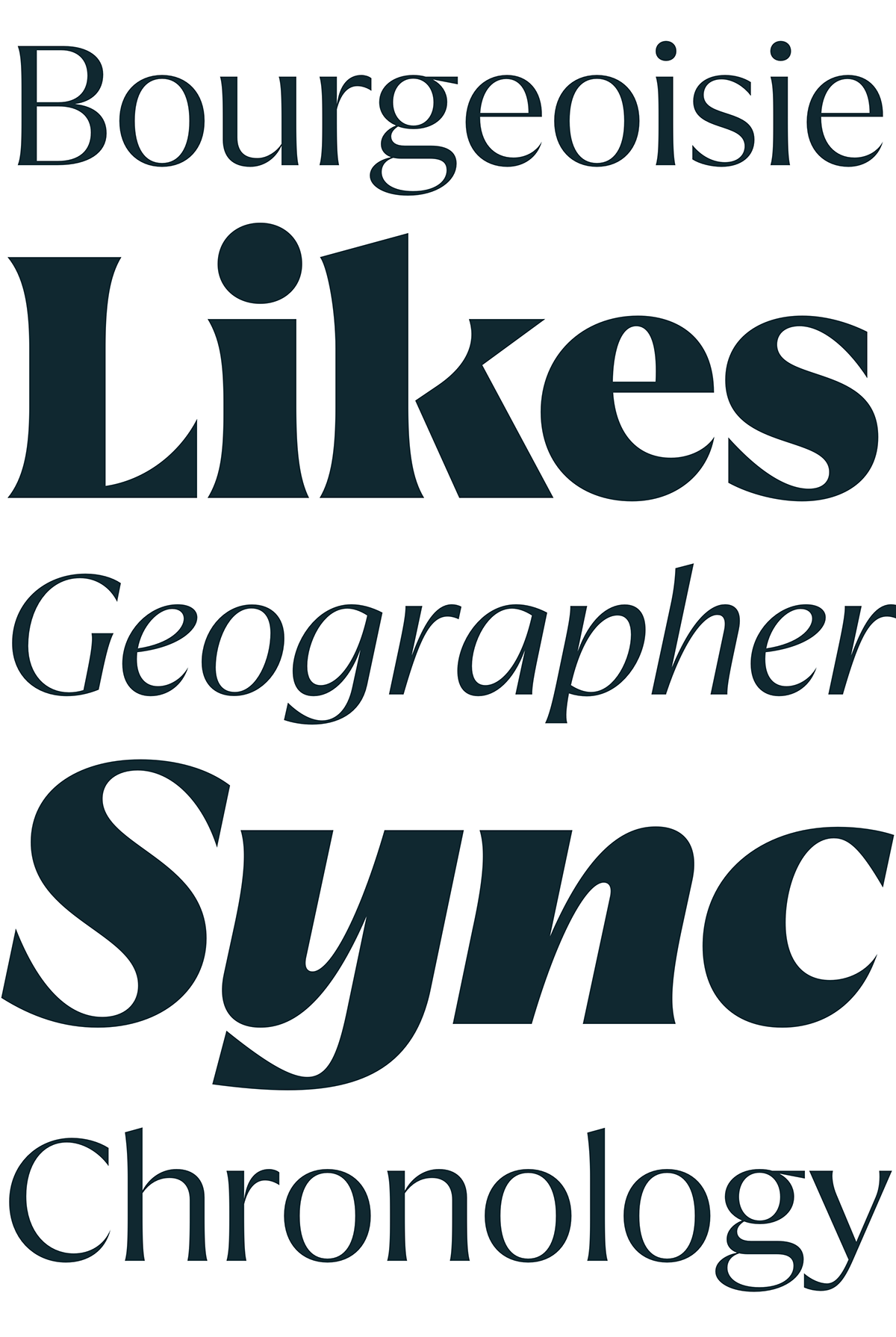
Quaria has a very warm and approachable appearance. It is modern hybrid, distilled trough the last 200 years of type design history. Special features are the pointed terminals on Q and a or the flaring terminals on f and j. It is available in two optical sizes: display and text.


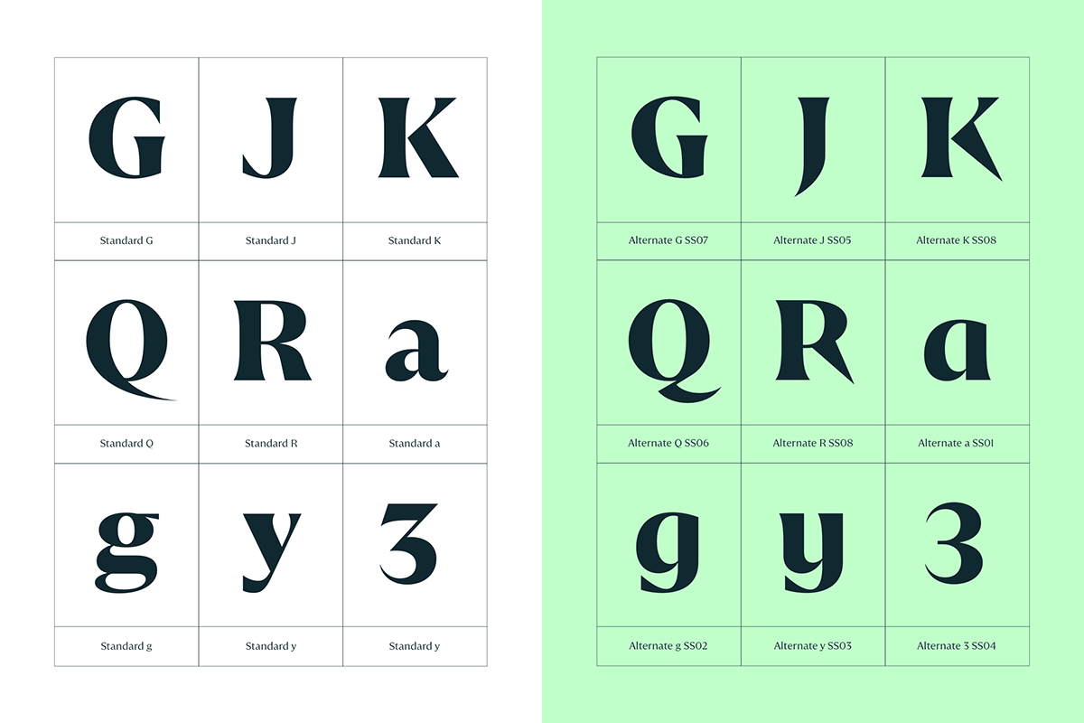
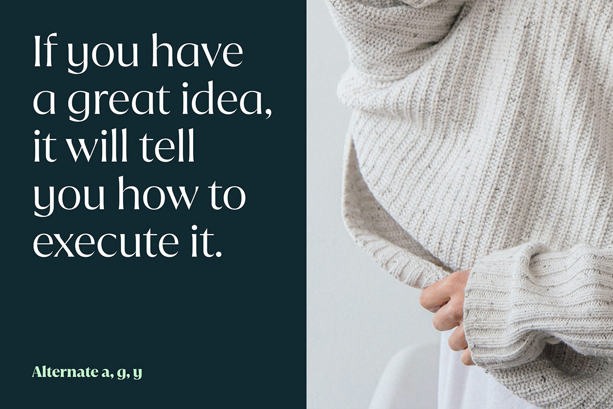
Alternates
Quaria comes with several alternates to allow you to customize the appearance of a paragraph. By applying the alternates, a unique brand font can be created with little effort.


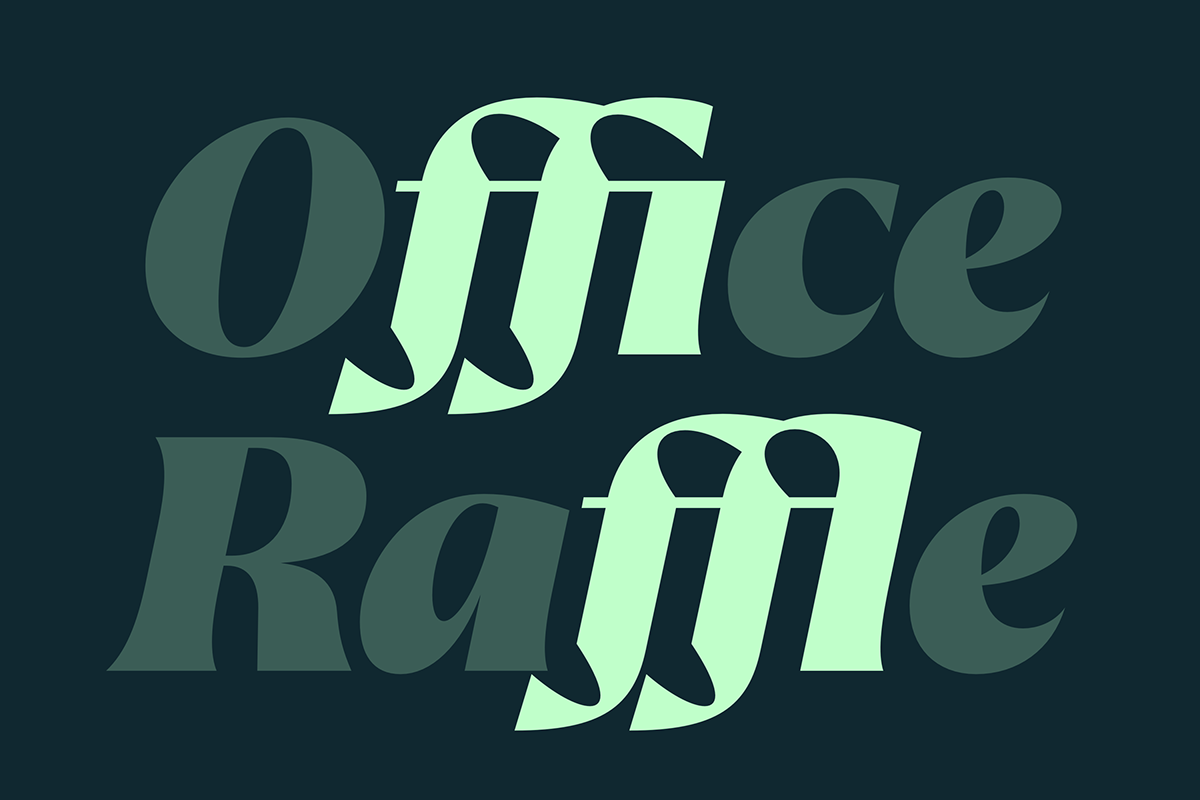
Ligatures
In order to avoid colliding characters, Quaria is equipped with many ligatures.

Languages
The Quaria family comes with with various language-specific characters and supports more than 200 languages based on the Latin character system.


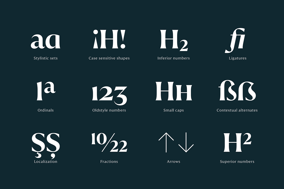
Opentype
Quaria is equipped with all modern Opentype features such as small caps, fractions, tabular figures, oldstyle figures, contextual alternates and many more.


Styles
Both families, display and text are available in 5 weights with matching italics making it a truely versatile tool. All styles are optimized for digital and print use.