Somo (2022)
Branding
[PT-BR]
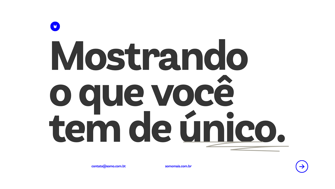
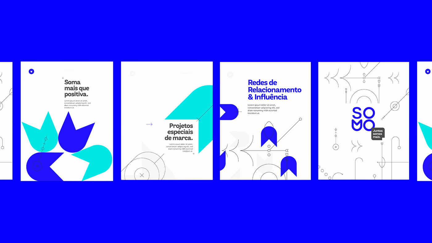
A Somo é uma empresa de inovação. Tem foco em desenvolver projetos especiais de marca amparados em três frentes: creative business; conexões estratégicas e propósito.
A letra M foi desenhada como se fosse uma flor, que também é o símbolo da marca.
A Tulipa mais especificamente simboliza o renascimento e pretende trazer a união do natural com o digital. Além de mostrar toda vitalidade e vigor de uma empresa de inovação que surgiu do coletivo, sempre com a intenção de somar.
[ENG]
Somo is an innovation company. It focuses on developing special brand projects supported on three fronts: creative business; strategic connections and purpose.
The letter M was designed as if it were a flower, which is also the symbol of the brand.
The Tulip more specifically symbolizes rebirth and intends to bring the union of the natural with the digital. In addition to showing all the vitality and vigor of an innovation company that emerged from the collective, always with the intention of adding.
The Tulip more specifically symbolizes rebirth and intends to bring the union of the natural with the digital. In addition to showing all the vitality and vigor of an innovation company that emerged from the collective, always with the intention of adding.