


acque veronesi, rebranding & advertising
Communication restyling and rebranding designed for Acque Veronesi, Verona's water supplier.
Water quality and the constant checks performed on it are a central focus for Acque Veronesi. There are still too many people who buy water at the supermarket. Why spend more when we have such a high quality local product? The concept we want to convey is this: Verona is a city that offers clean, safe and sustainable water. Verona is the city of water.
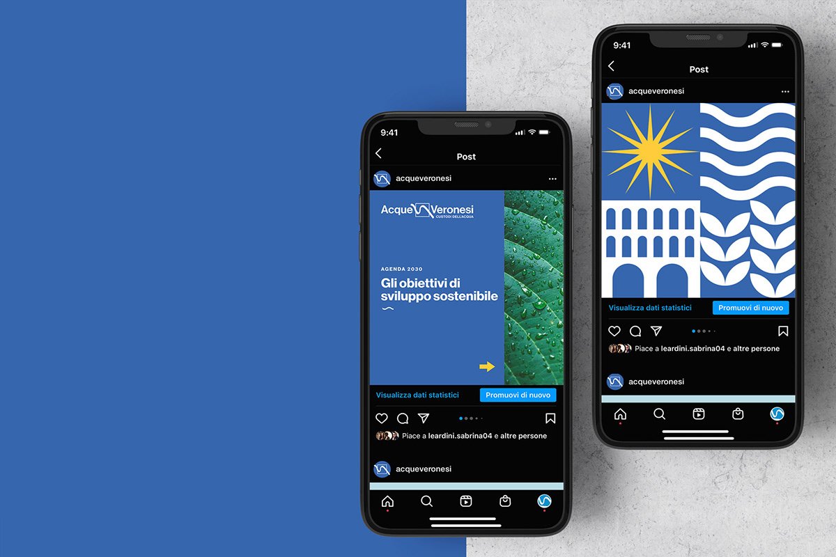
The communication style is developed through a contemporary, modular and flexible graphic language. The colors are inspired by the coat of arms of the municipality of Verona: blue, yellow and white.


FOLLOW MY WORK ON


