
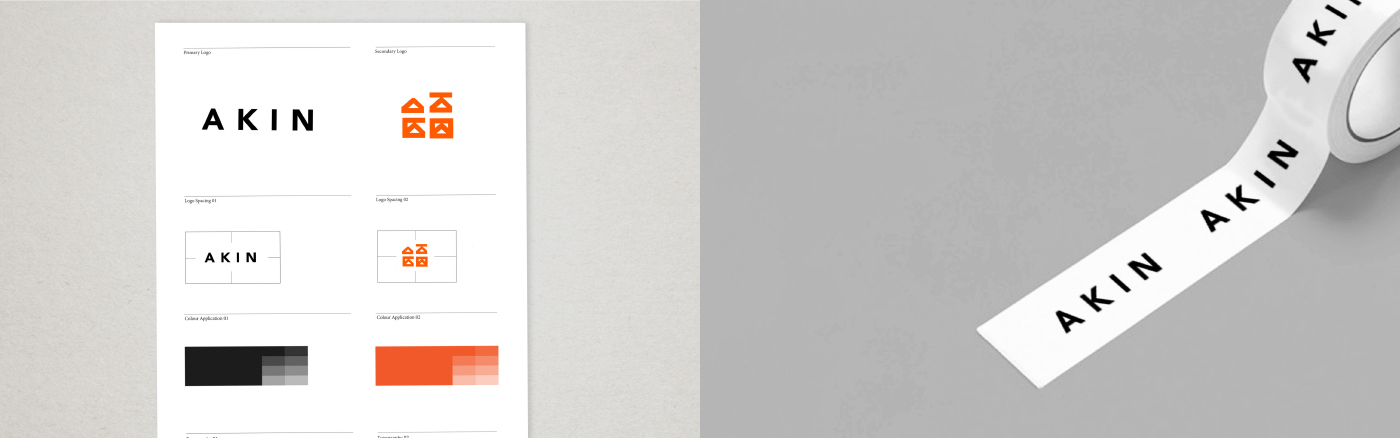
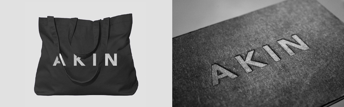
Akin
Branding and Identity for a proposed Independent Fashion
House. Akin simply translates to ‘Mine’, with the name being
born from the idea of the products being extremley desirable.
House. Akin simply translates to ‘Mine’, with the name being
born from the idea of the products being extremley desirable.

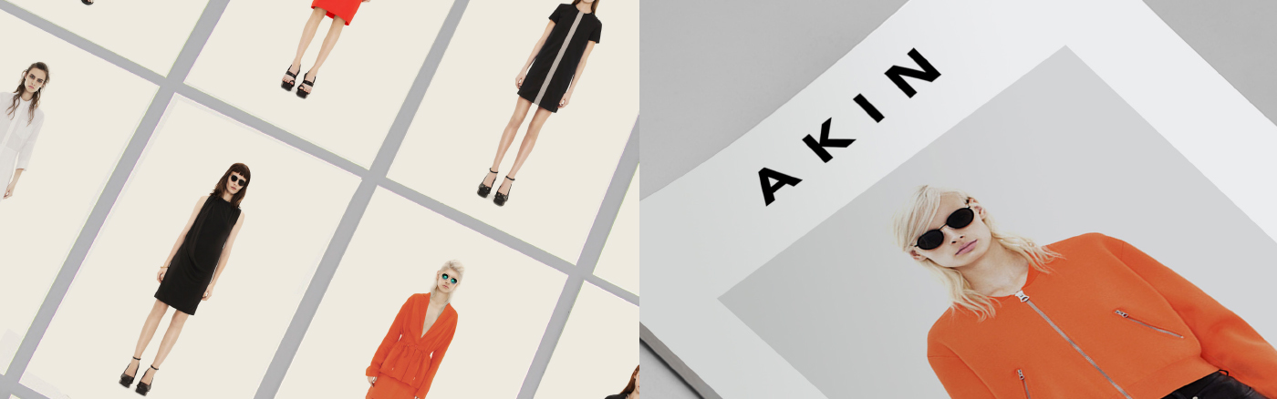
Muted, Bold, Tactile
The core colour palette is muted in order to let the garments shine.
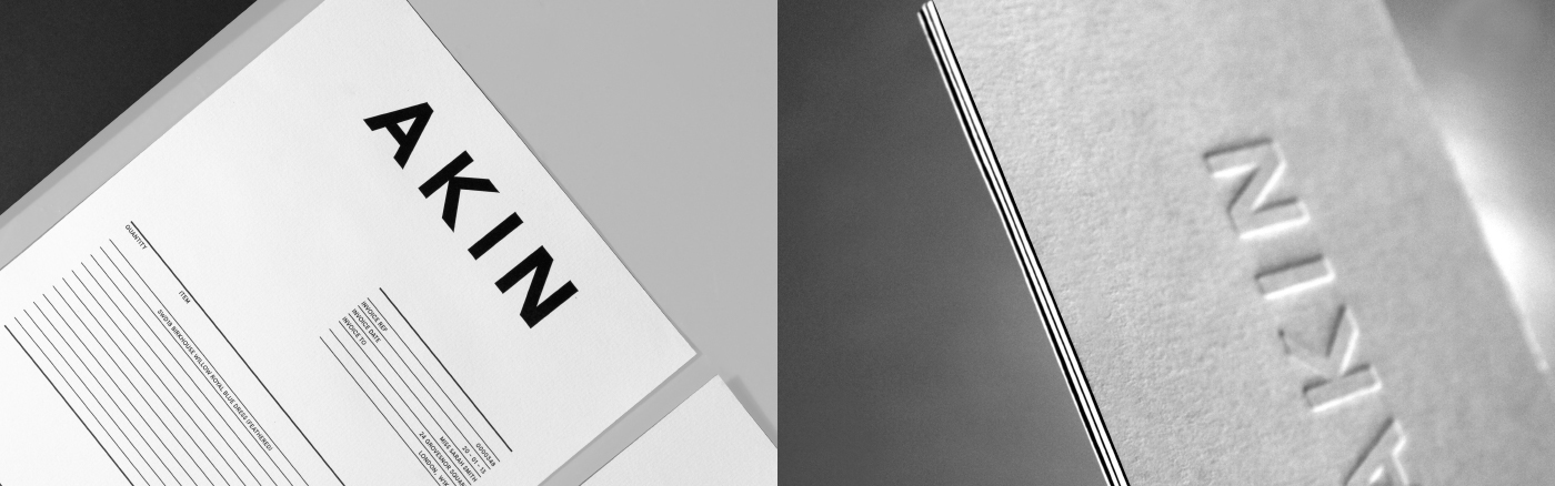
Generous usage of white space and a core black and white palette
allow for the full focus to be on the product.
Generous usage of white space and a core black and white palette
allow for the full focus to be on the product.

E-Commerce Web Design
An e-commerce website that is tailored to the brand helps
categorise and filter products to the users requirements.
The interface remains clean and on-brand to not only make
it user friendly but also retain the the ethos and styling of the brand.
categorise and filter products to the users requirements.
The interface remains clean and on-brand to not only make
it user friendly but also retain the the ethos and styling of the brand.


Thanks for scrolling
To see the full case study, visit our website;
madebyalphabet.com
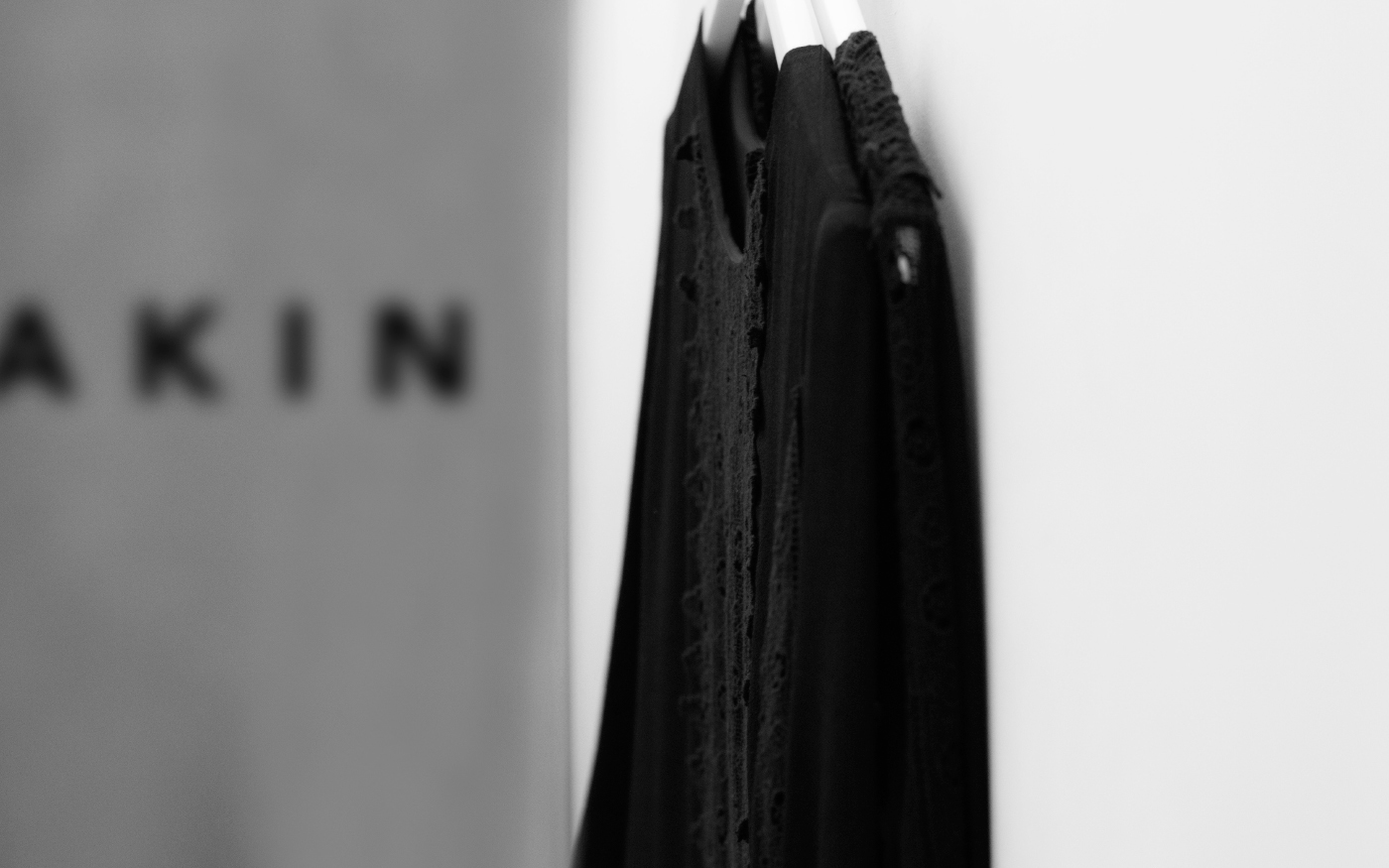
Please Note : Images of garmets used for
presentational purposes onlyand belong
to their respective owners.


