


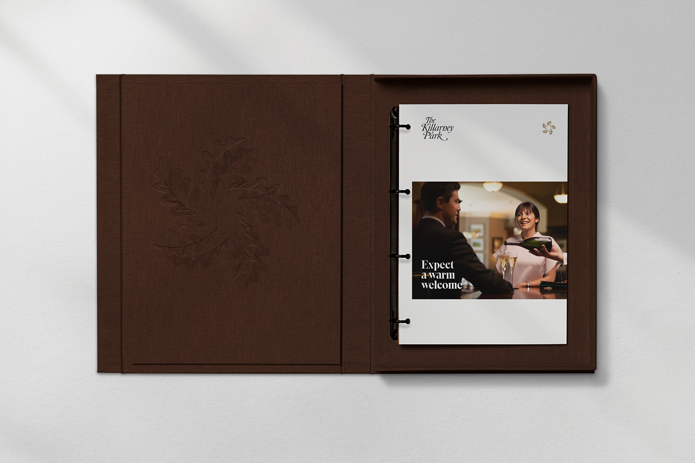
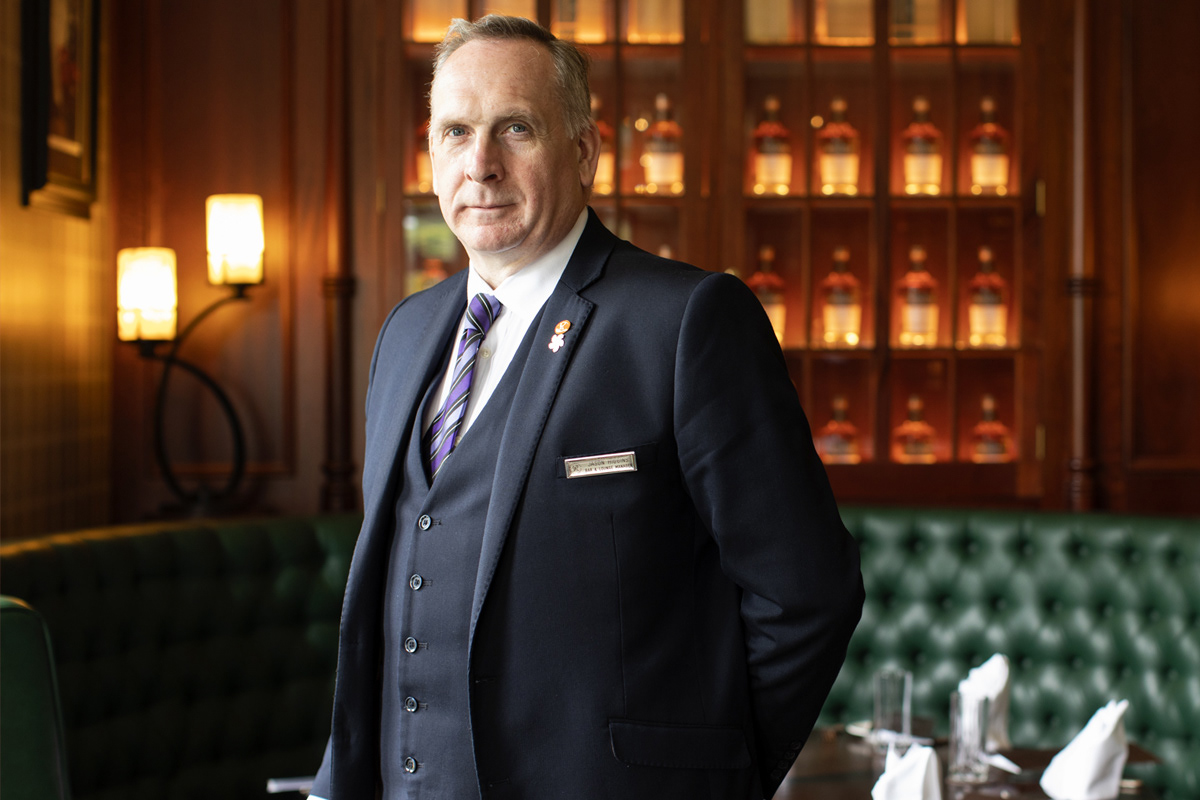
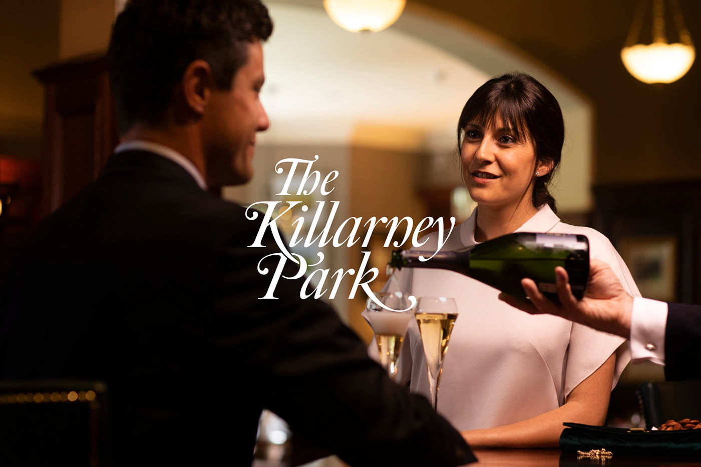
The Killarney Park, a luxury five star hotel and its sister hotel The Ross, a modern four star, are located in the heart of Killarney. Family owned and run with a personable high standard service, the business needed a brand that defined a clear path forward, better reflected their true nature and focus on being a people centric offering with a unique Killarney style.
The Opportunity
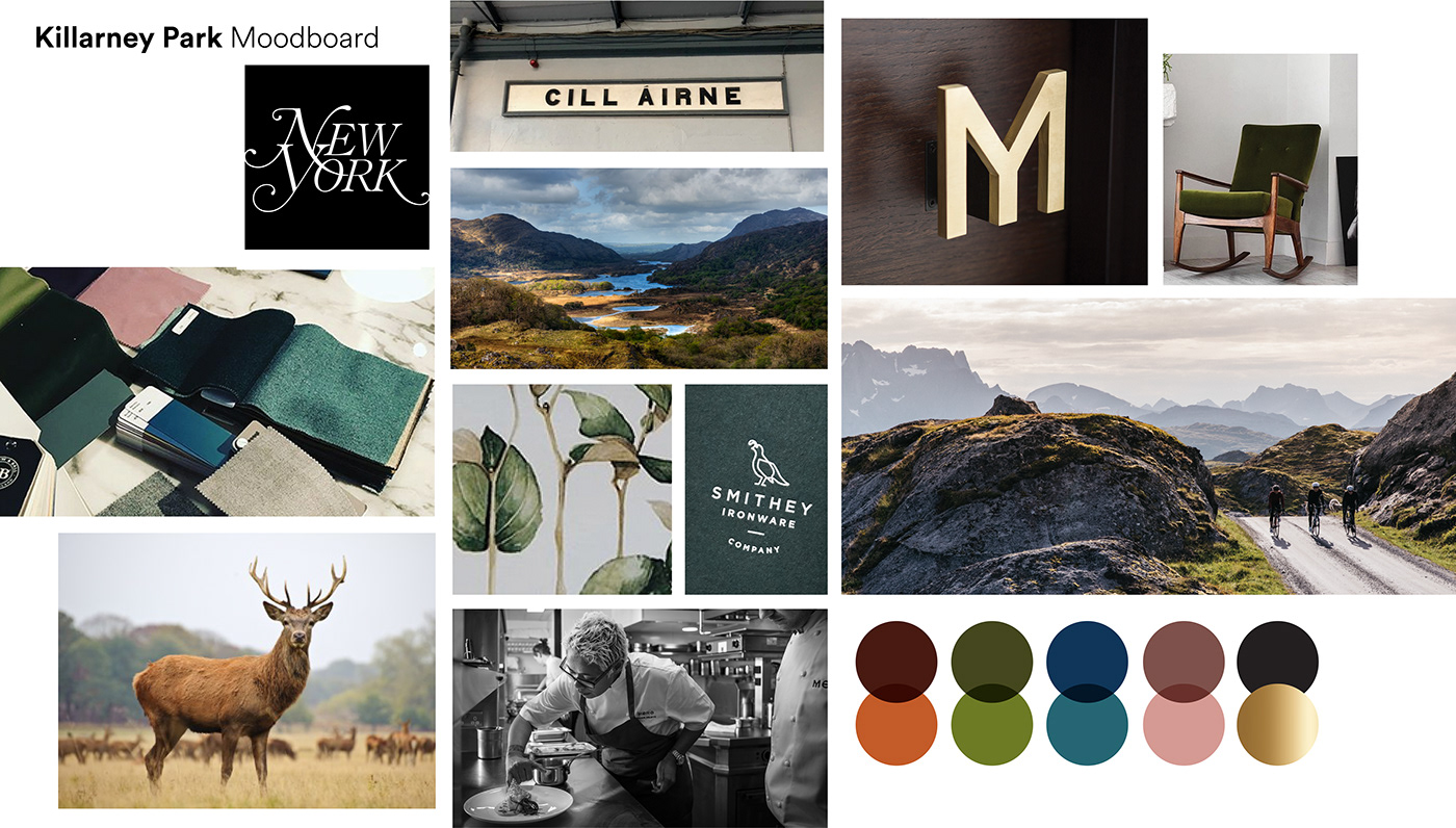
Following an in-depth audit, both desk & on-site research and looking at local and global competition we identified that the Killarney Park Hotel had a unique set of ingredients. It's not only acclaimed for its friendly staff and warm visitor experience and Leading Hotel of the World status, it's a retreat where old world elegance meets modern day luxury, all in a central town location with the glorious Kingdom of Kerry on its doorstep. The real opportunity here was to communicate its truly immersive experience, something people seek again and again, a five star hotel like no other.


Carefully Crafted
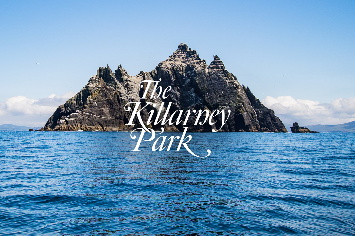
The Killarney Park is truly a timeless example of superlative service, delivered with genuine warmth. The new carefully crafted logotype needed to accentuate these personal qualities to help project the correct tone of voice. It is based on classic calligraphic penmenship, is unique, distinct and expresses a timelessness with the utmost clarity.
A Symbol of Unity
Killarney is a lush and forested landscape and on the hotel grounds is a large oak tree which formerly formed part of the hotels identity. Evolving and expanding out the nature theme, the icon has a connection with the past, a connection to the landscape and a connection to the National Park. It's 5 leaves reflect its family heritage with each leaf representing an individual family member and of course the world-class 5 star status.


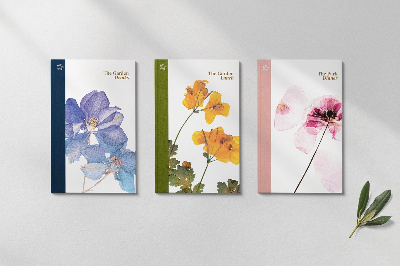
Colour is an essential feature of the revitalised brand and plays a major role in building awareness and recognition. Inspired by the stunning surrounding landscape, its warm, natural and authentic. Natural plant life and wild flowers are celebrated throughout printed communications and form hero images for the Hotel's Park Restaurant and Garden Bar.


The Peregrine Restaurant
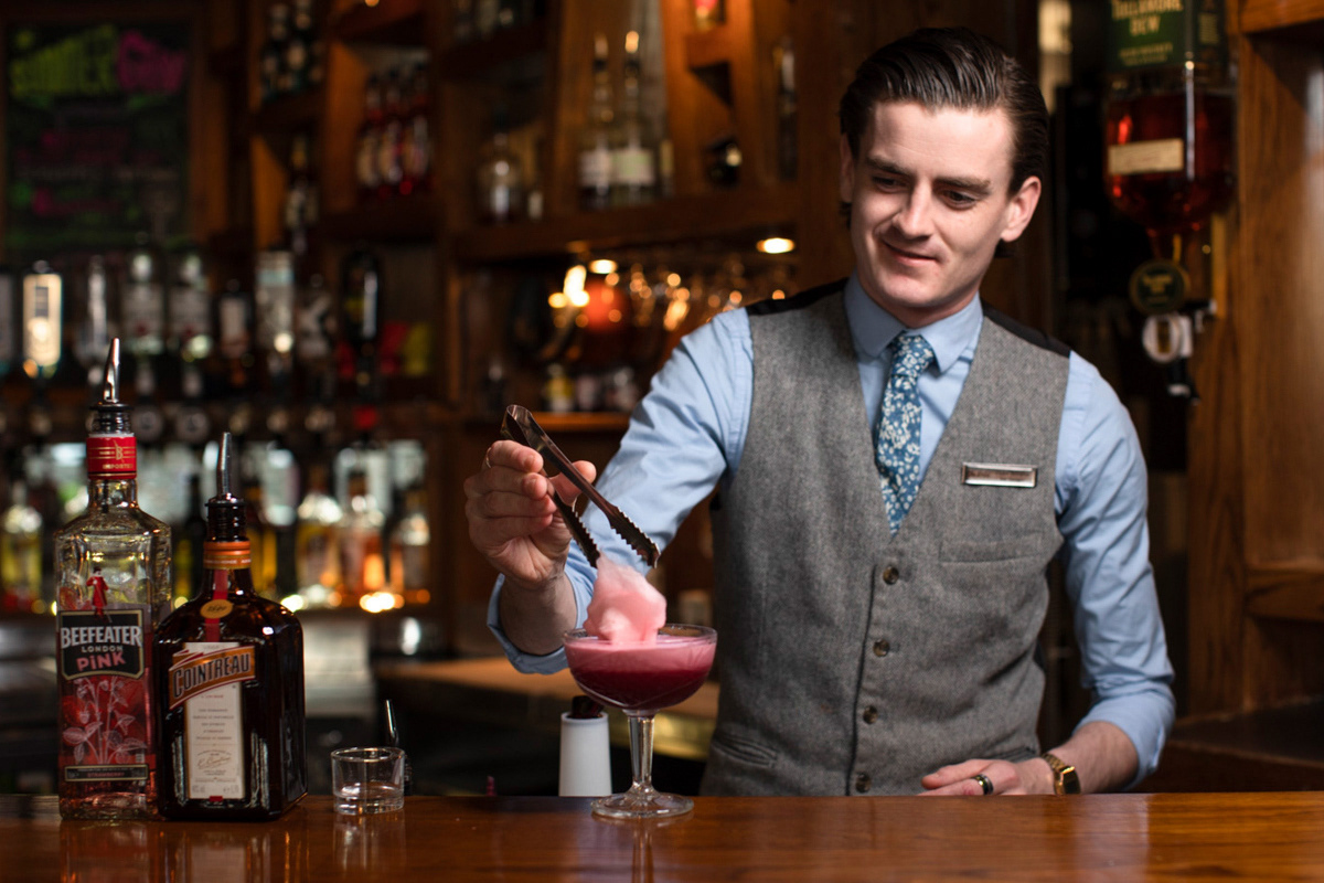
Killarney Park has extended their five-star offering with a new distinctive restaurant. A new name and identity were required for this new addition and a story that defined its ambition. For the foundations for the brand and the new name, we built upon the same foundations as the Masterbrand, the distinctive natural surroundings of Killarney. We named it after the Peregrine, the beautiful bird of prey that lives in the park and skies of the Killarney National Park. We worked with the interior designers throughout the process so that the brand work and the interior environment all gelled seamlessly, resulting in a beautifully streamlined identity and a hand-painted mural in the restaurant of the landscape with a Peregrine sorting high above. The identity even found its way to influencing the cocktail menu, all coming together to create a unique experience in the heart of Killarney.


