Camara Ireland and Suas Ireland - two established organizations in education approached us to build a brand that wholly represented the strength of their collaboration and one that would propel them forward in a transformative way. By merging, they would now be capable of so much more. Consideration was also needed regarding an educational programme of Camara Ireland – TechSpace, a subbrand with 478 dedicated TechSpace sites nationally and 839 Techspace Educators, which had achieved strong recognition in its own right.
The core objective was to create a name and identity that would unite all 3 brands and help propel the new organisation into the future. Marketing expertise was also required to guide them in successfully balancing their communications to various audiences from children to corporate & government stakeholders to educators and the wider community. We also strongly recommended a real discovery and unearthing of both organisations in establishing mutual goals, brand values and overarching purpose, with the ultimate ambition to achieve one new organisation, united in its vision all represented by a new name and brand identity. An interesting challenge!
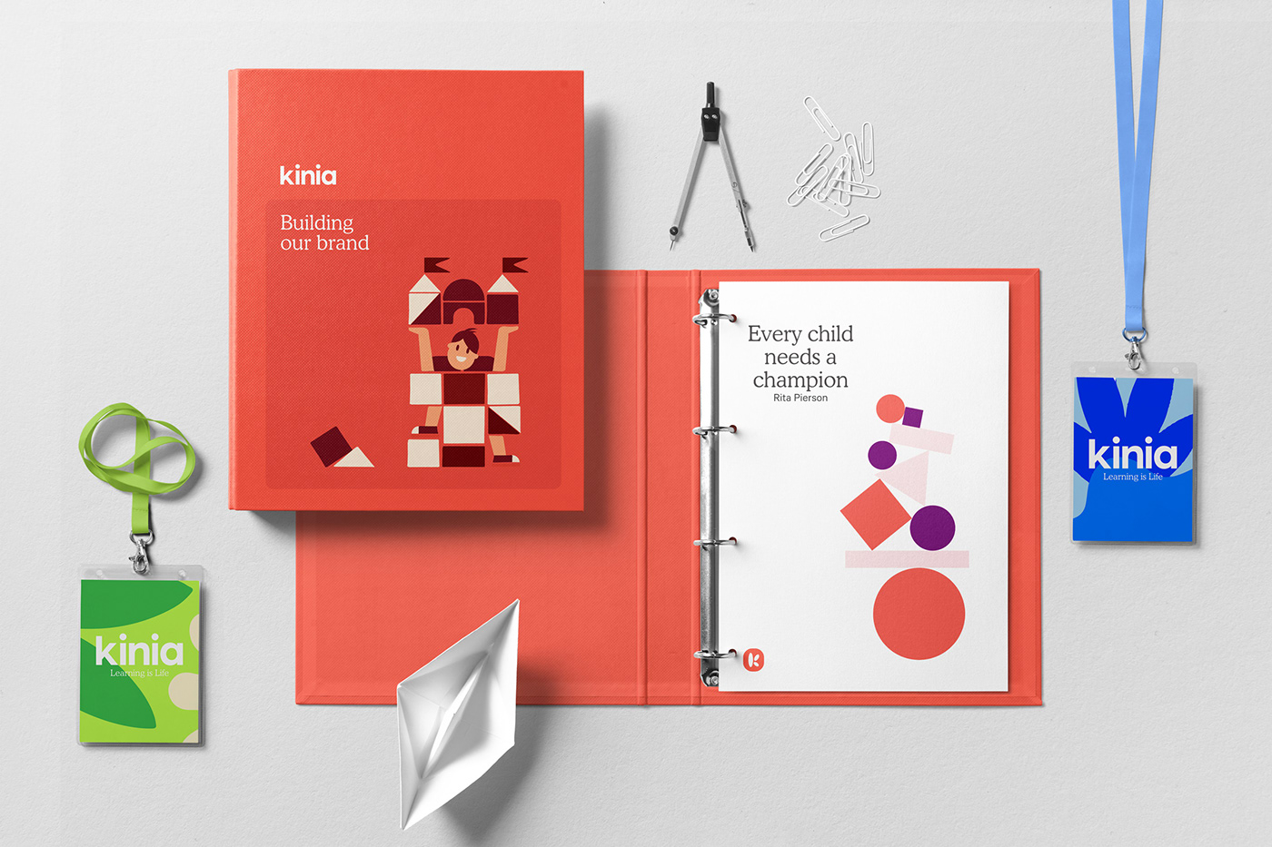
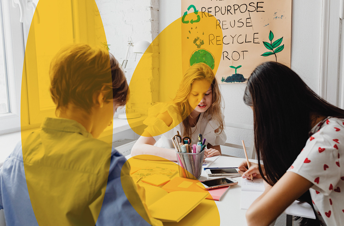
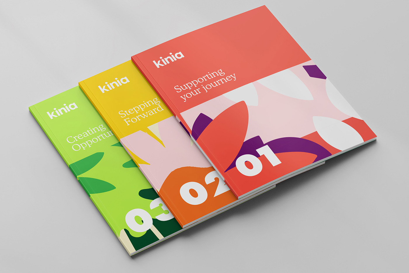
As Alkamee wove its way through an extensive journey of discovery, we discovered the enormous power of education. Learning builds a spirit of lifelong curiosity and imbues individuals with personal confidence. Both organisations were all about helping children reach higher and achieve their true potential. When all children have access to quality education, it creates a ripple effect of opportunity that influences multiple generations. We set about building a brand all based upon a solid positioning of Collectively creating opportunity for children, young people and their communities. The new name stems from this positioning - one family coming together to collectively create opportunity with an outward-facing brand purpose for the whole world to see - Learning is Life. Our inspiration to visually bring such positivity to life came from the creativity of the classroom - the cutting of coloured paper to create shapes and forms that could express ideas with simplicity and strength with a cheerful palette that took notes from colouring pens, paints and pencils, that project a fresh, confident and joyful expression.


Creativity
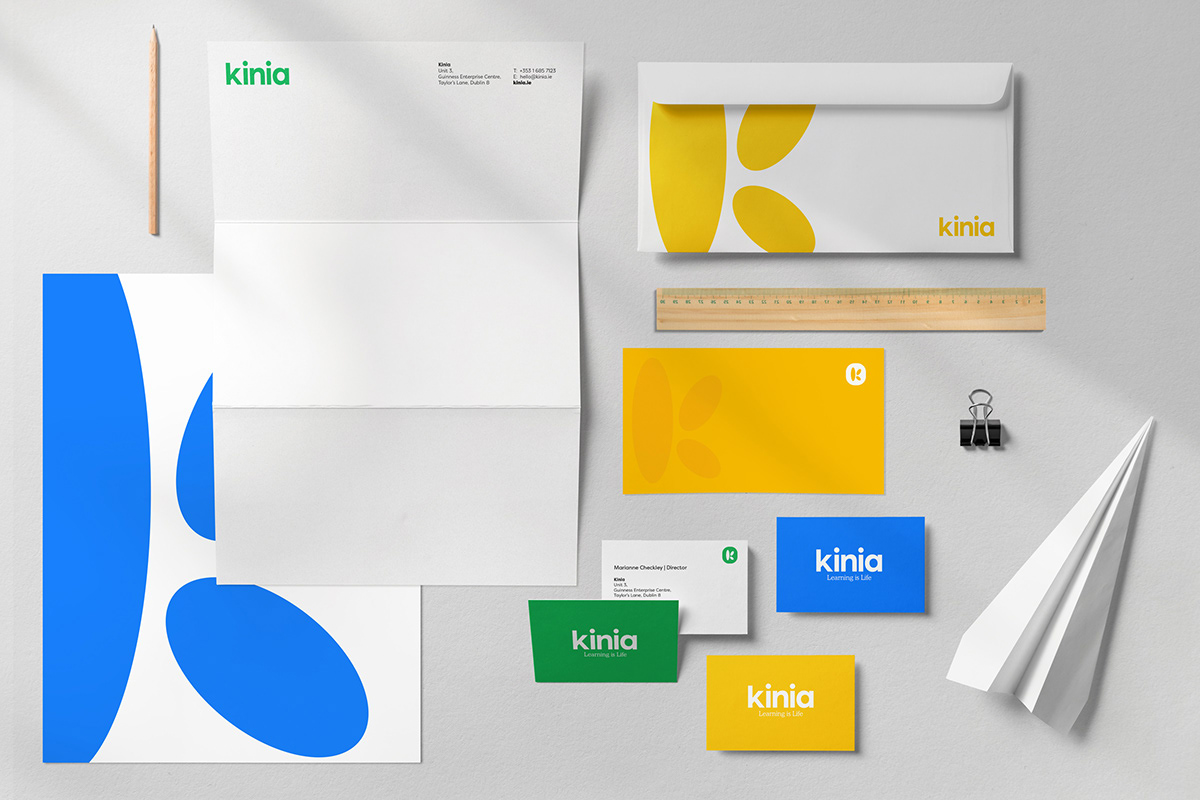
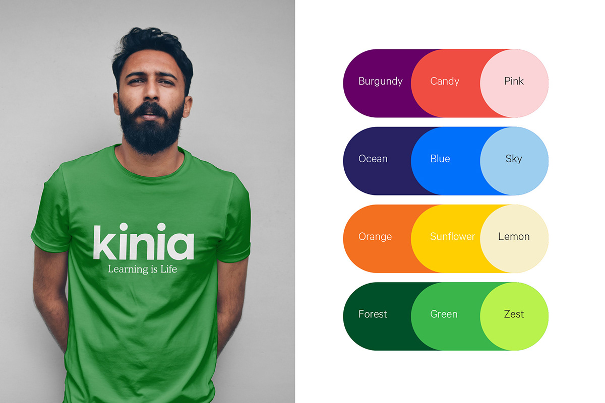
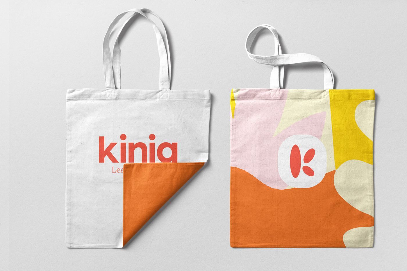
Our inspiration to visually bring all of this positivity to life came from the creativity of the classroom, cutting coloured paper to create shapes and forms that could express ideas with simplicity and strength. We took notes from Henri Mattise and Keith Haring on bringing energy and light to the visual language. Our shapes and forms and our core logo device came from this playful exploration. We created a ‘K’ monogram formed of differing parts coming together. Icons and illustrations based on different themes and finally patterns and organic shapes that we could bring to every touch-point. We edited these back more and more to create the most straightforward and most robust forms possible, unique to Kinia but which could transcend from paper to pixel, and be created equally by designer or child, a brand that all could embrace. Finally, we injected everything with a cheerful palette that took notes from colouring pens, paints and pencils, vibrant but natural, bold and beautifully brave, a fresh, confident and joyful expression to match the organisation’s overarching vision.
Our inspiration to visually bring all of this positivity to life came from the creativity of the classroom, cutting coloured paper to create shapes and forms that could express ideas with simplicity and strength. We took notes from Henri Mattise and Keith Haring on bringing energy and light to the visual language. Our shapes and forms and our core logo device came from this playful exploration. We created a ‘K’ monogram formed of differing parts coming together. Icons and illustrations based on different themes and finally patterns and organic shapes that we could bring to every touch-point. We edited these back more and more to create the most straightforward and most robust forms possible, unique to Kinia but which could transcend from paper to pixel, and be created equally by designer or child, a brand that all could embrace. Finally, we injected everything with a cheerful palette that took notes from colouring pens, paints and pencils, vibrant but natural, bold and beautifully brave, a fresh, confident and joyful expression to match the organisation’s overarching vision.