


Designing Maps to Improve Orientation for Persons with Low Cognitive Mapping Skills
Final report for graduate design course in Design Research Methods. My design goal was to make the results of an academic research project visually interesting.
Unfortunately, the course itself was incredibly pointless & psychologically damaging...the academic equivalent of the dentist chair scene in the 1976 film Marathon Man. Indeed, the experience was so unpleasant that I ended up leaving graduate school entirely.
I did, however, get a decent piece of editorial design out of it.

Front cover of report. The title begins on the back cover & wraps around the saddle-stitched spine. Typeface is Fedra Sans, by superlative Slovak type designer Peter Bil'ak.

Back cover of report, with another view of the wraparound title.

Report abstract. Heading set in Fedra Sans, with all body copy set in Fedra Serif A. Opening line set in small caps.

Table of Contents. Headings & table information set in Fedra Sans.

Introduction. Heading, sub-heading, & pullquote set in Fedra Sans. Body copy set in Fedra Serif A.

Opening spread of Literature Review. The layout uses an asymmetrical two-column grid, with an additional outside column for sidenotes.

Detail of Literature Review opening spread. All headings, subheadings, pullquotes, & sidenotes set in Fedra Sans. Body copy set in Fedra Serif A.

Second spread from the Literature Review. The diagram explains the anchor point theory of navigation.
Third spread from the Literature Review, featuring an image with an overlaid pullquote. First-level subheading, sidenotes, pullquote, & image caption set in Fedra Sans. Second-level subheading & body copy set in Fedra Serif A.

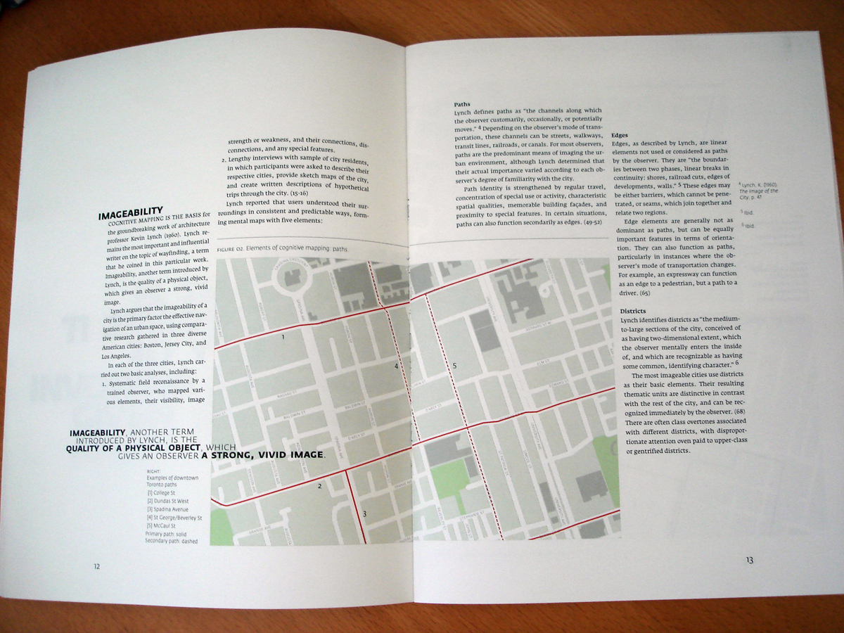
Detail of yet another spread from the Literature Review. Kevin Lynch's elements of imageability are explained using maps of downtown Toronto.

Section break, with quotation from Kevin Lynch's 1960 work The Image of the City...still the most important book ever written on the subject of wayfinding.

Another Kevin Lynch quotation, alongside a section on the architectural integration of directional signage.

Opening spread of Project Methodology section. This is where things really start to get dull.

Section break, with a quotation from German graphic designer & typographer Otl Aicher, best known for designing the pictograms for the 1972 Munich Olympics. He also designed the much-reviled Rotis typeface...which I actually like, particularly its freakish Semi Serif variant.

Opening spread of Supporting Information section, containing consent forms, questionnaires, photos, & other supporting documentation. No one ever reads this stuff.

The colophon...which marked the end of both the report & my academic career.


