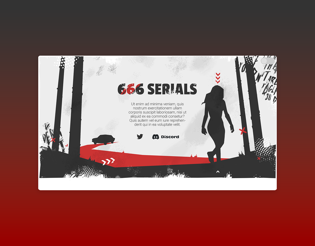
It was a client work. I had to visualize 2 versions for the project landing page. The energy-saving black version also shows the progress of the dark theme... Maybe I was born too long ago for the concept of "trash polka", but in any case, I tried to implement the design elements into the illustration.